Idea #3 – Korean Flag

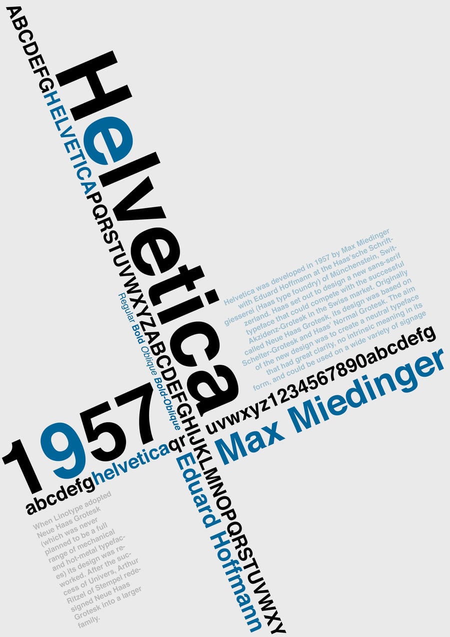
My 3rd idea came from seeing news about a legal dispute between a Korean biking business and large entertainment company. The spokesperson for the biking company claimed they had copied their design.

unknownbike-logo

ikon3


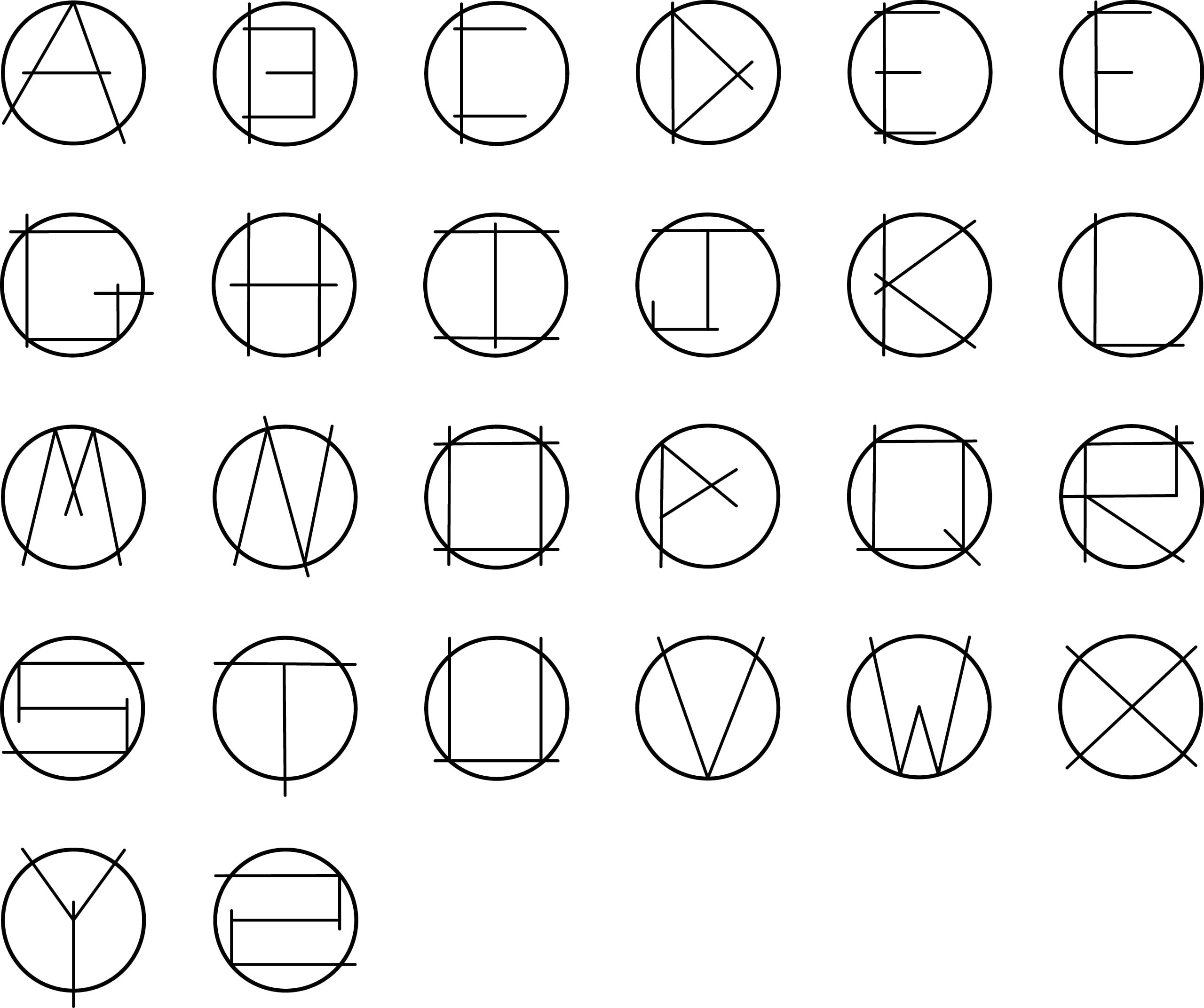
Both designs take their elements from the Korean flag creating a slanted block of letters. I took a closer look at the Korean flag and decided how I could use those elements to create my own typeface.

koreanflagA

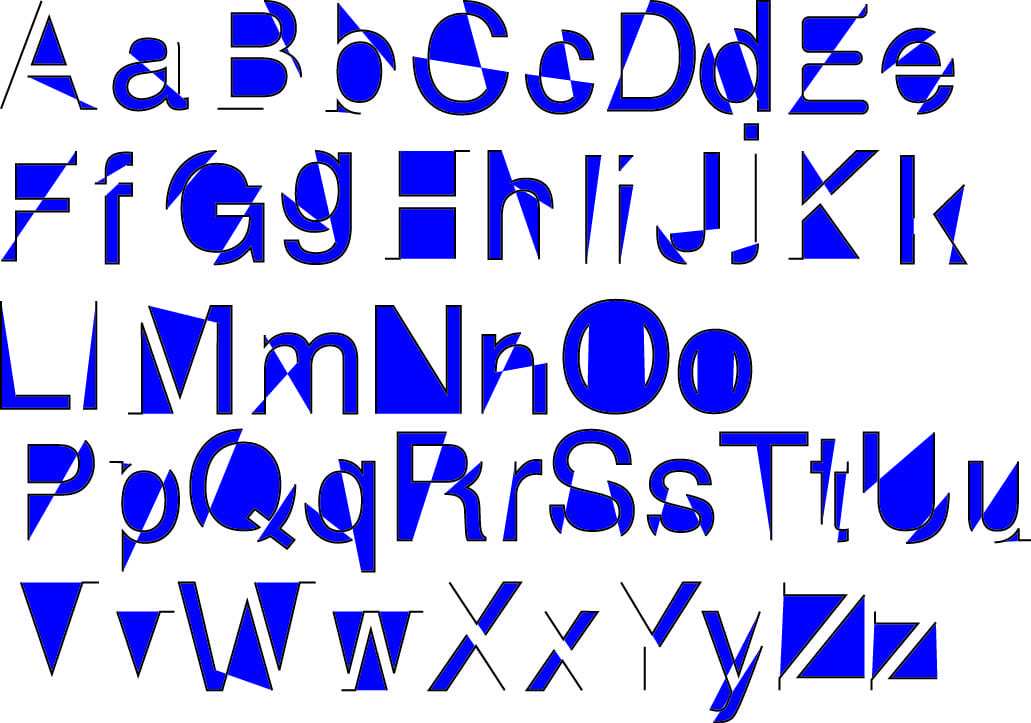
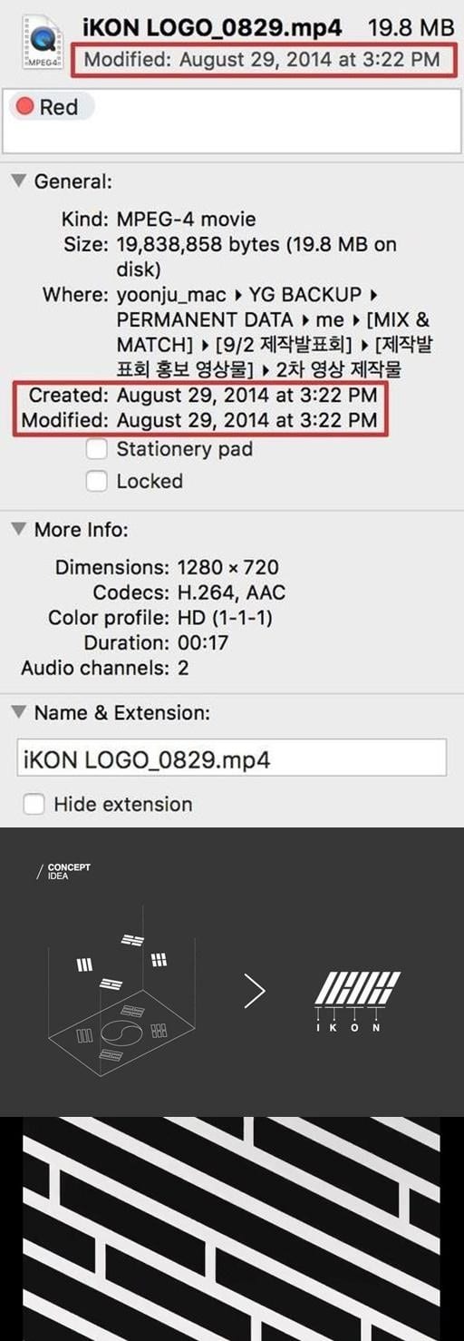
At first these block letters were created, however they did not stand out to me as striking. There was nothing unique about the upper and lowercase A’s. They seemed to simplistic and the lowercase ‘a’ did not necessarily look like an A.

MOREVARIATIONS

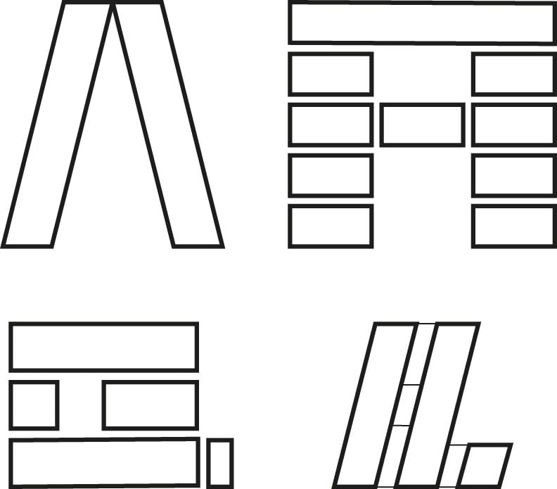
It was then I decided to create different variations. For the idea of the top left I chose to mirror the blocks instead of slanting them in one direction. This began to form an A but looked better as a stand alone logo on its own. The lowercase ‘a’ on the bottom left was an improvement from my first idea as it looked more like an ‘a’ than the one before it. The design I enjoyed the most was the one in the bottom right and has prompted me for more ideas. In this design I chose to use lines with a smaller stroke to connect the blocks and it looks quite futuristic in the detail. It reminds me of the way wires connect between objects and act as nerves in a kinetic sense.

Idea #2 – Intersect

The development of my second idea came after seeing the logo for the hip hop crew Just Music. Their logo uses subtle and protruding lines to create what appears to be similar to scales. Through this they’ve tried to emphasise balance as well as disorder creating a contrast depending on how you view their music.

CtnoVuMP

The way the lines exit the circle inspired me to create a type that incorporated circles and protruding lines. The result was the intersect typeface:

intersect

This is an improvement from the first type I made because each individual letter is identifiable. I chose to round the edges to create more flow to the way the lines moved.  When I used rough edges the lines look out of place.


Idea #1 – Geometric Type Development

Upon learning of the ability to create an outline of type and being able to delete elements from a specific type I began to mess around deleting elements from the Helvetica typeface. The problem was maintaining the legibility of the letters so that they were still identifiable as say ‘A & a’.

Geo1-2The black outlines allowed the letters to maintain some of their original shape. for instance the Z and H are particularly identifiable because of their outline. Some letters on their own would be harder to identify.

Geo1-3

The second trial removed the black outlines in aid of the same colour and made the letters looks more formulaic without any black intersecting lines. Having one solid block colour made the letters have the ability to sustain themselves. Therefore the letters were still legible in their own right.

Design Now

Image bookmarking is very usual for finding visual inspiration. Websites like pinterest and even Google Images has made it simple for designers to find inspiration for their own pieces of work. It is useful as the reverse as well to promote your own work to a wide range of people. Simply by using an image sharing website.

Screen Shot 2015-12-11 at 15.20.33

The use of Design in Consumerism is fundamental in the branding of a company. The shops we use often are all identifiable by the design of their logo/title. This is also fundamental in independent retail where smaller stores use clever design to attract customers.

Design doesn’t just cover words and drawings on a page, but also architectural design. We are currently in an age where the sustainability of our planet is more important than ever. Architects are charged with the task of sustainability.


International Typography

A Design Movement that emphasised cleanliness, readability and objectivity.

The fascination of this Design movement stems from the idea that Switzerland was a neutral country during the Second World War. So people would flock towards Switzerland looking to stay out of conflict. The result is the collaboration of designers. This particular movement is responsible for the simplicity of type today. The use of grids and sans-serif typefaces were formally introduced during this period.

typography___final_test_by_reevosaulus

Two sans-serifs were introduced and used globally for their ease of readability

  • Univers Family
  • Helvetica

Helvetica is representative of how we view font today and use as to point us in directions, in logos etc. Purely because of the simplicity and legibility.