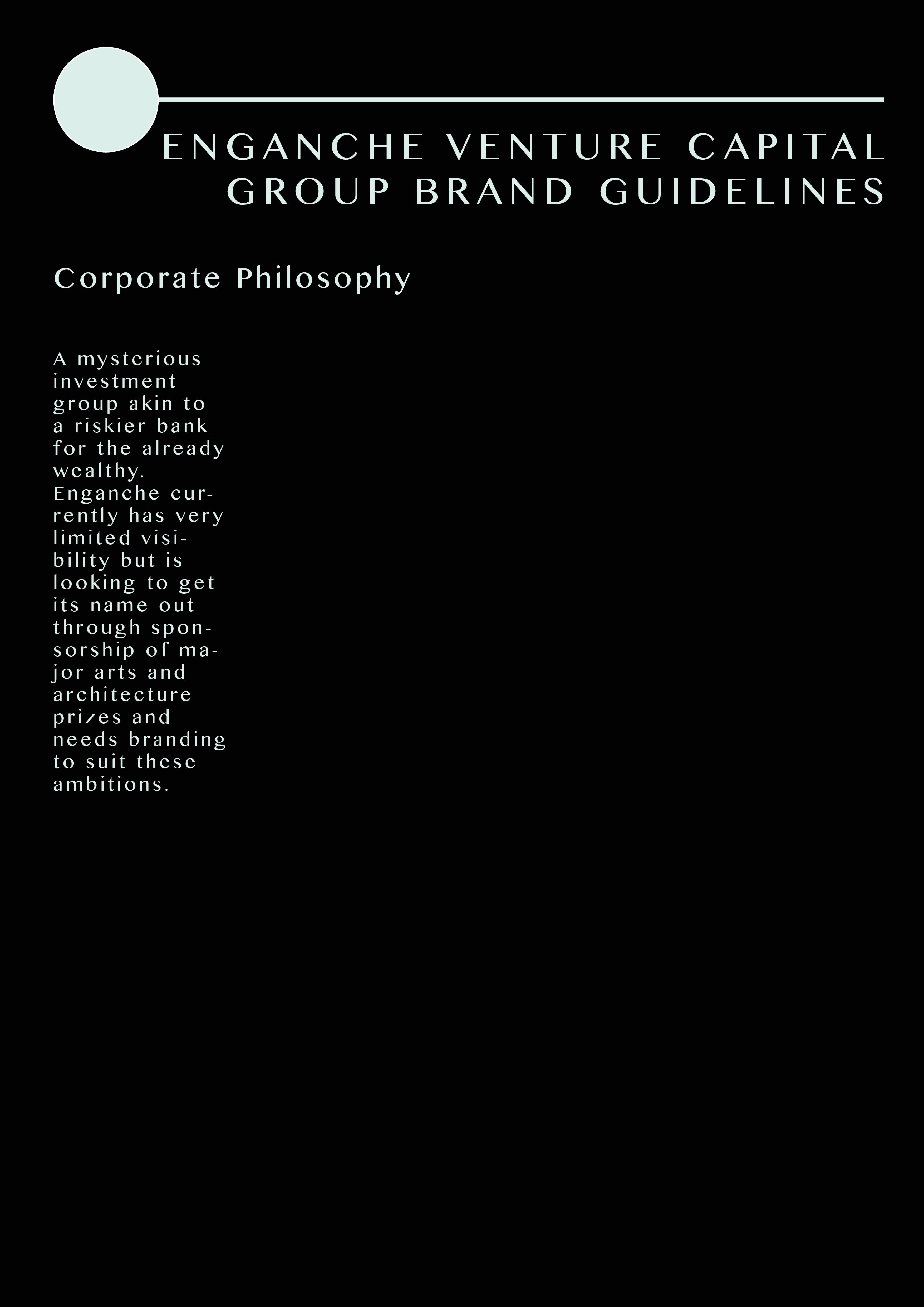
Following feedback from in-class discussions I decided to head in a different direction with the branding of Enganche and what I felt was suitable to the brief. Enganche are a mysterious investment group and this needed to be presented in the brand guidelines.
Feedback from my logo pointed towards a redesign of my preferred design. People preferred the top-left design as a basis for elaboration and it looked mysterious and had a keyhole design. Almost as if you were unlocking something.
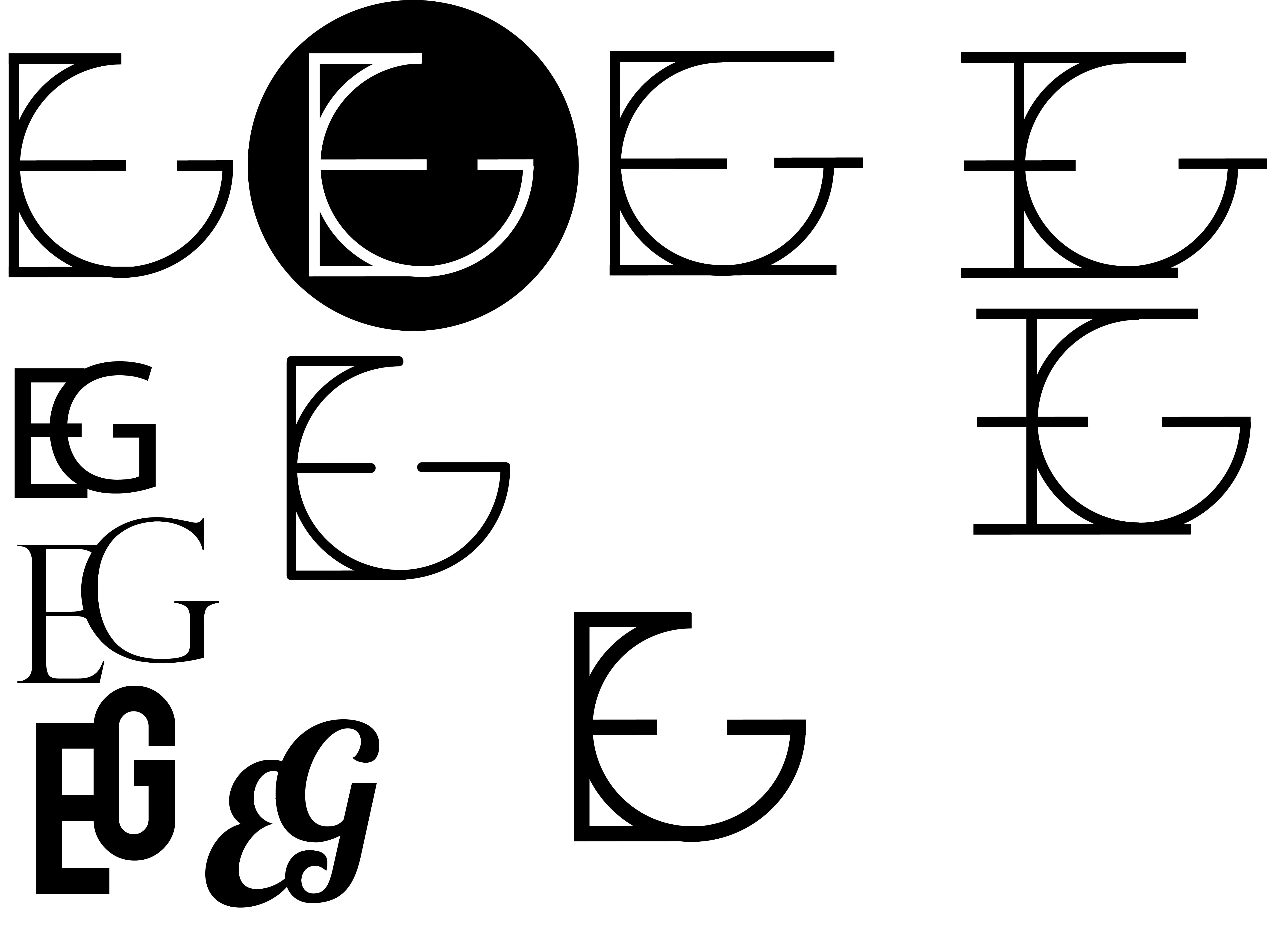
Variations of Logo Design
As a result I chose a traditional design with serifs that connected the two letters together. The front of the brand guidelines was redesigned to be completely black and have a foil-like logo. To show this effect on Photoshop/inDesign I chose to layer a gold foil over the letters. Although it is not easy to see it is effective in suiting the specifications of the brief.
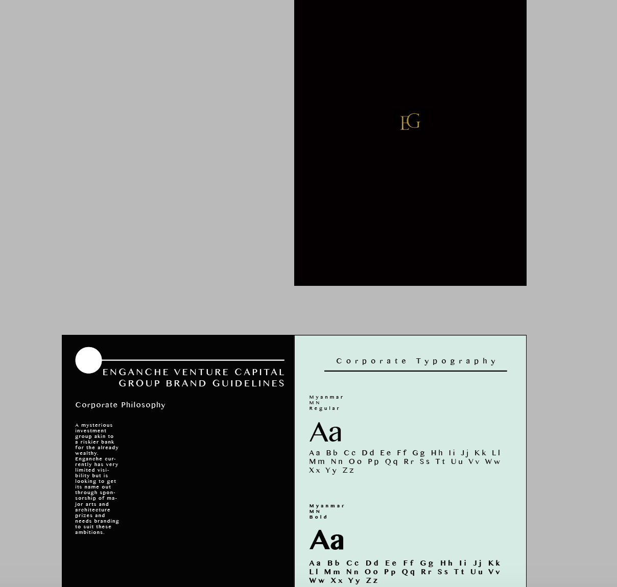
Brand guidelines redesign
The main idea behind this design is to apply minimalistic features to the page. The corporate philosophy does not dominate the page and it also remains the sole focus with white space to support the minimalistic approach.
Proposed Brand Guidelines
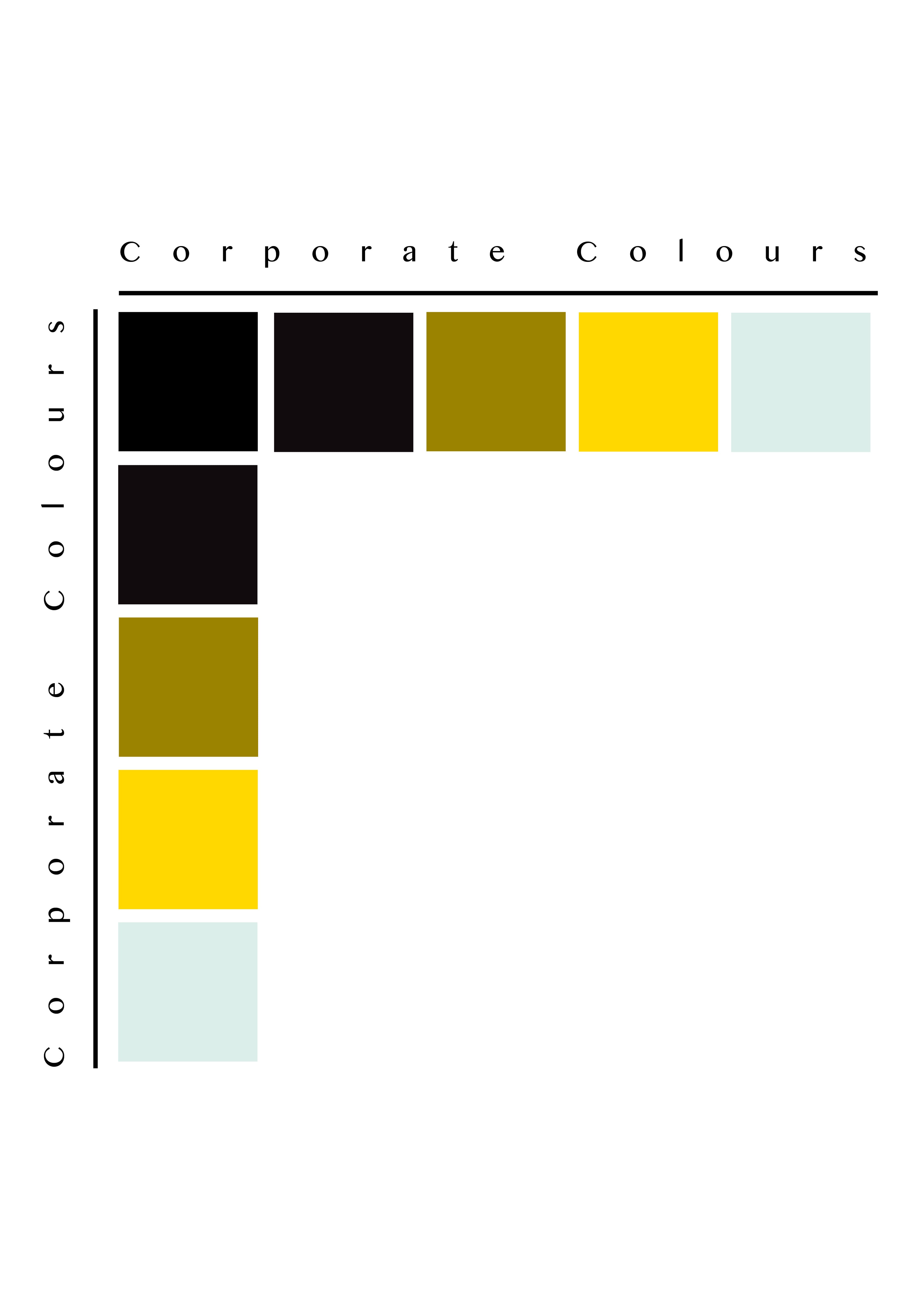
At this point I would like to change the colour palette to be more suitable however the light-paper like texture is effective.

Final Colour Palette
I decided my final colour palette would be made of four colours, for a minimalistic effect. The strong use of mysterious and financial colours compliment each other to create the brand identity for Enganche.