Children’s Book Research

The Contracts of Literacy

Without an initial burst of inspiration for a children’s book idea I was quite open to the breadth of research I could do.

To first decide the layout and direction that the book will be heading I referred to The Contracts of Literacy (Catherine Snow & Anat Ninio (1986). These rules explore how children make sense and understand books.

  1. Books are for reading, not manipulating (they’re not food or toys)
  2. The book is in control, the reader is led – like a jigsaw you must submit to the system that the book sets out in order to receive the intended results
  3. Pictures are not things, but are representative of things.
  4. Pictures are for naming – they illicit a response

 5. Pictures, though static, can represent events implied narrative and passage of time, for instance. Children do not automatically understand picture sequencing

6. Book events occur outside of the normal flow of time. i.e: you shut the book, open it again and things are where they were.

7. Books constitute an autonomous fictional world – the ‘reality’ of a book is not the same as our lived experience but may well contain like for like representations.

The biggest part of the contracts is the representational concepts explored. These being that pictures/images are representative of events and an implied narrative, as well as separating the reality of the content and the reader. So my use of pictures will be orientated this way.

Exploring Concepts

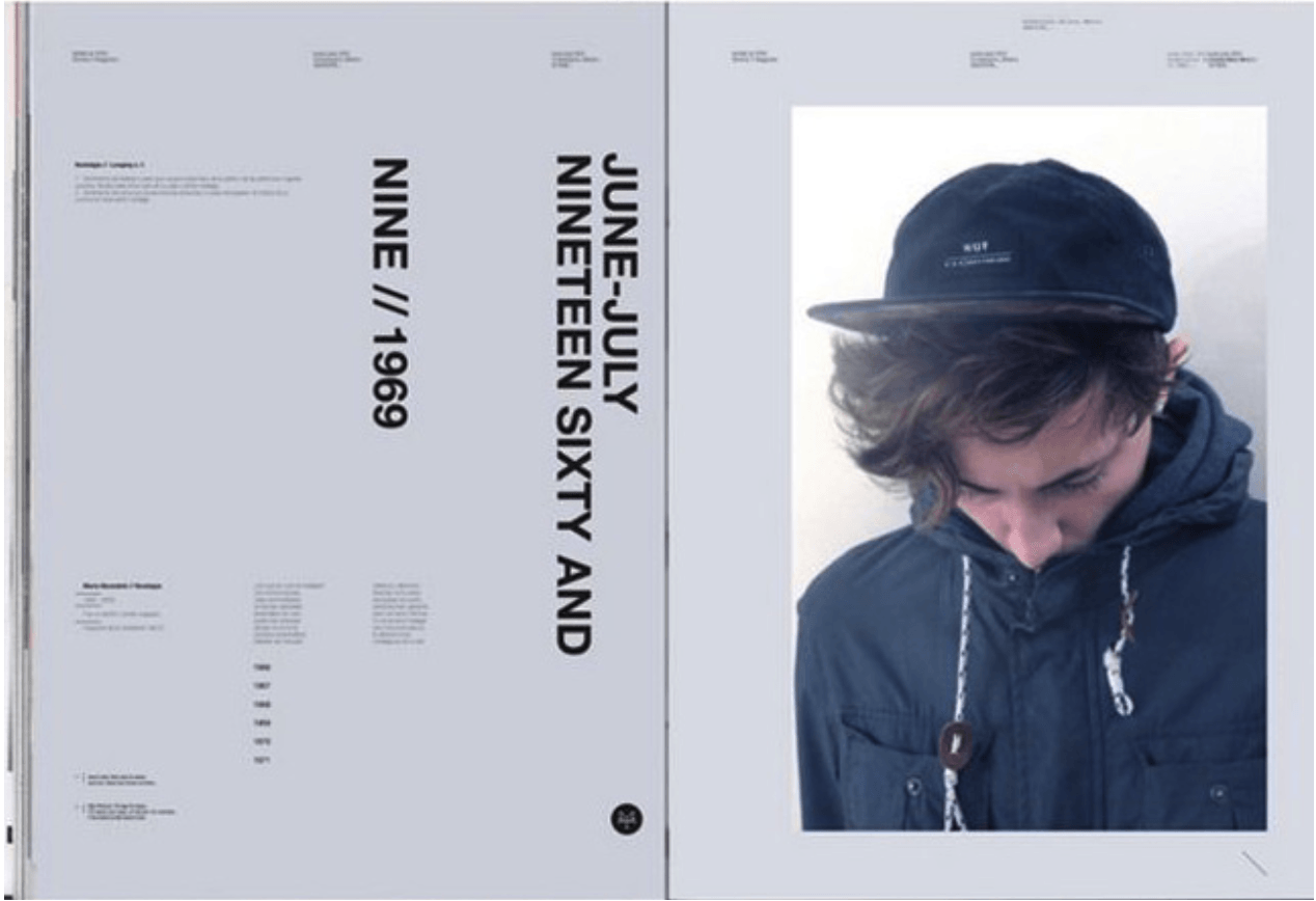
I was very drawn into the set of pictures below that were more photographic compared to typical children’s books that are illustrated. I will more than likely take a photographic approach due to a lack of illustrating skill. However, this would not hinder my design but advance it. Using photography I can move away from the norm of producing anthropomorphised animal content and focus on perhaps more pressing issues relating to the human being.

Screen Shot 2016-02-23 at 15.19.05


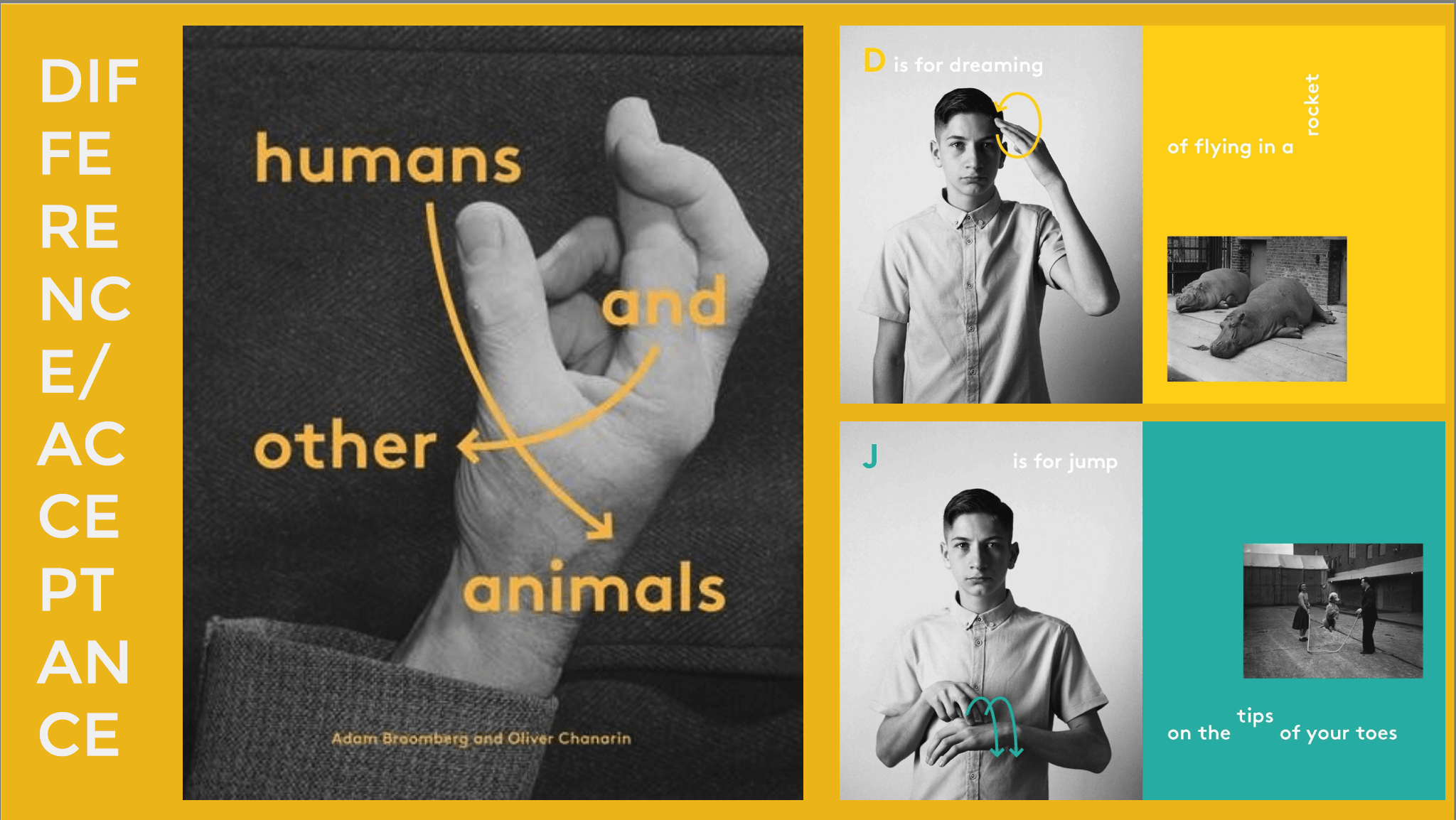
Especially when using photographs the key area of this book will be layout and the use of typography. So I need to utilise complimentary type and imagery to do this. A contrast in colours could potentially be a sensible idea depending on the content of my piece. The spread above focuses specifically on teaching sign language in a creative and distinct way. The instructions are clear and simple to the readers despite the obscure layout, which isn’t necessarily a bad thing. Similarly, I’d like to include a unique, obscure layout depending on the concept of the book.

Focal Point 

I’d be very interested in creating a book around colourblindness. Although not a hugely prominent issue like mentality and psychological disorders, I could produce a book that could potentially test for colourblindness as well as encouraging kids to harness this disability to enhance their creativity that goes against the norm.

All About Color Blindness – A Guide to Color Vision Deficiency for Kids (and grown-ups too!) (Karen Rae Levine, 2013)

9780988561519
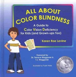
The first book cover I explored was a guide to colour vision deficiency aimed at children. The style of the book is basic and has a lack of creativity. However it does give me some idea towards a potential rainbow-like colour scheme that could be incorporated. The playful language directly suits the target audience as well as featuring a helpful character that the children can relate to.


(http://allaboutcolorblindness.com)

Screen Shot 2016-02-23 at 15.45.35


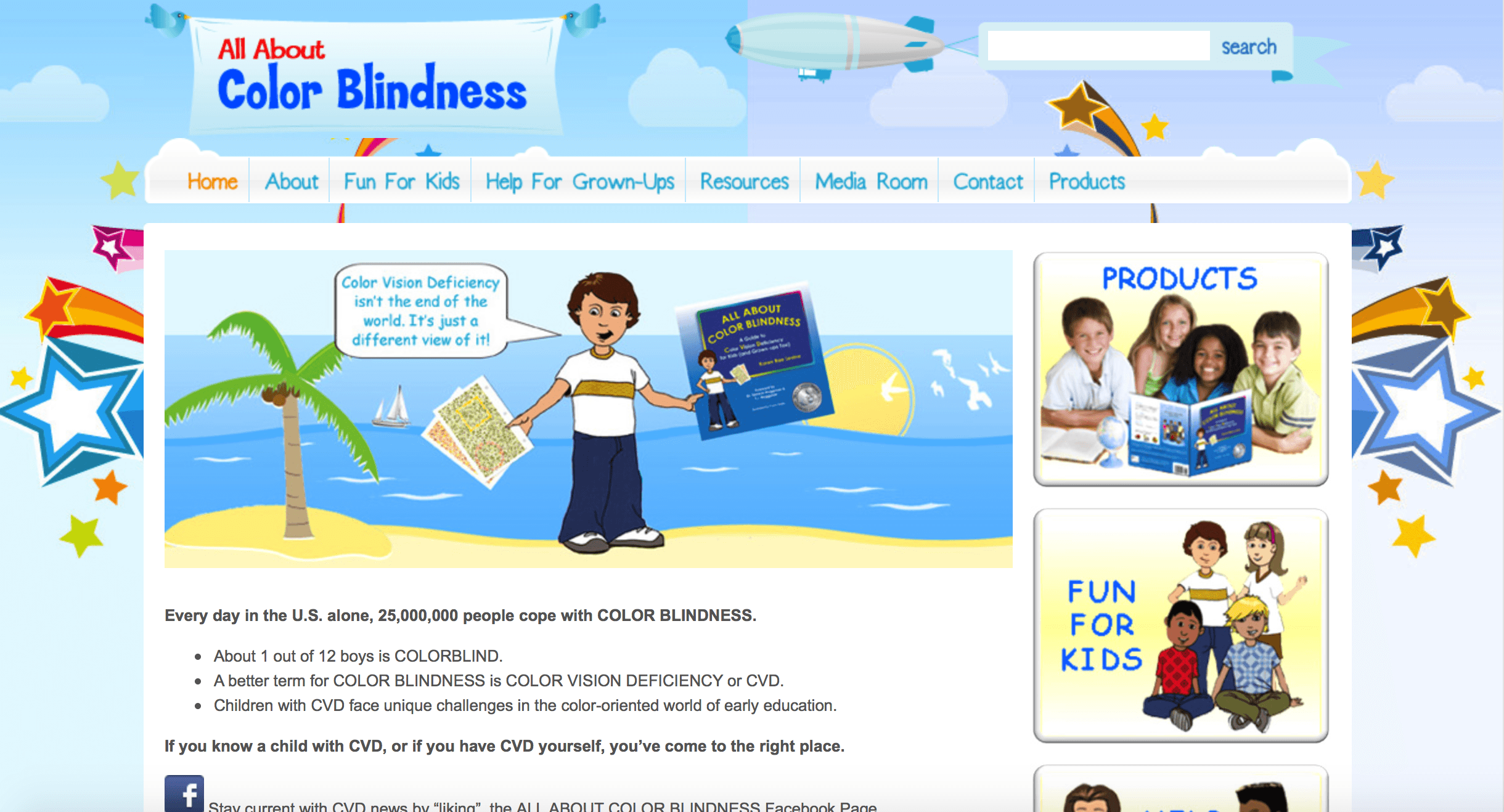
The book by Rae Levine is directly linked to the All About Color Blindness website. I was particularly drawn in by what the character is saying in the banner image. ‘Colour Vision Deficiency isn’t the end of the world. It’s just a different view of it!’ This is the message I will try to get across the in the book. Essentially teaching children how to use their colourblindness to enhance their creativity.

Colour Blind (Brian Andreas)

CBwebDet_1024x1024


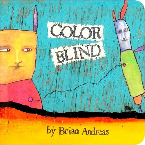
This design was very unique in that it was colourful and did not directly have a clear message. The connecting line could represent the difficulty is assessing colours for colourblind people.

Target Audience

Although the book is intended for children I will focus moreso on an age range of 5-7 year olds. This is because of the time children can diagnosed with colourblindness. Therefore parents will be more likely to look for something to give their child that can allow them to focus on whatever the chosen concept will be.


Guidelines Research

Designing a portfolio of company guidelines will be a unique design element that needs to be tackled for Enganche. The reason why I chose to specifically look at guidelines was because the guidelines didn’t necessarily need to be formulaic but I could freely design something that otherwise would be ignored.

Screen Shot 2016-02-09 at 15.39.24

The first guidelines I looked at explored the typography that must be employed in the company for design of documents, etc. The typefaces on the page are contrasted against the dark background and vary depending on the weight of the type.

Screen Shot 2016-02-09 at 15.43.12

design.inc Brand Guidelines


InitialTestDesign

InitialTestDesign


For inspiration of my first design I produced a similar set of guidelines to design.inc. What I have yet to introduce is colour to the design. However, this is entirely dependent on the progress of my logo design and whether my colour palette extends past black/white. I have tested both the reverse logotypes on a black/white background and it looks successful in design. The layout of the page needs some development to become more unique. At the moment there is little emphasis on corporate ideology and the brand package makes little to no comparison.

At this point the corporate typography is dominating the page and could be made smaller in order to fit more onto the page, or to emphasise white space in this design. From here, I will continue to work on both layout and colour implication.

[Update]

engancheguidelines2 engancheguidelines22 engancheguidelines23


These set of designs are a step up from my initial test design but i would like to rebrand Enganche in the near future.

Layout Research

In order to design a brochure or set of stationary documents I needed to produce some research into existing examples of layout to decide what is suitable for the corporate package Enganche needs.

www.stocklayouts.com

www.stocklayouts.com

The first example that stood out to me was from stocklayouts.com. The design is business-oriented and what stood out was the images on the page. The images are impactful but not so much that they dominate the page. As a mysterious, investment group, I need to make sure the images are both serious and impactful in a layout.

Screen Shot 2016-02-09 at 15.14.12


What made this design interesting was the positive upset of balance on the page that actually created balance. No one column is similar in style, but the balance of text and images on the page creates an irregular harmony. As a magazine article the page bares little white space. However, I would like to emphasise white space in my brochure/stationary for the specific reason of targeting specific parts of text.

Screen Shot 2016-02-09 at 15.21.16

Despite not being business-oriented, the style of this magazine is modern and unique. It is unique because of the dominance of the right hand image and the imposing white space on the left hand side of the page. Larger, bolder typeface drags the attention of the reader to that area. Despite being rotated vertically it is still legible. However, I feel this design cannot be used as a basis for Enganche as there is too much white space and too little information.

Screen Shot 2016-02-09 at 15.25.05

What drew me to this design was the varying amount of space and colour used in this collection of images. The yellow blocks are dominating, but also present a tranquil atmosphere. The use of simply white and yellow are harmonic. The amount of variety in these designs is something I could consider for my design of the Enganche brochure/stationary layout.

Creating a Corporate Logo #2 – Considering Colour

In my first set of designs for the company logo I chose to adopt a black and white approach to match the company’s ambiguity and mysteriousness. The problem with colour that anything eccentric could take away the company’s identity entirely. Certain colours would be useful at representing Enganche’s playmaking ideology.

Red, a typically powerful/energetic colour would represent their dominance in their chosen market whereas a combination is artistic colours would show their progression into the art and architecture side of the creative industry.

Using Adobe Color CC I chose a monochromatic and complementary approach in order to try and find some correlation with the ideology of the company.

Screen Shot 2016-02-02 at 15.34.40

Monochromatic


Complementary

Complementary

I will continue to focus on finding a suitable combination of colours that will reflect the company. These colours may eventually turn into the palette for the stationary set on top of this.

Stationary Development #1

staionary1

In order to start developing a suitable stationary set I decided to use the free branding/identity mockup website FusionPlate (http://www.fusionplate.com/3014/free-brandingidentity-stationery-psd-mockups/). I chose a retro minimalistic style of stationary in order to match the identity of the mysterious Enganche group. I immediately dove into combining two of my logos to blend them together. In some cases it is successful but mostly the combination is unbalanced and completely unnecessary. At this point my goal was to simply see if my logo(s) fit with the minimalistic concept. However, it seems that the logo needs more development to be suitable enough for this approach. Building on top of this I can start to look at the development of a style for the layout of the stationary.

Screen Shot 2016-02-09 at 15.32.37

Instead of using just the six elements in the original mockup, I would like to consider more than six elements and perhaps develop the use of colours. The letters will deliberately have a different layout, so that I am completely producing a set of ‘instructions’ for Enganche.