Brochure Mockup

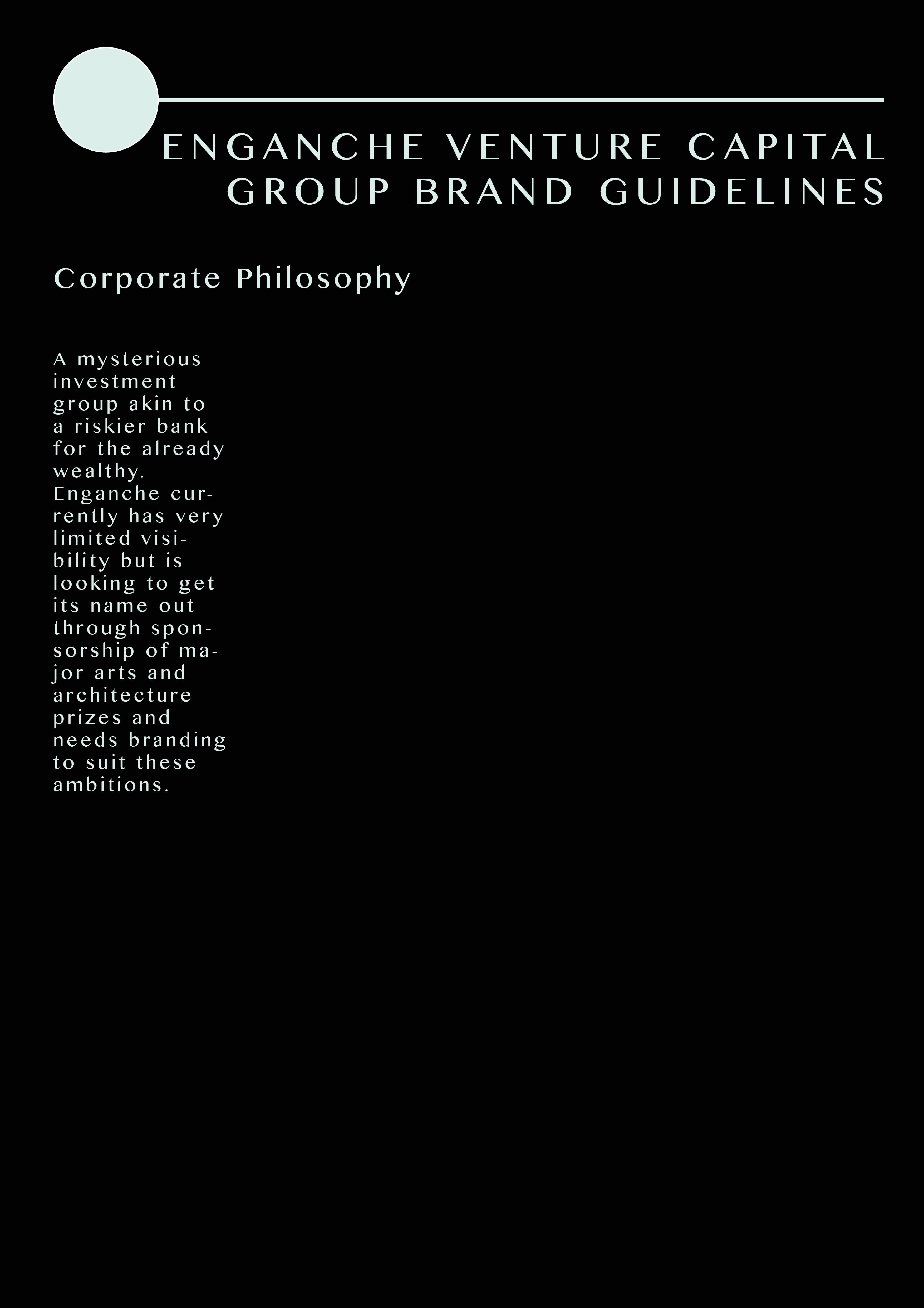
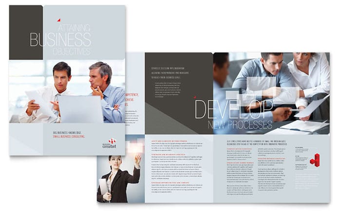
As my secondary output for Enganche branding I chose to create a trifold brochure:
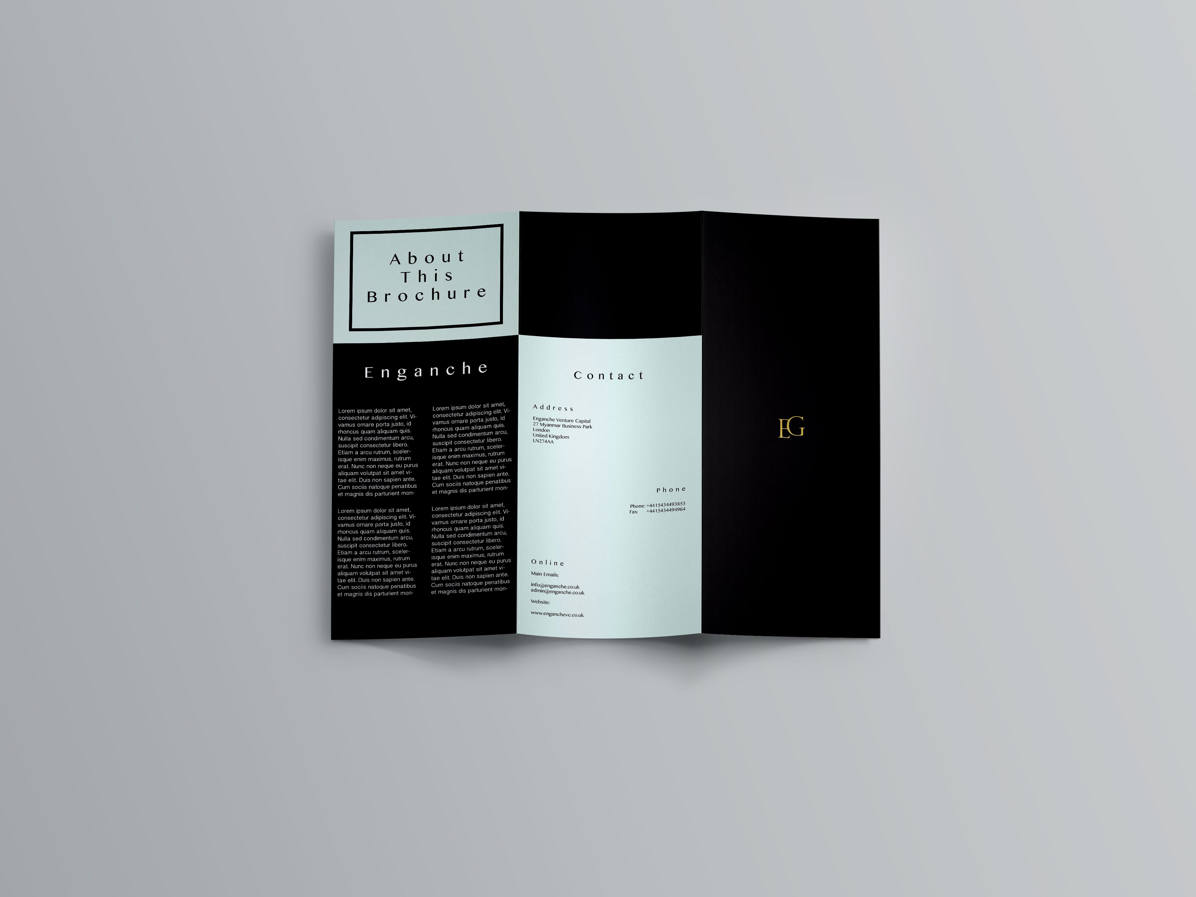
outside

Outside of Brochure

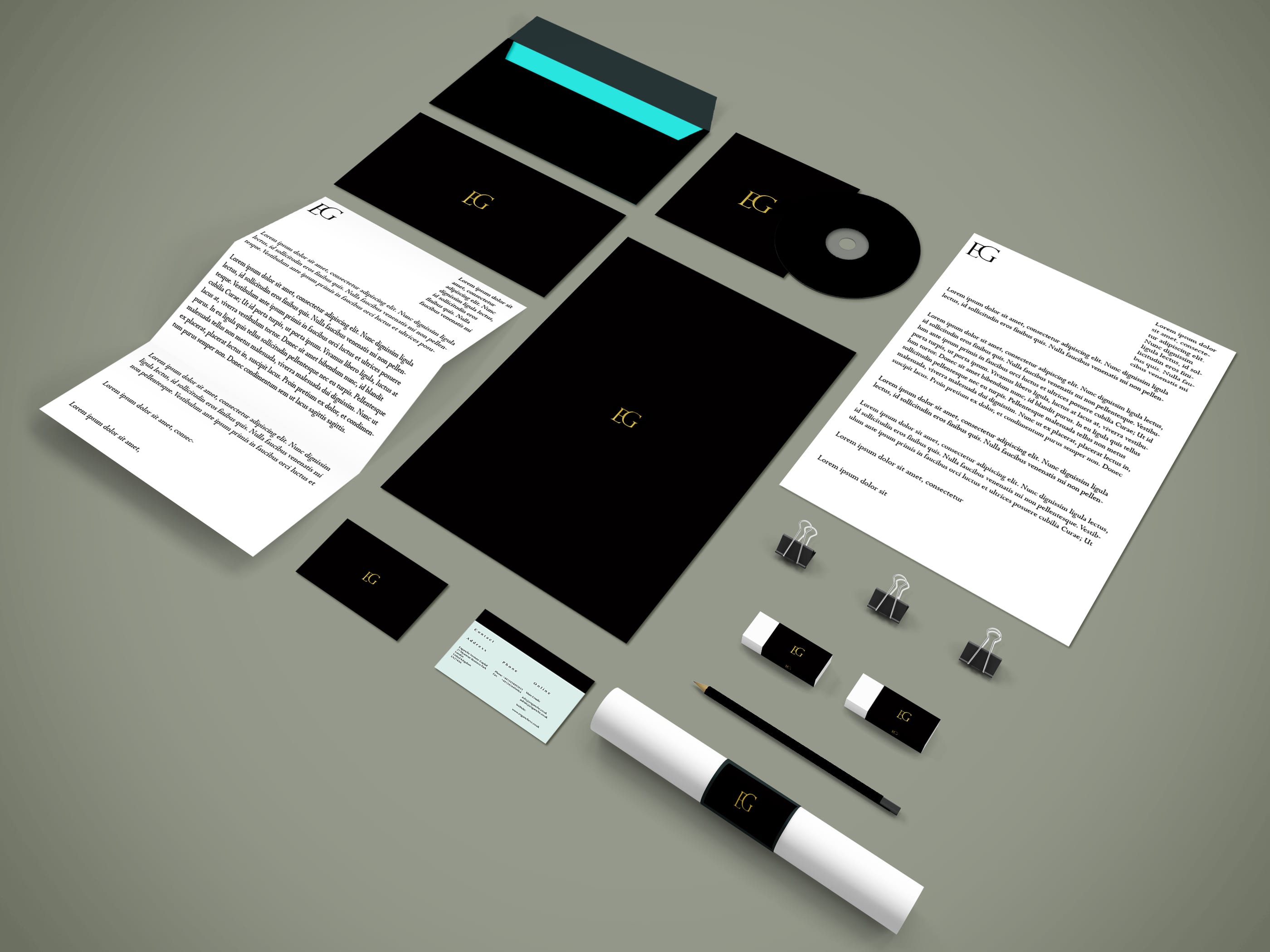
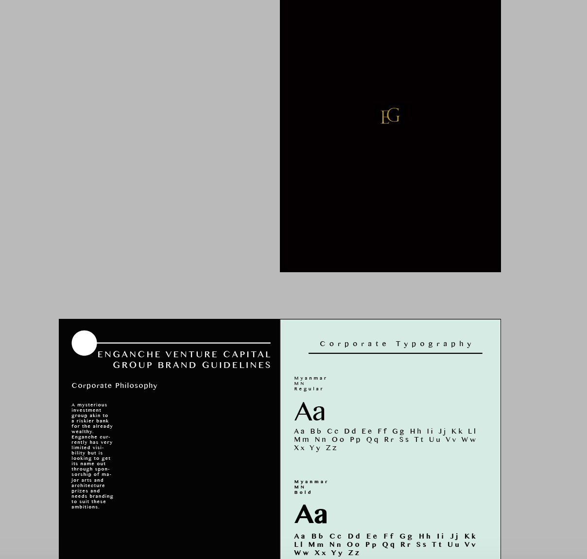
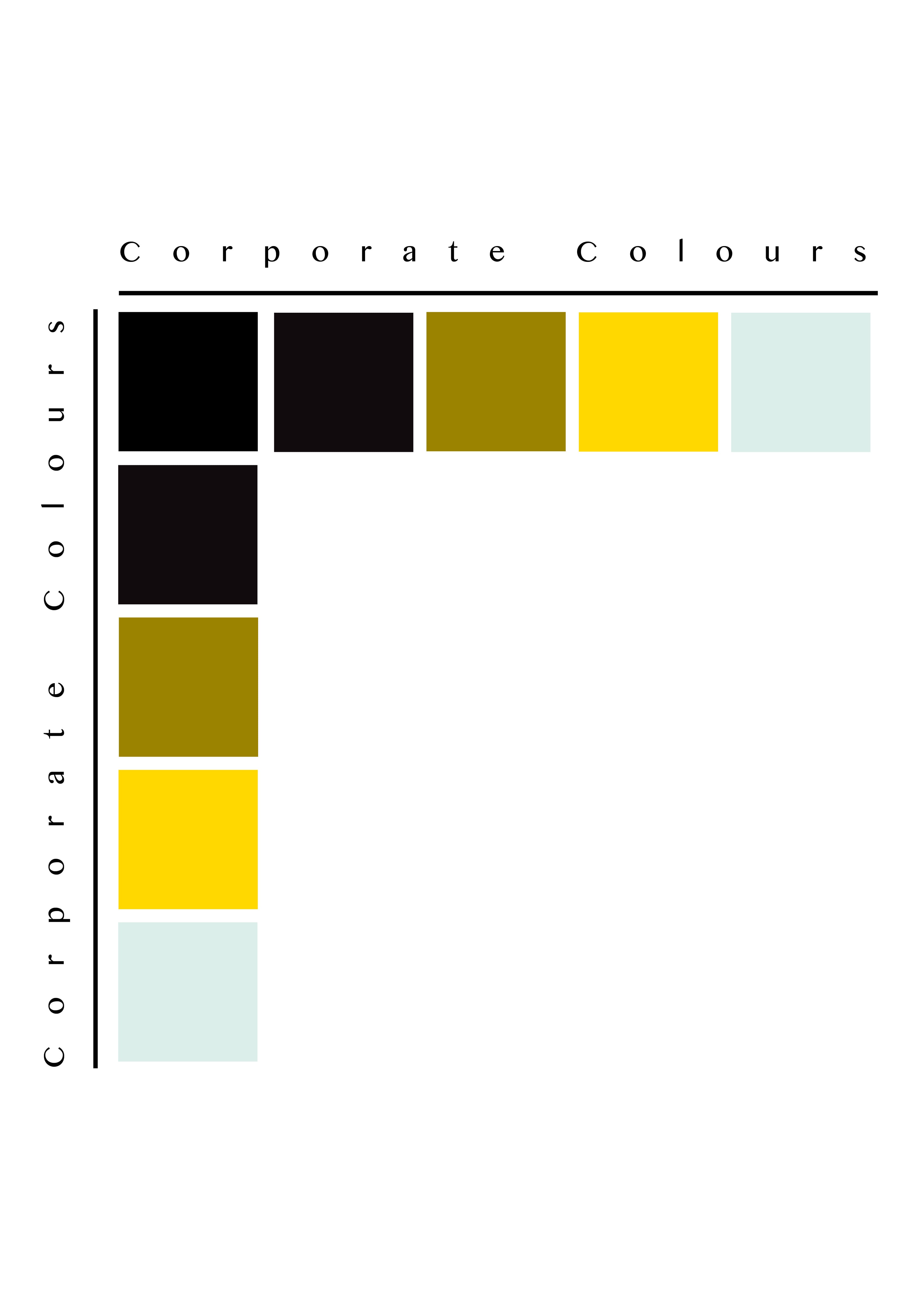
I wanted to maintain the same style of branding that was in the brand guidelines for the Enganche company itself. So I kept the same style of a gold-foil logo cover. The smallness emphasises the company’s mysterious investment nature. The back cover looks very similar to the business card but more spread out. The amount of white space works effectively here. The ‘About This Brochure’ is surrounded by a box that is a more recent style of design that has caught on. The pattern works effectively here in cohesion with the typeface.
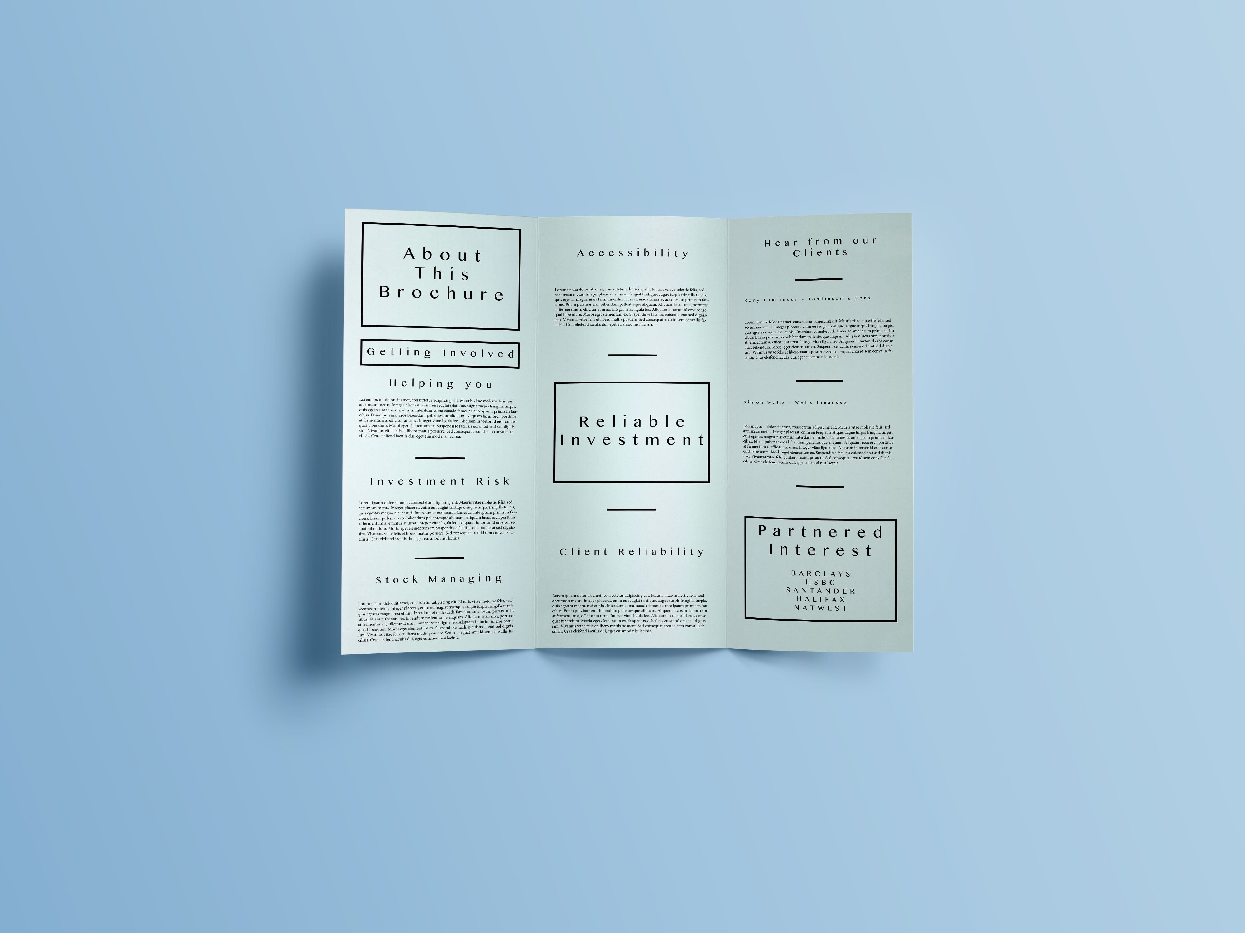
inside

Inside of Brochure

I then chose to continue this box design on the inside of the brochure by highlighting key areas of the Enganche company. The layout is quite modernised suiting the style of branding I was aiming for. I then choose to use a variety of headers combined with lorem ipsum to form the contents of the brochure. E.g.

  • Investment Risk
  • Stock Managing

Overall, I think the brochure is most effective in conveying the information that it needs to. Although it could be seen as a bland design it suits the brand identity of the company and should be seen in such a way. It looks exclusive and secretive which is implied through the Enganche logo and colour palette which has been maintained throughout all of the projects for this design brief.

Stationary Design

Using a PSD Mockup I found I chose to design a series of stationary that would match the Enganche branding:

Branding Mockup

Branding Mockup

Creating a range of stationary allowed me to see the Enganche logo across a variety of mediums and check its effectiveness. I am quite pleased with the outcome of this output. The strongest area being the foil-texture that appears on the branding. It is both mysterious and elitist in its appeal which suits the direction of the target audience.

Perhaps more care could have been paid to the layout of the letterhead and the folded letterhead to include this foil-design. However, I am pleased with the business card and how the two main palette colours compliment each other.

Branding Overhaul

Following feedback from in-class discussions I decided to head in a different direction with the branding of Enganche and what I felt was suitable to the brief. Enganche are a mysterious investment group and this needed to be presented in the brand guidelines.

Feedback from my logo pointed towards a redesign of my preferred design. People preferred the top-left design as a basis for elaboration and it looked mysterious and had a keyhole design. Almost as if you were unlocking something.

Variations of Logo Design

Variations of Logo Design

As a result I chose a traditional design with serifs that connected the two letters together. The front of the brand guidelines was redesigned to be completely black and have a foil-like logo. To show this effect on Photoshop/inDesign I chose to layer a gold foil over the letters. Although it is not easy to see it is effective in suiting the specifications of the brief.

Brand guidelines redesign

Brand guidelines redesign

The main idea behind this design is to apply minimalistic features to the page. The corporate philosophy does not dominate the page and it also remains the sole focus with white space to support the minimalistic approach.

Proposed Brand Guidelines

engancheguidelines2engancheguidelines22engancheguidelines23engancheguidelines24

engancheguidelines25engancheguidelines26

At this point I would like to change the colour palette to be more suitable however the light-paper like texture is effective.  

Final Colour Palette

Final Colour Palette

I decided my final colour palette would be made of four colours, for a minimalistic effect. The strong use of mysterious and financial colours compliment each other to create the brand identity for Enganche.


Guidelines Research

Designing a portfolio of company guidelines will be a unique design element that needs to be tackled for Enganche. The reason why I chose to specifically look at guidelines was because the guidelines didn’t necessarily need to be formulaic but I could freely design something that otherwise would be ignored.

Screen Shot 2016-02-09 at 15.39.24

The first guidelines I looked at explored the typography that must be employed in the company for design of documents, etc. The typefaces on the page are contrasted against the dark background and vary depending on the weight of the type.

Screen Shot 2016-02-09 at 15.43.12

design.inc Brand Guidelines


InitialTestDesign

InitialTestDesign


For inspiration of my first design I produced a similar set of guidelines to design.inc. What I have yet to introduce is colour to the design. However, this is entirely dependent on the progress of my logo design and whether my colour palette extends past black/white. I have tested both the reverse logotypes on a black/white background and it looks successful in design. The layout of the page needs some development to become more unique. At the moment there is little emphasis on corporate ideology and the brand package makes little to no comparison.

At this point the corporate typography is dominating the page and could be made smaller in order to fit more onto the page, or to emphasise white space in this design. From here, I will continue to work on both layout and colour implication.

[Update]

engancheguidelines2 engancheguidelines22 engancheguidelines23


These set of designs are a step up from my initial test design but i would like to rebrand Enganche in the near future.

Layout Research

In order to design a brochure or set of stationary documents I needed to produce some research into existing examples of layout to decide what is suitable for the corporate package Enganche needs.

www.stocklayouts.com

www.stocklayouts.com

The first example that stood out to me was from stocklayouts.com. The design is business-oriented and what stood out was the images on the page. The images are impactful but not so much that they dominate the page. As a mysterious, investment group, I need to make sure the images are both serious and impactful in a layout.

Screen Shot 2016-02-09 at 15.14.12


What made this design interesting was the positive upset of balance on the page that actually created balance. No one column is similar in style, but the balance of text and images on the page creates an irregular harmony. As a magazine article the page bares little white space. However, I would like to emphasise white space in my brochure/stationary for the specific reason of targeting specific parts of text.

Screen Shot 2016-02-09 at 15.21.16

Despite not being business-oriented, the style of this magazine is modern and unique. It is unique because of the dominance of the right hand image and the imposing white space on the left hand side of the page. Larger, bolder typeface drags the attention of the reader to that area. Despite being rotated vertically it is still legible. However, I feel this design cannot be used as a basis for Enganche as there is too much white space and too little information.

Screen Shot 2016-02-09 at 15.25.05

What drew me to this design was the varying amount of space and colour used in this collection of images. The yellow blocks are dominating, but also present a tranquil atmosphere. The use of simply white and yellow are harmonic. The amount of variety in these designs is something I could consider for my design of the Enganche brochure/stationary layout.