The development of my second idea came after seeing the logo for the hip hop crew Just Music. Their logo uses subtle and protruding lines to create what appears to be similar to scales. Through this they’ve tried to emphasise balance as well as disorder creating a contrast depending on how you view their music.
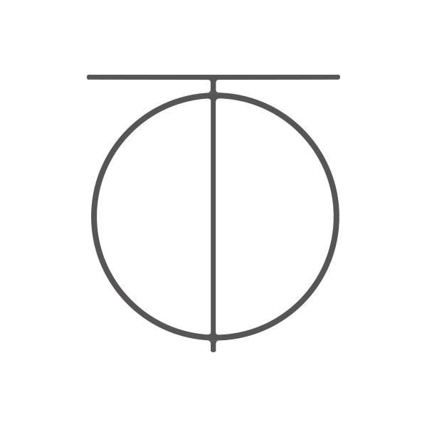
The way the lines exit the circle inspired me to create a type that incorporated circles and protruding lines. The result was the intersect typeface:
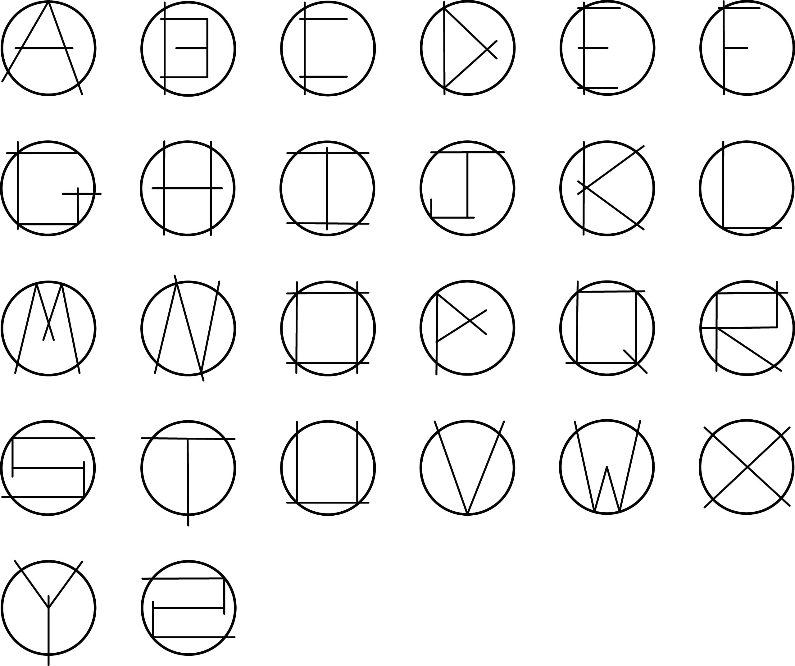
This is an improvement from the first type I made because each individual letter is identifiable. I chose to round the edges to create more flow to the way the lines moved. When I used rough edges the lines look out of place.