Second Brief Discussions

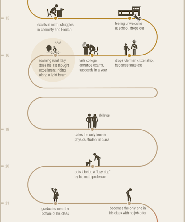
Upon learning the details of the second brief, ‘Einstein and the Theory of Relativity’, I decided to do some research into the topic and look at already existing infographics relating to this theory. The resulting research was intricate and detailed to an extent where it did not look simplistic enough. It made me question how young people would be able to understand this theory if I could not understand it myself. How many other people were in my position? The already existing infographics were plain and did nothing to further my knowledge of relativity. That’s when I started looking into Einstein as a person. Infographics about his life were frequent and look generally better and more interesting to read, but what made them different from one another?

I had to make a list of the things I could do to design a set of infographics that would engage audiences.

  • Target Audience would be young people (9-13 year olds) without an understanding of Einstein and the Theory of Relativity.
  • How could I make my infographics stand out from the rest?
  • What aspects of Einstein as a person had not been explored?

2.jpg header.jpg tumblr_kwrq9sTKDz1qz7z7io1_1280


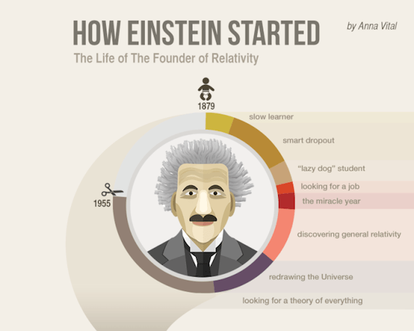
All of the existing Einstein’s infographics shared a common feature. The use of green, pastel colours were prominent in all designs.This allows diagrams and writings to be more impactful to the reader. These colours are also more calm and inviting rather than be in your face. These infographics look more targeted to a mature individual as children would rather have these explosive colours to attract their attention. As I am designing for young teenagers I would like to mix and match ideas between the two to create something captivating as well as informative at the same time.

[UPDATE]

After doing research into sensible typefaces to use I came across a presentation that showed the trendiest font combinations of 2015 (http://www.slideshare.net/adamnoar/presentation-panda-2015-font-trends/).
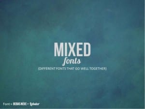
2015-font-trends-for-presentations-11-638

There were:

  • Handwritten fonts that mimicked the look of handwriting.
  • Flat fonts that complimented flat design.
  • Mixed fonts that go well together.
  • Hipster fonts with a contemporary feel.
  • Bold fonts that demand attention.

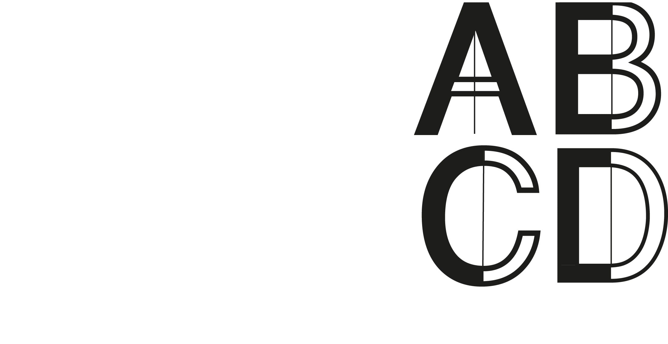
I chose to use Bebas Neue because it was in fact a bold font that demanded attention and would be powerful for headings. I then chose to use Lobster for subheadings because of its fluidity and the way it mimicked handwriting would create a complimentary contrast. For the body of texts I chose the typeface Aleo because it had a neutral impact that felt like it could portray information legibly to children. I feel like this combination is well aimed at my target audience of 9-13 year olds.

[UPDATE]

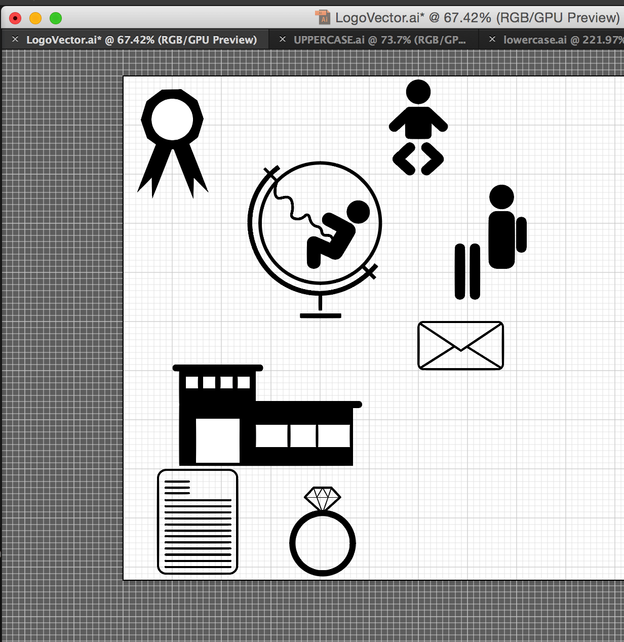
After the discovery of The Noun Project I decided to opt for vector-type graphics because the simplicity of these designs would appeal to children and would be easily identifiable. The Noun Project provided the perfect template for me to develop my ideas and create my own types of vectors to be used in my designs.

Screen Shot 2015-12-10 at 03.52.19


Creation of the Einstein Caricature

noun_213812_cc

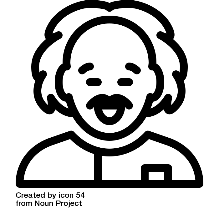
Using this existing icon vector sourced from Noun Project. I developed at a similar yet different idea for my Einstein. In order to do so I made him look cuter with squinted ideas and crazier hair to appeal to my target audience.

Screen Shot 2015-12-11 at 03.15.31

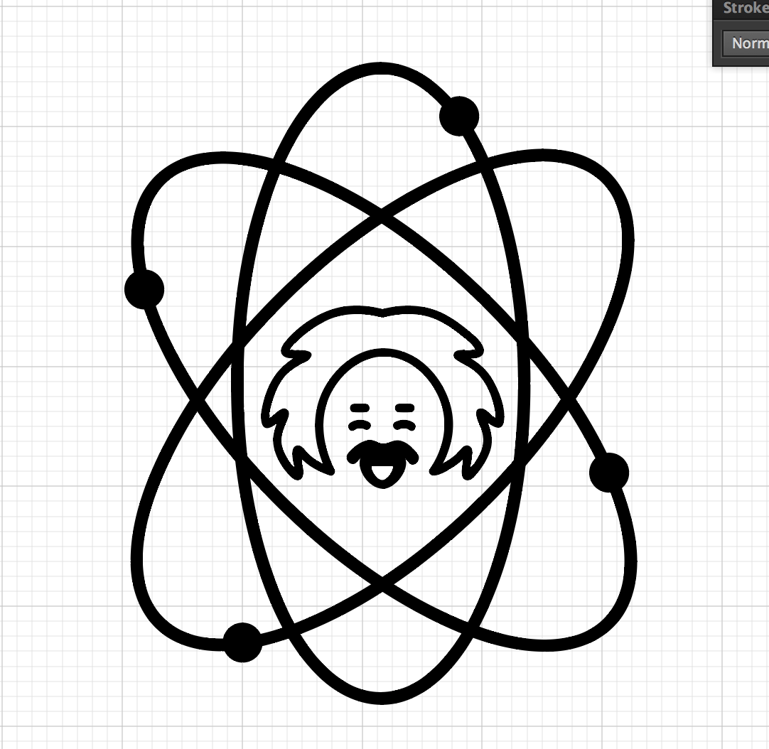
As a centrepiece for my designs and logos I included the symbol for atoms and electrons with Einstein in the middle. These would provide a basis for my designs to take shape.

Final Typeface Design Development #1

My final typeface design was an expansion of the Korean flag research and development that I looked into. Originally I had developed multiple designs that looked into using blocks and slants to create a typeface.

FinaltypeUPPER

I really liked how in one of my original designs the smaller stroked lines connected the blocks to form letters. Therefore I chose to develop how these looked with all the uppercase letters. The individuals letters are strong on their own but as a group are much stronger. The typeface looks very cybernetic in appearance and looks somewhat like a flowchart.

The difficulty in the development of this type was the consistency of the letters. The blocks had to be expanded multiple ways to accompany for the different shapes and sizes. Some of the letters were simply inverted like the ‘M’ and ‘W’. Only the letter Y changes different of the slant whereas all the other letters lean to the right. I made this decision to distinguish the X from the Y.

lowercaseI then began to develop the lowercase letters. These proved more difficult than uppercase letters because of the curves. Some letters like ‘m, n and w’ were scaled down to size to maintain consistency in pattern and legibility.

These letters began to look more and more corporate through development. Therefore I will try to combine these letters with a company to create a logo and then do a mockup for this.

Idea #8 & #9 – Mapping Out & Helvetica Contrast

In the workshop we had the opportunity to pin our work to the wall then photograph it before scanning it in with the new texture. This gave me the idea to use a map and mark out various cities and locations to create a typeface.

IMG_1891

Originally I had planned to go through capital cities only, however this proved difficult with the way the a’s were leaning. I quite like the concept behind this however there was not much contrast between the string and the locations on the map. If I was to continue with this idea I would find a better room to do photograph this in because of the poor lighting.

lm


The image on the right was the start of another typeface where I had manipulated Helvetica. I wanted to present a strong black/white contrast whilst adding something to the design to literally divide it.


Idea’s #5,6,7 – Artificial World

Idea #5

I was very interested in using the natural world to create a typeface because of what nature can produce. Then I decided, what if I artificially manufactured something to look like it was produced naturally thereby creating a contrast.

Originally I had wanted to use water however this proved to be difficult because of the environment and how to actually use water. I then decided to use the sky as a backdrop and use cotton wool to artificially reproduce clouds in the way I wanted/creating ‘A’ and ‘a’.

IMG_1902

I collected an empty picture frame as I thought I could use this to balance the wool so that I could create the transparency.

The result was a natural looking formation of typeface in the shape of clouds:

IMG_1911

Fortunately, the weather was viable enough to have a good formation of clouds for the backdrop. Out of the typeface ideas I had, this was by far my favourite to create. It wasn’t easy doing this by myself, but I am pleased with the end product.

Idea #6

This idea stemmed from using the natural world but rather using spray paint and another backdrop. I knew I wanted the use the frame again where I could look over the city but also create the free flow of spray paint.

IMG_1918

The issue with this idea was that I would not be able to create a whole typeface because I only had one frame and once the paint had dried it would not come off. The second issue with this idea was that the ‘a’ did not look right. It had two separate flicks coming off and lines overlapped due to human error. However, I did like the way the paint dripped down. I perhaps would of used a different backdrop. One that would show the grittiness of a city and this would accompany the spray paint.

Idea #7

This idea came about completely by accident. I had been photographing the spray painted frame over the city and turned around to see the letters on the ground behind me:

IMG_1922

The flicks on the ‘a’ that appeared unnatural in the last idea were barely invisible in this photograph and it provided an interesting dynamic to the overall frame idea that I initially had.

Idea #4 – Basketball

Building on top of previous research I took a closer look at Korean band iKON and their associated logos. I then found a poster for their upcoming album tracklist. The designers for this preview had chosen a basketball orientated theme.

f35087ae57c1e0d1632799530aad9cf1

I liked the way the arrows and crosses moved fluidly between the individual tracks and thought this would be a good idea for a typeface. Therefore I set about using the crosses and arrows to develop a typeface for the letters ‘Aa’.

basketball

This idea proved to work very effectively. I had to make sure the curvature of the lines was not consistent so that it looked like it was drawn freehand. There could not be much exploration of the form of the letters due to fluidity and legibility therefore the typeface, should I choose to develop it, will look plain.