Front Cover Design

I was immediately taken by a design for a poster by DVARTWORKS. The design creates disorder on the planet through the separation of the circle that represents the Earth as a whole. The poster essentially is saying that without trees there is no earth.

saves trees. save earth - DVARTWORKS

saves trees. save earth – DVARTWORKS

Using a similar style of design I would like to take the standardised colour tests that feature numbers in a series of bubbles. I have separared the bubble and created disorder and I will use a placeholder image of the character of myself and overlay the two together:

Initial Book Cover

Initial Book Cover

At this point the text is a working title as well as the style of typeface. Depending on the kinds of images I choose to put on the front cover I may choose to have more geometric designs.

(UPDATE)

After the taking the photographic montage I redesigned the front cover to suit the style of the book.

Book Designs

To develop this even further I may choose to fracture the Ishihara test like the DVARTWORK picture. This would sort the fractured design layout that I would like to achieve in this book.

Awareness of Target Audience

Through research I discovered a promotional video for Colour Blind Awareness #1ineveryclassroom:

Rainbow Song - Colourblind Awareness

Rainbow Song – Colourblind Awareness

‘Cuddle the Cloud sings us the colours of the rainbow and we see how they look to him.’

An exclusive PDF by www.colourblindawareness.org uses the kind of language I want to replicate in my book. It relates to children and how ‘cool’ it can be.

‘Some cool aspects of colour blindness are that colour blind people can often see better in the dark and many colour blind people can spot friends and enemies if they are wearing camouflage!’

Screen Shot 2016-03-08 at 16.55.29

The document goes further to look into famous people who are colourblind. Most notably, Facebook CEO Mark Zuckerberg and Jamie Oliver, are both colourblind but hugely successful.


Constructing a Narrative

To develop the narrative of this book I looked into the dialogue used in non-fictional children’s books.

To create the narrative I looked into the key themes of this book. These being:

  • Colourblindness
  • Creativity
  • Engagement
  • Semi-sensitive issues

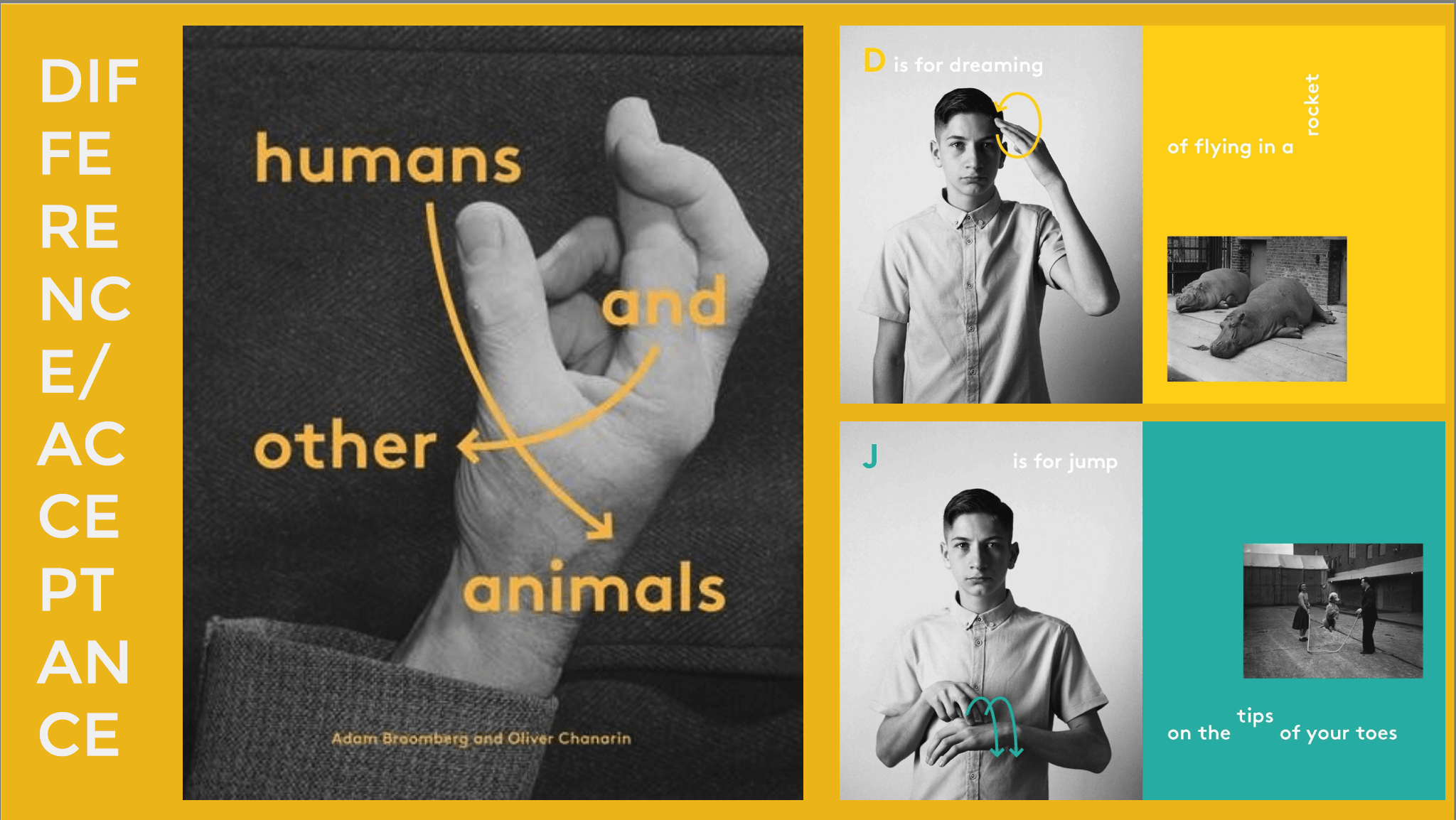
I’d consider the main area to focus on is creative engagement. I want to encourage children not to be limited by this minor disability but to use it to their advantage. To engage the children I will use pictures of myself in a comical way. Through this the children can feel like they are conversing with someone else who is colourblind. So the manner of the book is empathetic in a way.

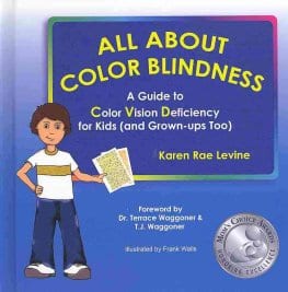
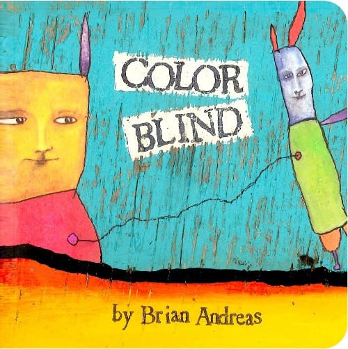
I have named the character of the book ‘Colourblind Karl’, a very simple, generic name. It is childlike in manner and therefore suits the theme of the book. A working title at the moment would be ‘My Life in Grey’ which is almost a satirical take at colourblindness whereby it is extremely rare to be completely colourblind. However, the title itself is witty and simple.

Using the key themes I started to develop a narrative within the book:

Page 1:-

This is Karl. Karl is colourblind.

Karl found out he was colourblind when he was 7.

Since then he has had trouble with reds, greens, purple and blues.

Karl often does design work that require colours.

How does Karl do his work without colours?

The first page works as a introduction to the character portrayed as well as laying down a foundation to critical engagement with the children. It is also not limiting towards encouraging children to take up art/design courses. The language is very simplified for the children and therefore suits the target audience.

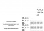
An immediate, almost hasty design on the first page would look like this:

book1

Above the white space on the left hand side will be an image introducing the character. The style of the typeface is a placeholder at the moment as well as the text on the right hand side. This design is heavily influenced by the branding for Cosmico, an amateur astronomy festival.
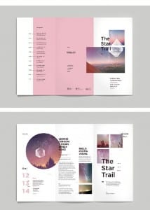
Cosmico Branding

Cosmico Branding

They use their shapes to create order but they are also disorderly placed on the page. This is intrinsically linked to the way that colourblindness is a disorder and I think this will be a suitable design format for engaging children in a creative way.


Children’s Book Research

The Contracts of Literacy

Without an initial burst of inspiration for a children’s book idea I was quite open to the breadth of research I could do.

To first decide the layout and direction that the book will be heading I referred to The Contracts of Literacy (Catherine Snow & Anat Ninio (1986). These rules explore how children make sense and understand books.

  1. Books are for reading, not manipulating (they’re not food or toys)
  2. The book is in control, the reader is led – like a jigsaw you must submit to the system that the book sets out in order to receive the intended results
  3. Pictures are not things, but are representative of things.
  4. Pictures are for naming – they illicit a response

 5. Pictures, though static, can represent events implied narrative and passage of time, for instance. Children do not automatically understand picture sequencing

6. Book events occur outside of the normal flow of time. i.e: you shut the book, open it again and things are where they were.

7. Books constitute an autonomous fictional world – the ‘reality’ of a book is not the same as our lived experience but may well contain like for like representations.

The biggest part of the contracts is the representational concepts explored. These being that pictures/images are representative of events and an implied narrative, as well as separating the reality of the content and the reader. So my use of pictures will be orientated this way.

Exploring Concepts

I was very drawn into the set of pictures below that were more photographic compared to typical children’s books that are illustrated. I will more than likely take a photographic approach due to a lack of illustrating skill. However, this would not hinder my design but advance it. Using photography I can move away from the norm of producing anthropomorphised animal content and focus on perhaps more pressing issues relating to the human being.

Screen Shot 2016-02-23 at 15.19.05


Especially when using photographs the key area of this book will be layout and the use of typography. So I need to utilise complimentary type and imagery to do this. A contrast in colours could potentially be a sensible idea depending on the content of my piece. The spread above focuses specifically on teaching sign language in a creative and distinct way. The instructions are clear and simple to the readers despite the obscure layout, which isn’t necessarily a bad thing. Similarly, I’d like to include a unique, obscure layout depending on the concept of the book.

Focal Point 

I’d be very interested in creating a book around colourblindness. Although not a hugely prominent issue like mentality and psychological disorders, I could produce a book that could potentially test for colourblindness as well as encouraging kids to harness this disability to enhance their creativity that goes against the norm.

All About Color Blindness – A Guide to Color Vision Deficiency for Kids (and grown-ups too!) (Karen Rae Levine, 2013)

9780988561519The first book cover I explored was a guide to colour vision deficiency aimed at children. The style of the book is basic and has a lack of creativity. However it does give me some idea towards a potential rainbow-like colour scheme that could be incorporated. The playful language directly suits the target audience as well as featuring a helpful character that the children can relate to.


(http://allaboutcolorblindness.com)

Screen Shot 2016-02-23 at 15.45.35


The book by Rae Levine is directly linked to the All About Color Blindness website. I was particularly drawn in by what the character is saying in the banner image. ‘Colour Vision Deficiency isn’t the end of the world. It’s just a different view of it!’ This is the message I will try to get across the in the book. Essentially teaching children how to use their colourblindness to enhance their creativity.

Colour Blind (Brian Andreas)

CBwebDet_1024x1024


This design was very unique in that it was colourful and did not directly have a clear message. The connecting line could represent the difficulty is assessing colours for colourblind people.

Target Audience

Although the book is intended for children I will focus moreso on an age range of 5-7 year olds. This is because of the time children can diagnosed with colourblindness. Therefore parents will be more likely to look for something to give their child that can allow them to focus on whatever the chosen concept will be.


Guidelines Research

Designing a portfolio of company guidelines will be a unique design element that needs to be tackled for Enganche. The reason why I chose to specifically look at guidelines was because the guidelines didn’t necessarily need to be formulaic but I could freely design something that otherwise would be ignored.

Screen Shot 2016-02-09 at 15.39.24

The first guidelines I looked at explored the typography that must be employed in the company for design of documents, etc. The typefaces on the page are contrasted against the dark background and vary depending on the weight of the type.

Screen Shot 2016-02-09 at 15.43.12

design.inc Brand Guidelines


InitialTestDesign

InitialTestDesign


For inspiration of my first design I produced a similar set of guidelines to design.inc. What I have yet to introduce is colour to the design. However, this is entirely dependent on the progress of my logo design and whether my colour palette extends past black/white. I have tested both the reverse logotypes on a black/white background and it looks successful in design. The layout of the page needs some development to become more unique. At the moment there is little emphasis on corporate ideology and the brand package makes little to no comparison.

At this point the corporate typography is dominating the page and could be made smaller in order to fit more onto the page, or to emphasise white space in this design. From here, I will continue to work on both layout and colour implication.

[Update]

engancheguidelines2 engancheguidelines22 engancheguidelines23


These set of designs are a step up from my initial test design but i would like to rebrand Enganche in the near future.