Final Typeface Design Development #2

With a few minor adjustments to the typeface I have developed the finished result is follows:

lowercase UPPERCASE

I refined the size of the letters and the positioning to make them all look equally spread out and of the same size. When applying this to a mockup I chose to title the typeface Cyber because of its cybernetic-like feel.

Subway_Metro_Screen_Mockup_1


I feel like my typeface would be aimed at corporations who specifically target technological development. The typeface is very futuristic and should be used in this way. This typeface would not be used in standard text based writing but rather for logo and poster design.

Final Typeface Design Development #1

My final typeface design was an expansion of the Korean flag research and development that I looked into. Originally I had developed multiple designs that looked into using blocks and slants to create a typeface.

FinaltypeUPPER

I really liked how in one of my original designs the smaller stroked lines connected the blocks to form letters. Therefore I chose to develop how these looked with all the uppercase letters. The individuals letters are strong on their own but as a group are much stronger. The typeface looks very cybernetic in appearance and looks somewhat like a flowchart.

The difficulty in the development of this type was the consistency of the letters. The blocks had to be expanded multiple ways to accompany for the different shapes and sizes. Some of the letters were simply inverted like the ‘M’ and ‘W’. Only the letter Y changes different of the slant whereas all the other letters lean to the right. I made this decision to distinguish the X from the Y.

lowercaseI then began to develop the lowercase letters. These proved more difficult than uppercase letters because of the curves. Some letters like ‘m, n and w’ were scaled down to size to maintain consistency in pattern and legibility.

These letters began to look more and more corporate through development. Therefore I will try to combine these letters with a company to create a logo and then do a mockup for this.

Idea #8 & #9 – Mapping Out & Helvetica Contrast

In the workshop we had the opportunity to pin our work to the wall then photograph it before scanning it in with the new texture. This gave me the idea to use a map and mark out various cities and locations to create a typeface.

IMG_1891

Originally I had planned to go through capital cities only, however this proved difficult with the way the a’s were leaning. I quite like the concept behind this however there was not much contrast between the string and the locations on the map. If I was to continue with this idea I would find a better room to do photograph this in because of the poor lighting.

lm


The image on the right was the start of another typeface where I had manipulated Helvetica. I wanted to present a strong black/white contrast whilst adding something to the design to literally divide it.


Idea’s #5,6,7 – Artificial World

Idea #5

I was very interested in using the natural world to create a typeface because of what nature can produce. Then I decided, what if I artificially manufactured something to look like it was produced naturally thereby creating a contrast.

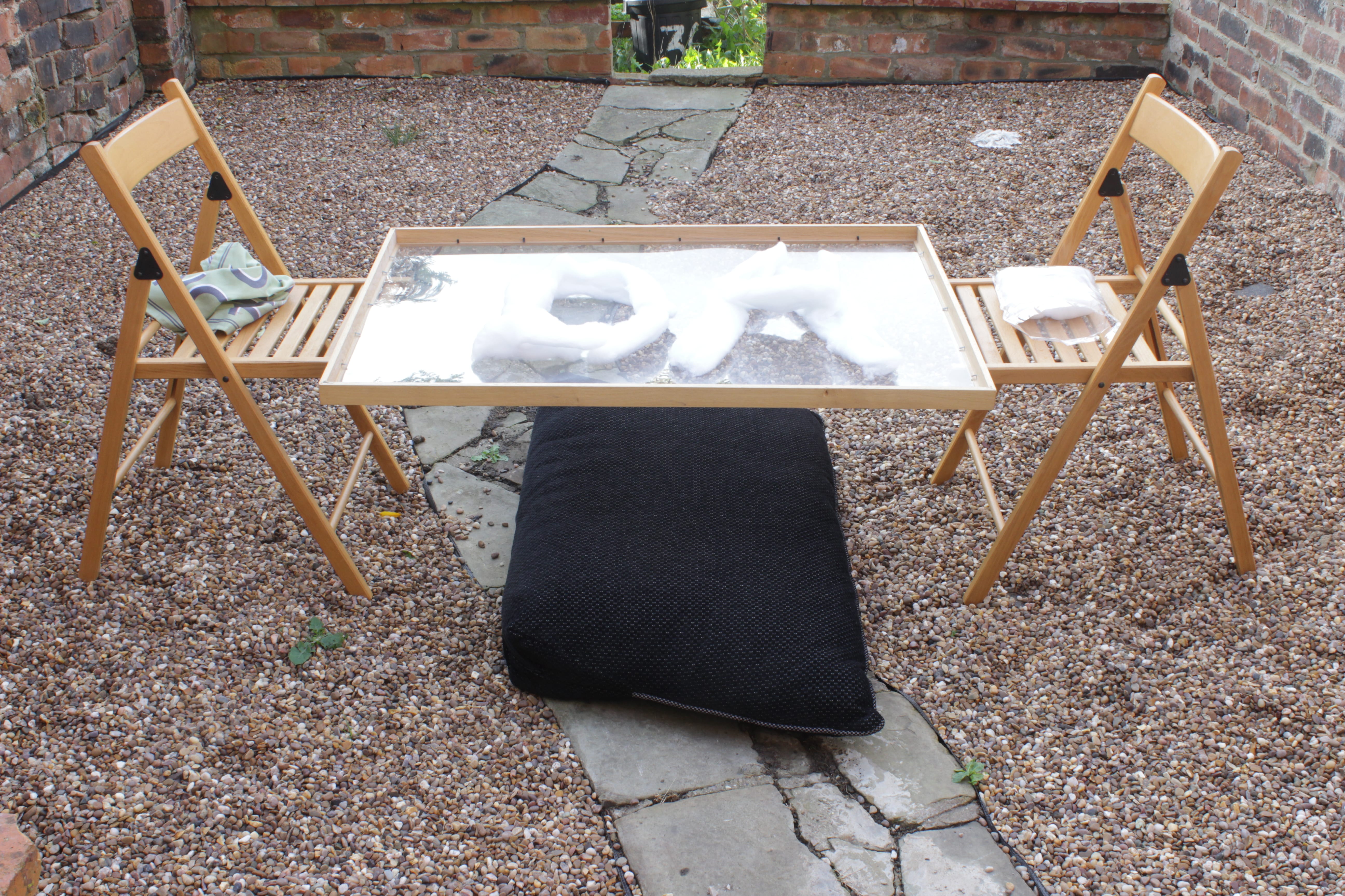
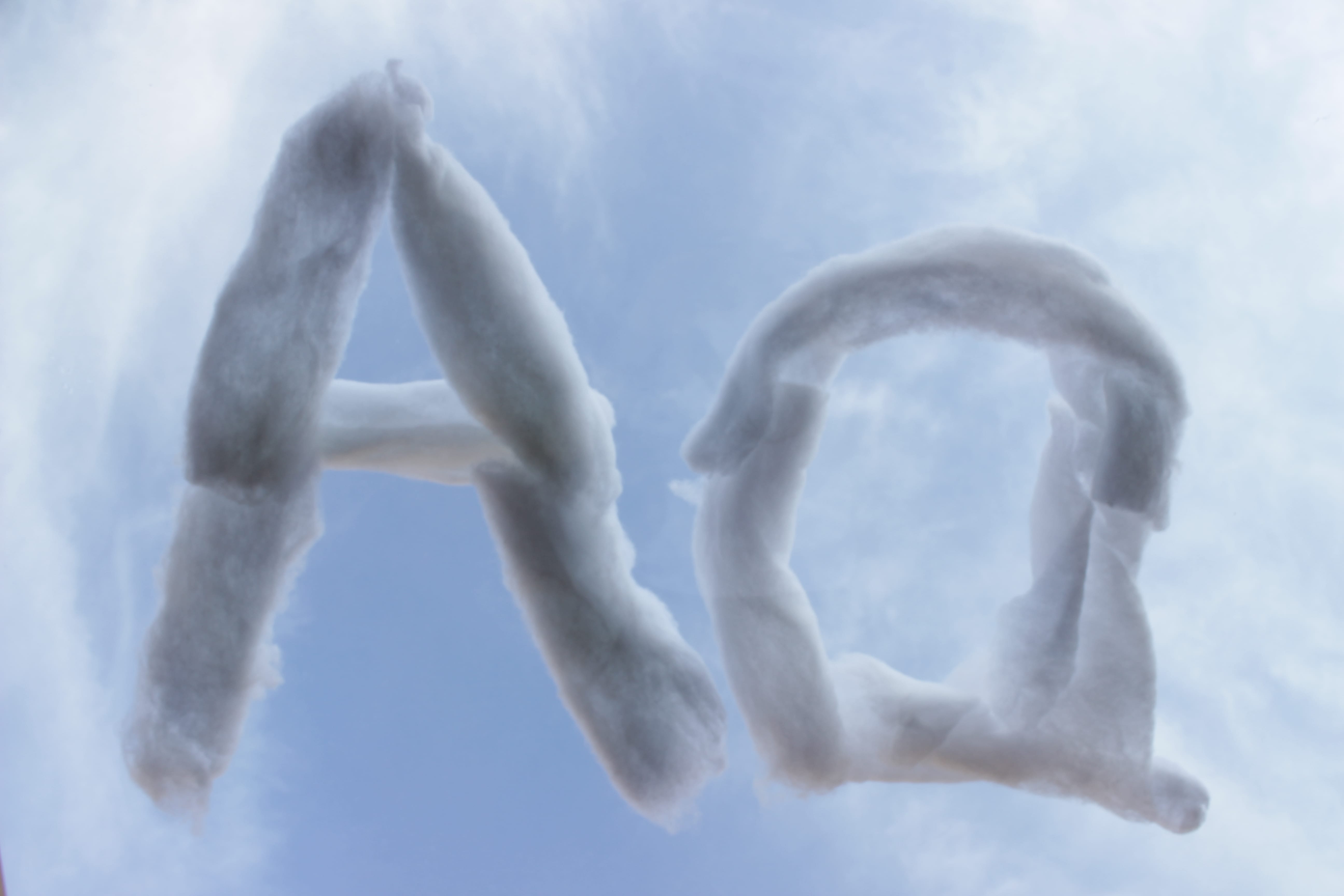
Originally I had wanted to use water however this proved to be difficult because of the environment and how to actually use water. I then decided to use the sky as a backdrop and use cotton wool to artificially reproduce clouds in the way I wanted/creating ‘A’ and ‘a’.

IMG_1902

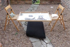
I collected an empty picture frame as I thought I could use this to balance the wool so that I could create the transparency.

The result was a natural looking formation of typeface in the shape of clouds:

IMG_1911

Fortunately, the weather was viable enough to have a good formation of clouds for the backdrop. Out of the typeface ideas I had, this was by far my favourite to create. It wasn’t easy doing this by myself, but I am pleased with the end product.
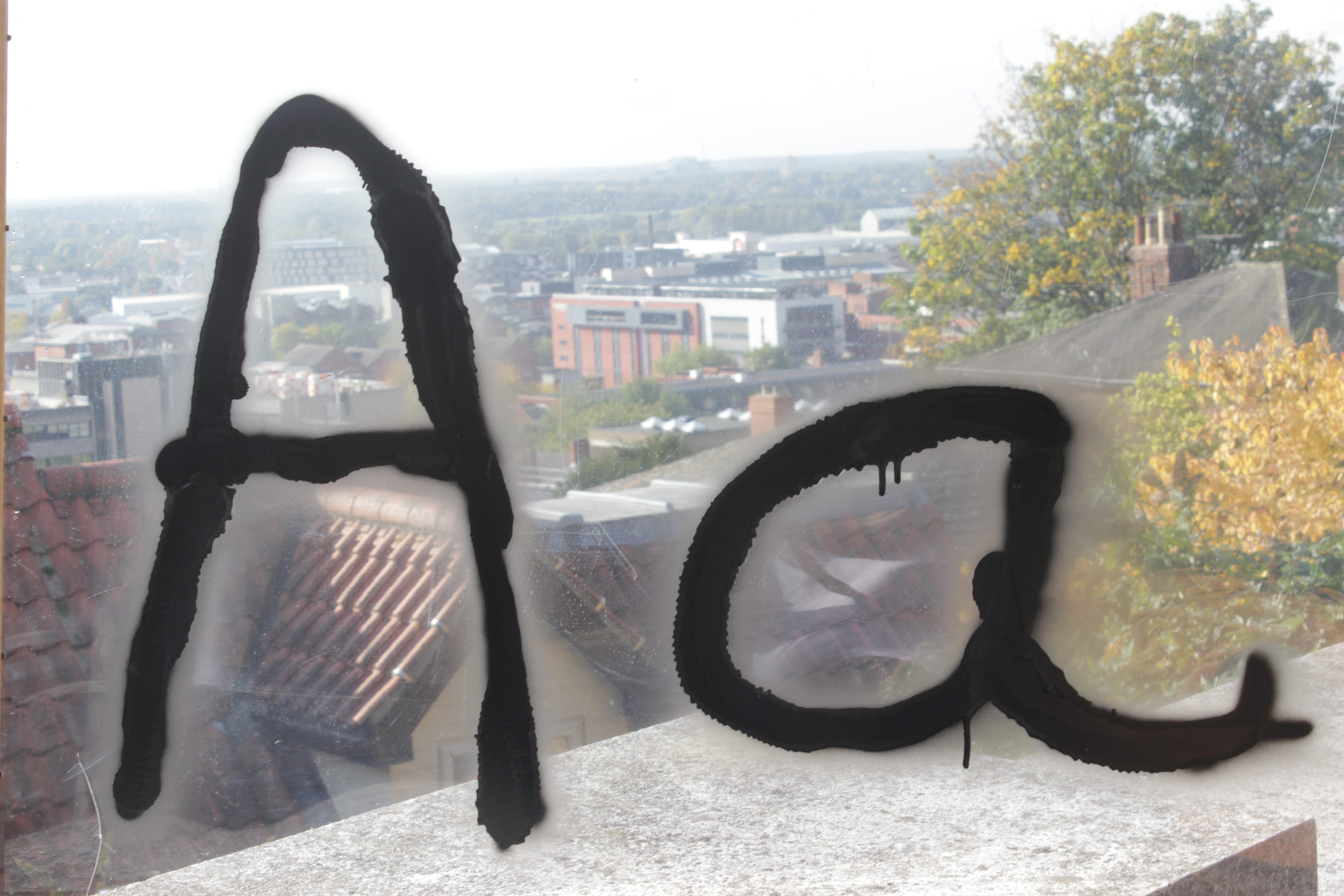
Idea #6

This idea stemmed from using the natural world but rather using spray paint and another backdrop. I knew I wanted the use the frame again where I could look over the city but also create the free flow of spray paint.

IMG_1918

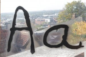
The issue with this idea was that I would not be able to create a whole typeface because I only had one frame and once the paint had dried it would not come off. The second issue with this idea was that the ‘a’ did not look right. It had two separate flicks coming off and lines overlapped due to human error. However, I did like the way the paint dripped down. I perhaps would of used a different backdrop. One that would show the grittiness of a city and this would accompany the spray paint.
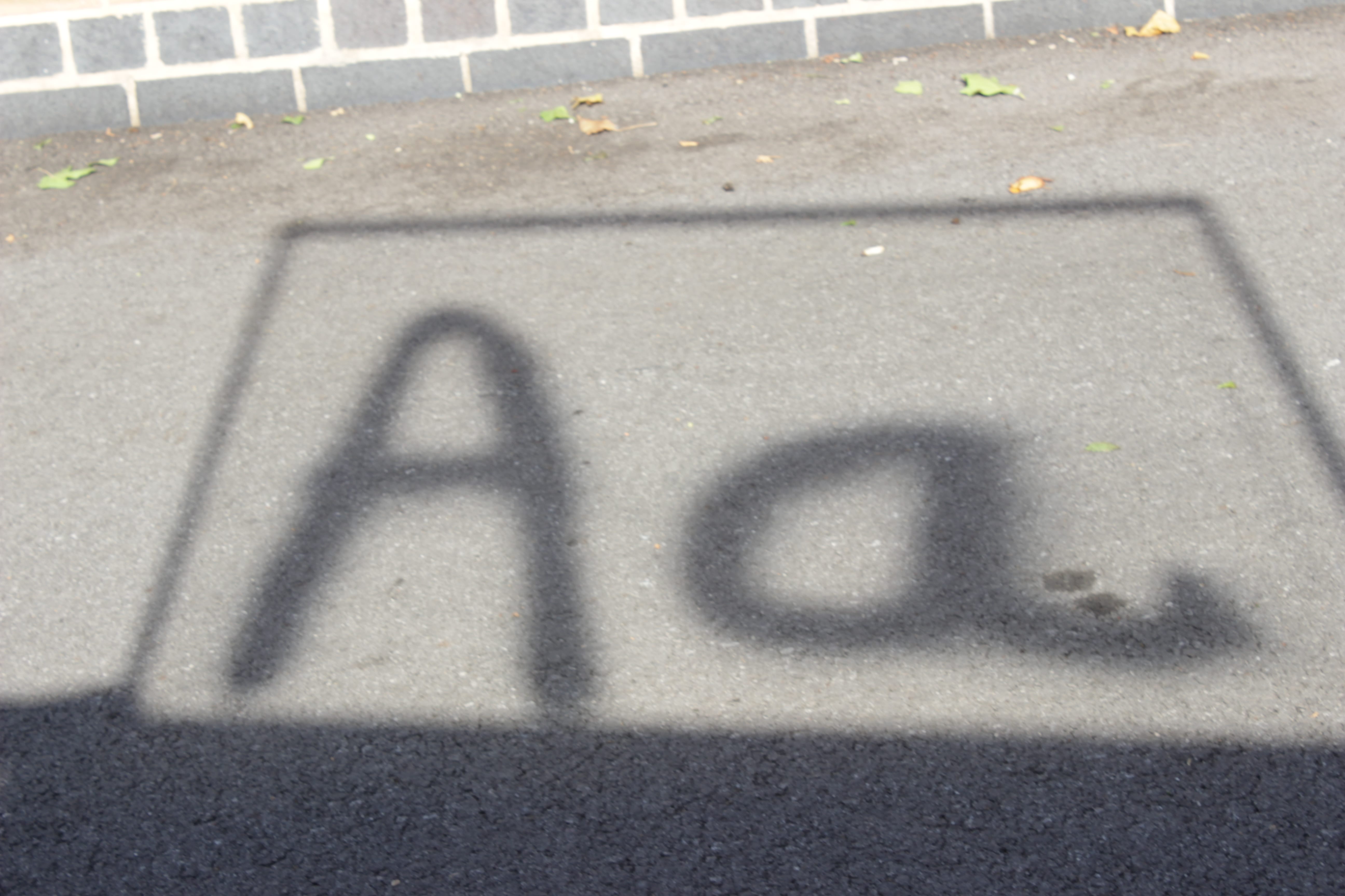
Idea #7

This idea came about completely by accident. I had been photographing the spray painted frame over the city and turned around to see the letters on the ground behind me:

IMG_1922

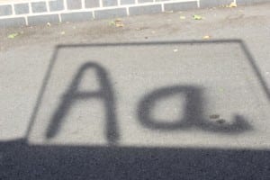
The flicks on the ‘a’ that appeared unnatural in the last idea were barely invisible in this photograph and it provided an interesting dynamic to the overall frame idea that I initially had.

Idea #4 – Basketball

Building on top of previous research I took a closer look at Korean band iKON and their associated logos. I then found a poster for their upcoming album tracklist. The designers for this preview had chosen a basketball orientated theme.

f35087ae57c1e0d1632799530aad9cf1

I liked the way the arrows and crosses moved fluidly between the individual tracks and thought this would be a good idea for a typeface. Therefore I set about using the crosses and arrows to develop a typeface for the letters ‘Aa’.

basketball

This idea proved to work very effectively. I had to make sure the curvature of the lines was not consistent so that it looked like it was drawn freehand. There could not be much exploration of the form of the letters due to fluidity and legibility therefore the typeface, should I choose to develop it, will look plain.