Upon learning of the ability to create an outline of type and being able to delete elements from a specific type I began to mess around deleting elements from the Helvetica typeface. The problem was maintaining the legibility of the letters so that they were still identifiable as say ‘A & a’.
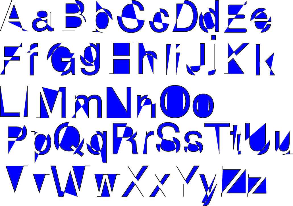 The black outlines allowed the letters to maintain some of their original shape. for instance the Z and H are particularly identifiable because of their outline. Some letters on their own would be harder to identify.

The second trial removed the black outlines in aid of the same colour and made the letters looks more formulaic without any black intersecting lines. Having one solid block colour made the letters have the ability to sustain themselves. Therefore the letters were still legible in their own right.