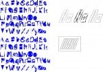
The first workshop introduced me to a practical exercise where we could walk around Lincoln discovering all sorts of found type. It was surprising to find that once you look around everything is designed for a reason. There is always a reason why that style of typeface has been used. The resulting type was collated:
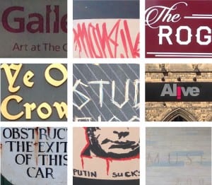
I chose to incorporate a range of styles so that direct comparisons could be made. Some were more modern whilst some had a Roman influence and style. Each fitted their purpose.
The sign reading ‘Do not obstruct the exit of this car’ is written in an almost threatening typeface that you would typically find in a Horror film or in a Haunted House. This allows the message to be clearly put across with a firm warning. It is archaic and the rust from the metal compliments the combination of the two.
The entrance to the Museum bears an etched in title similar to that of Roman-styled architecture which fits the theme of both Ancient History and the Roman occupation of Lincoln. Visitors are taken into the past without even stepping foot into the Museum.
In contrast to this the modern church Alive boasts a bold typeface that incorporates an upside down ‘i’ that forms an exclamation mark. This seeks to grab attention as well as aid in the modern feel the Church is trying to promote.
Following on from this the student discount sign is handmade in a rough, but artistic chalk typeface that boasts bright colours. The chalk style is reflective of education and links directly to students.
The Rogue Saint’s typeface flows freely reflecting the attitude of the bar.
‘Putin suck’s’ is both anti-establishment and provocative. Meant as a doodle it still comes across with a message, much like the way graffiti came sometimes carry messages of fighting against the system.
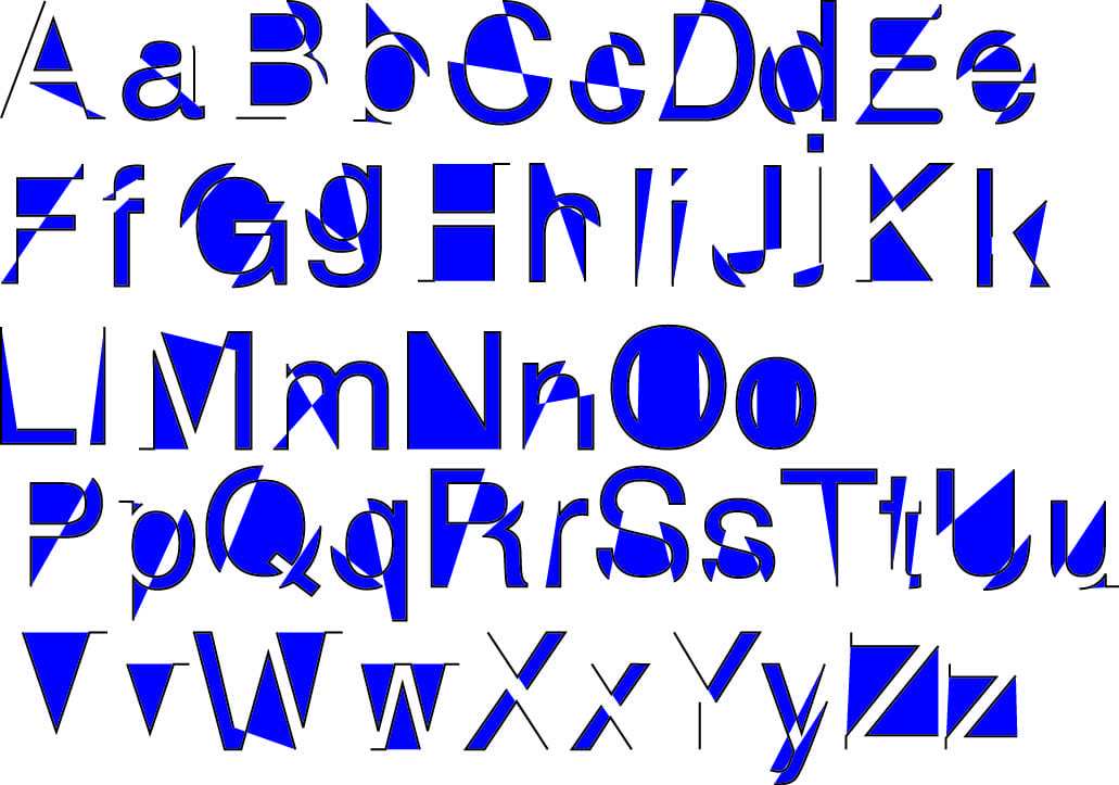 The black outlines allowed the letters to maintain some of their original shape. for instance the Z and H are particularly identifiable because of their outline. Some letters on their own would be harder to identify.