Layout Research

In order to design a brochure or set of stationary documents I needed to produce some research into existing examples of layout to decide what is suitable for the corporate package Enganche needs.

www.stocklayouts.com

www.stocklayouts.com

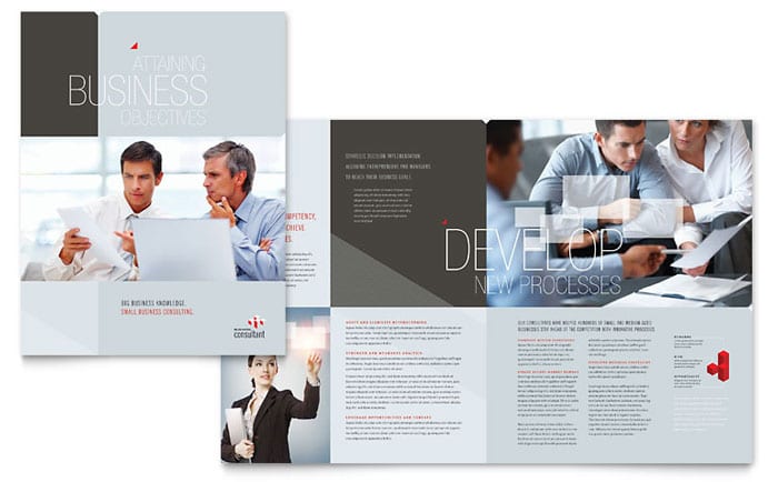
The first example that stood out to me was from stocklayouts.com. The design is business-oriented and what stood out was the images on the page. The images are impactful but not so much that they dominate the page. As a mysterious, investment group, I need to make sure the images are both serious and impactful in a layout.

Screen Shot 2016-02-09 at 15.14.12


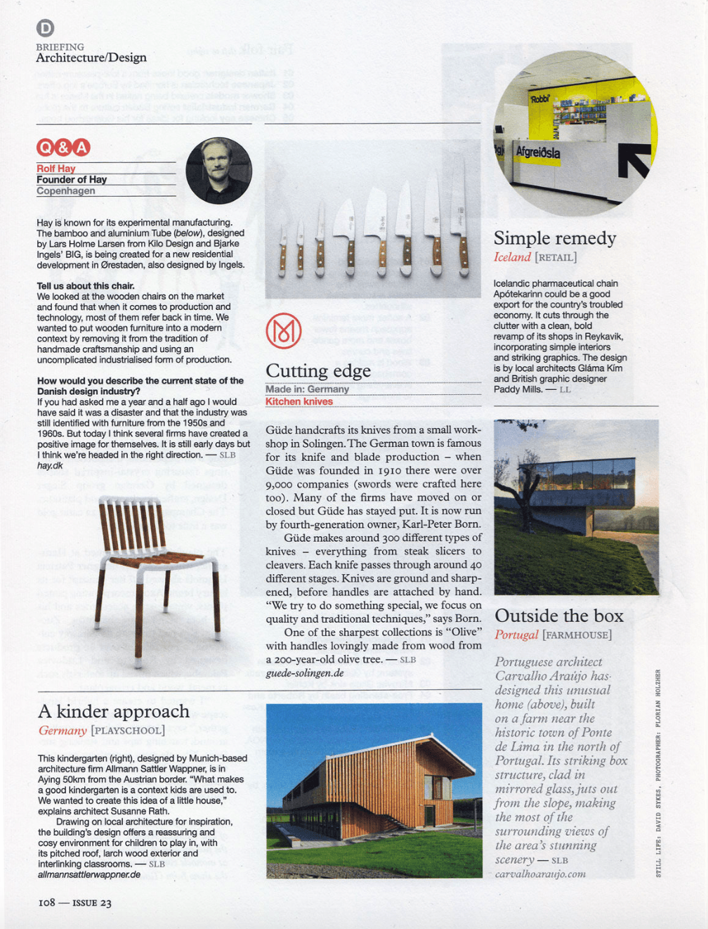
What made this design interesting was the positive upset of balance on the page that actually created balance. No one column is similar in style, but the balance of text and images on the page creates an irregular harmony. As a magazine article the page bares little white space. However, I would like to emphasise white space in my brochure/stationary for the specific reason of targeting specific parts of text.

Screen Shot 2016-02-09 at 15.21.16

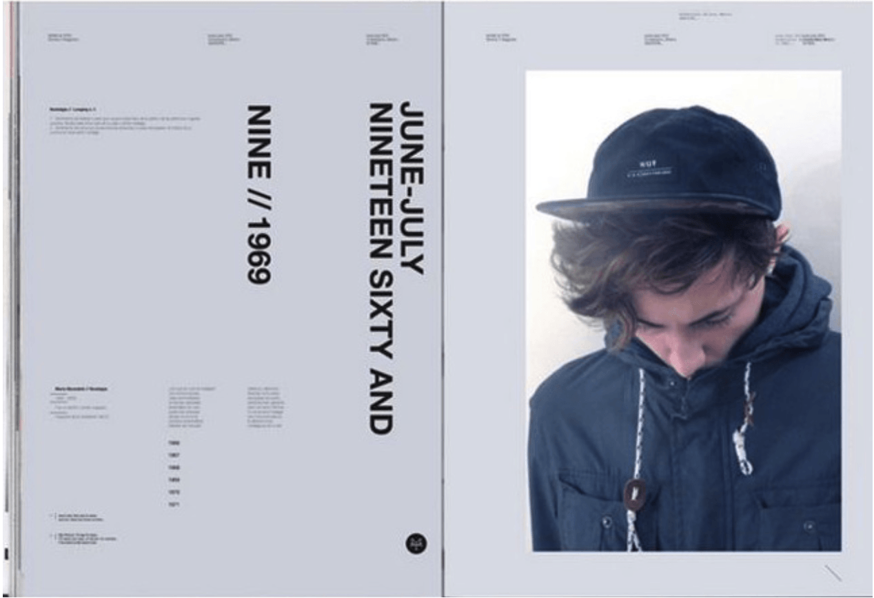
Despite not being business-oriented, the style of this magazine is modern and unique. It is unique because of the dominance of the right hand image and the imposing white space on the left hand side of the page. Larger, bolder typeface drags the attention of the reader to that area. Despite being rotated vertically it is still legible. However, I feel this design cannot be used as a basis for Enganche as there is too much white space and too little information.

Screen Shot 2016-02-09 at 15.25.05

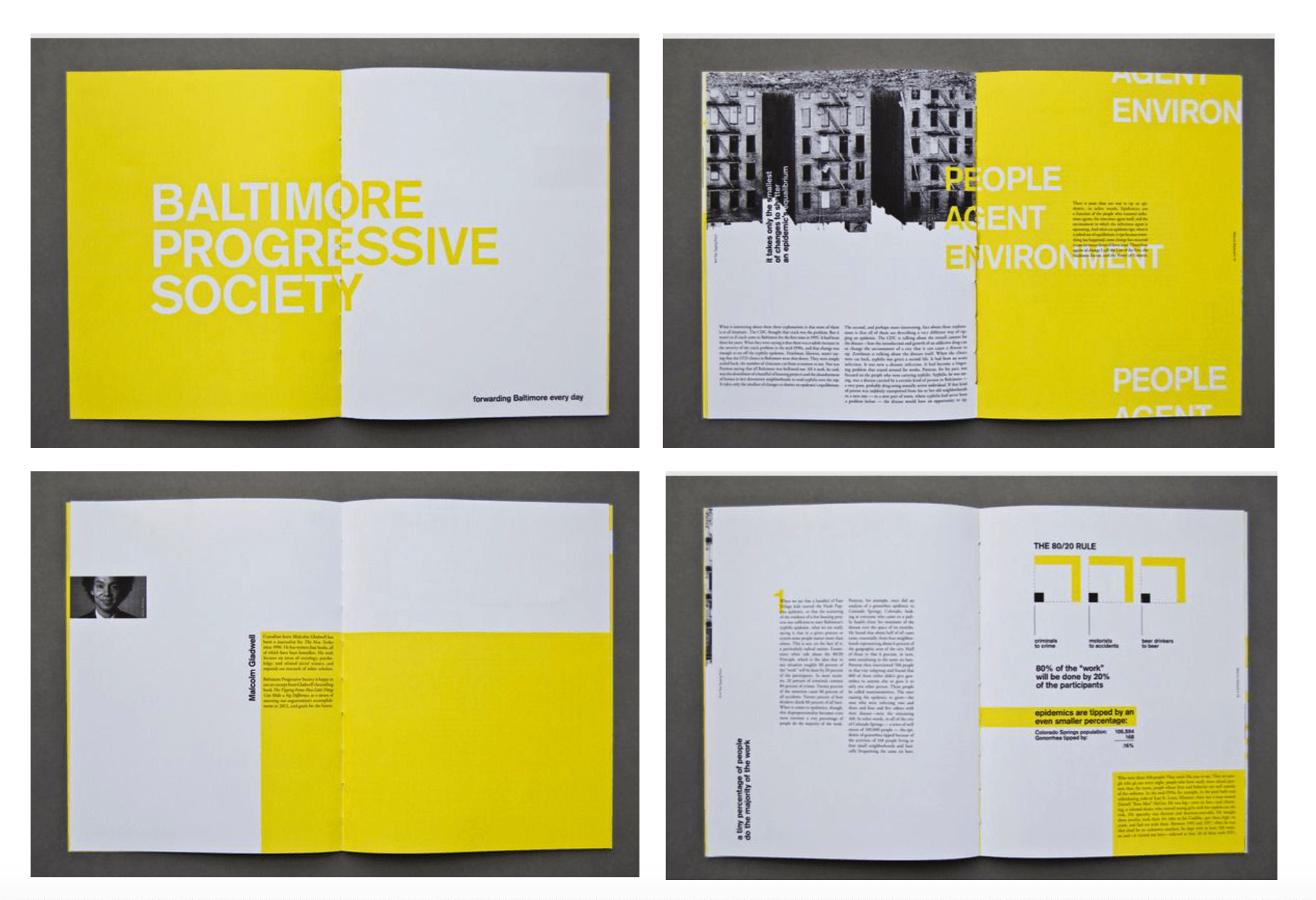
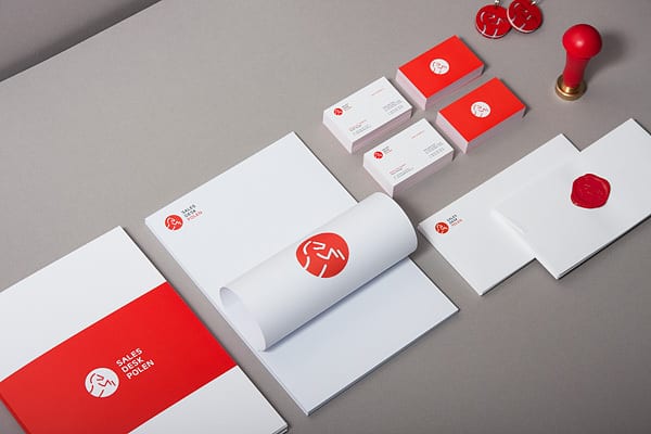
What drew me to this design was the varying amount of space and colour used in this collection of images. The yellow blocks are dominating, but also present a tranquil atmosphere. The use of simply white and yellow are harmonic. The amount of variety in these designs is something I could consider for my design of the Enganche brochure/stationary layout.

Creating a Corporate Logo #2 – Considering Colour

In my first set of designs for the company logo I chose to adopt a black and white approach to match the company’s ambiguity and mysteriousness. The problem with colour that anything eccentric could take away the company’s identity entirely. Certain colours would be useful at representing Enganche’s playmaking ideology.

Red, a typically powerful/energetic colour would represent their dominance in their chosen market whereas a combination is artistic colours would show their progression into the art and architecture side of the creative industry.

Using Adobe Color CC I chose a monochromatic and complementary approach in order to try and find some correlation with the ideology of the company.

Screen Shot 2016-02-02 at 15.34.40

Monochromatic


Complementary

Complementary

I will continue to focus on finding a suitable combination of colours that will reflect the company. These colours may eventually turn into the palette for the stationary set on top of this.

Stationary Development #1

staionary1

In order to start developing a suitable stationary set I decided to use the free branding/identity mockup website FusionPlate (http://www.fusionplate.com/3014/free-brandingidentity-stationery-psd-mockups/). I chose a retro minimalistic style of stationary in order to match the identity of the mysterious Enganche group. I immediately dove into combining two of my logos to blend them together. In some cases it is successful but mostly the combination is unbalanced and completely unnecessary. At this point my goal was to simply see if my logo(s) fit with the minimalistic concept. However, it seems that the logo needs more development to be suitable enough for this approach. Building on top of this I can start to look at the development of a style for the layout of the stationary.

Screen Shot 2016-02-09 at 15.32.37

Instead of using just the six elements in the original mockup, I would like to consider more than six elements and perhaps develop the use of colours. The letters will deliberately have a different layout, so that I am completely producing a set of ‘instructions’ for Enganche.

Creating a Corporate Logo #1

The development of Enganche’s logo will influence the final package for their business. The first idea I had was simplistic and took inspiration from the indie label ‘HIGHGRND’. The problem with this design was that it did not reflect anything about the company. It was simply the Enganche name.

enganche

My second design combined the separate letters of En and Ganche to create a blend of letters. The semiotics of this reflect the meaning of Enganche being playmakers, where they work together with the clients to generate results. I chose to do the logo in both a black and white/black circle logo to see which was more effective. The left letter looked ten times better without the circle.

enganche2

My third design suits the mysterious nature of Enganche as a group. The suit and tie shows sophistication whilst maintaining ambiguity.

enganche3

My fourth design was by far my favourite. The blocks next to the type show not only escalation and reaching new heights but also the company’s stability as a Venture Capital Group. I may choose to combine this design with the ambiguous suit and tie design but use the suit and tie design and the companies main logo.

enganche4

The final design for Enganche would be based around their intention to cover arts and architecture prizes therefore the pillars and serif typeface emphasise the archaic tone I’m trying to present in this logo. The pillars also represent stability much like the building blocks for the company in the previous design.

enganche5


[Update]

logo6

This logo has been created by combining two wireframe cubes to create a similar logo to the one above. Similarly the blocks show not only escalation and reaching new heights but also the company’s stability as a Venture Capital Group.

logo7

enganche8


Corporate Package Discussions

Who do ‘Enganche’ want to be?

Out of the available choices the one that stood out to me the most was the ‘Enganche Venture Capital Group’. After some initial research I learnt of the origin of the term Enganche and it is another name for a playmaker. So these businessmen are playmakers in the industry, which shows them as result-driven personalities. Therefore the branding has to suitable match their goals as a corporation.

They are described as a ‘riskier bank for the already wealthy’ but they do not describe themselves as aristocratic, so there is not a defined stereotype attached to them. Another key point of there description is that they are looking to branch out through sponsorship of major arts and architecture prizes. So they are a fairly modern style of company. Despite being business-orientated the branding needs to match their ambitions of branding out into the more creative industries.

The majority of Venture Capital Groups are conglomerate giants in the industry and their design is slick and presentable.

logo-acventures

Angel Capital Ventures

Foundation-Venture

Foundation Venture Capital Group

What should their corporate package look like?

What should a companies corporate identity look like? A blogging website PrintRunner produced an article that looks at 50 Inspiring Examples of Corporate Identity and Branding (http://blog.printrunner.com/2012/09/50-inspiring-examples-of-corporate-identity-and-branding/)

No one company uses a specific colour palette however the amount of colours are kept minimal. The majority of companies use similar types of packages that include business cards, letterheads and stationary. I would like to explore a Corporate Identity Package that would focus on the future of the company moreso than the present. This would include high profile presentations made at sponsorship events for art and architecture prizes. As well as extensive portfolios of design which would include a unique approach to their branding style. In order to match their intent of sponsoring the arts, their package should reflect the influence they could have in the arts sector as a venture capital group.

As a French term, there needs to be significant sophistication in the design of Enganche as well as being modern in design as it does not have a traditional brand identity.

Sales Desk Polen

Sales Desk Polen

I was very interested in the logo design of Sales Desk Polen with the use of vector images as well as the logo being suitable for use on both a white and coloured background. The bold red-white contrast provides for an impacting brand identity. It also provides for freedom of placement, whereby the company can put their logo on almost any kind of corporate packaging because of the simplistic viability of the design.

The majority of corporate packages are clean and functional. Naldz Graphics (http://naldzgraphics.net/design-2/11-reasons-why-white-spaces-are-good-in-graphic-design/) listed 11 reasons why white spaces are good in graphic design. The most notable I picked out were:

  • It signifies space for more creativity.
  • White Spaces Attracts the Eyes.
  • Used to Create a Balanced and Harmonious Layout.
  • Creates Professional, Sophisticated and Elegant Designs.

Given these points I will be likely to incorporate the use of white space in my designs in order to support the points above.

The main area I will focus on when designing my ideas is branching out to unique products to extend the branding. The Enganche Group are described as mysterious, therefore a mysterious approach is required to tackle their corporate branding.