To develop the narrative of this book I looked into the dialogue used in non-fictional children’s books.
To create the narrative I looked into the key themes of this book. These being:
- Colourblindness
- Creativity
- Engagement
- Semi-sensitive issues
I’d consider the main area to focus on is creative engagement. I want to encourage children not to be limited by this minor disability but to use it to their advantage. To engage the children I will use pictures of myself in a comical way. Through this the children can feel like they are conversing with someone else who is colourblind. So the manner of the book is empathetic in a way.
I have named the character of the book ‘Colourblind Karl’, a very simple, generic name. It is childlike in manner and therefore suits the theme of the book. A working title at the moment would be ‘My Life in Grey’ which is almost a satirical take at colourblindness whereby it is extremely rare to be completely colourblind. However, the title itself is witty and simple.
Using the key themes I started to develop a narrative within the book:
Page 1:-
This is Karl. Karl is colourblind.
Karl found out he was colourblind when he was 7.
Since then he has had trouble with reds, greens, purple and blues.
Karl often does design work that require colours.
How does Karl do his work without colours?
The first page works as a introduction to the character portrayed as well as laying down a foundation to critical engagement with the children. It is also not limiting towards encouraging children to take up art/design courses. The language is very simplified for the children and therefore suits the target audience.
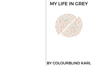
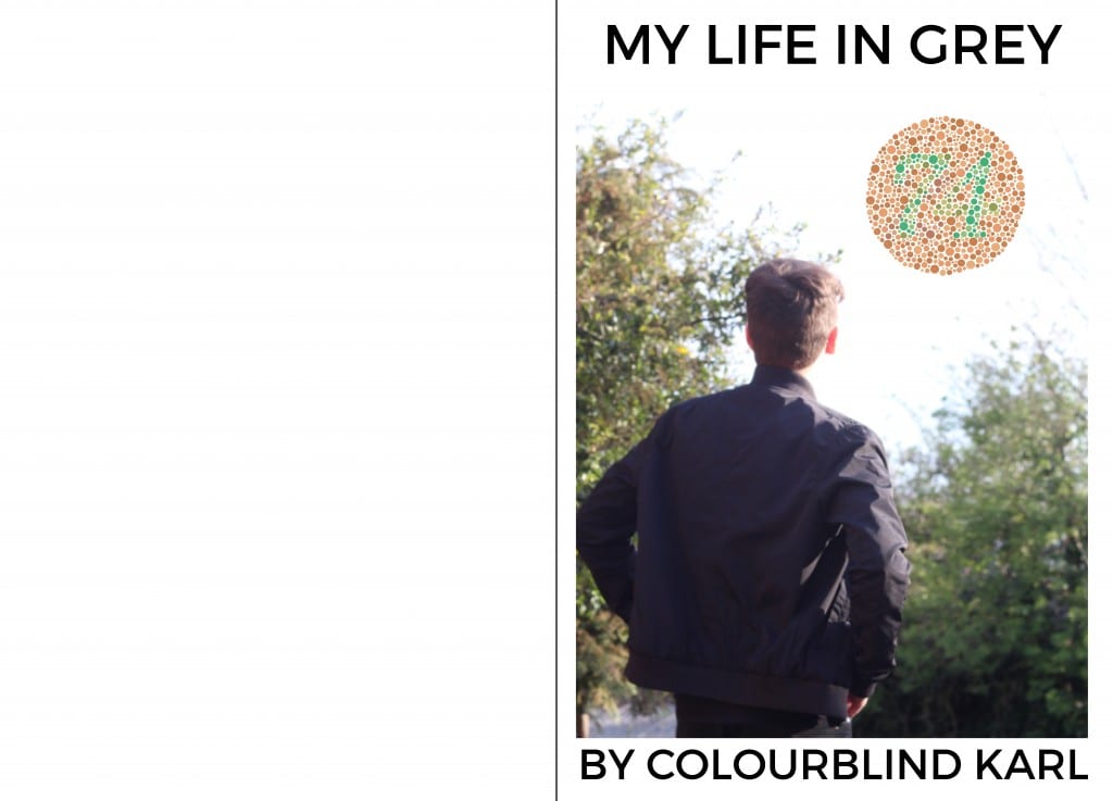
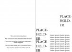
An immediate, almost hasty design on the first page would look like this:

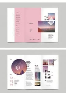
Above the white space on the left hand side will be an image introducing the character. The style of the typeface is a placeholder at the moment as well as the text on the right hand side. This design is heavily influenced by the branding for Cosmico, an amateur astronomy festival.

Cosmico Branding
They use their shapes to create order but they are also disorderly placed on the page. This is intrinsically linked to the way that colourblindness is a disorder and I think this will be a suitable design format for engaging children in a creative way.
