A Design Movement that emphasised cleanliness, readability and objectivity.
The fascination of this Design movement stems from the idea that Switzerland was a neutral country during the Second World War. So people would flock towards Switzerland looking to stay out of conflict. The result is the collaboration of designers. This particular movement is responsible for the simplicity of type today. The use of grids and sans-serif typefaces were formally introduced during this period.
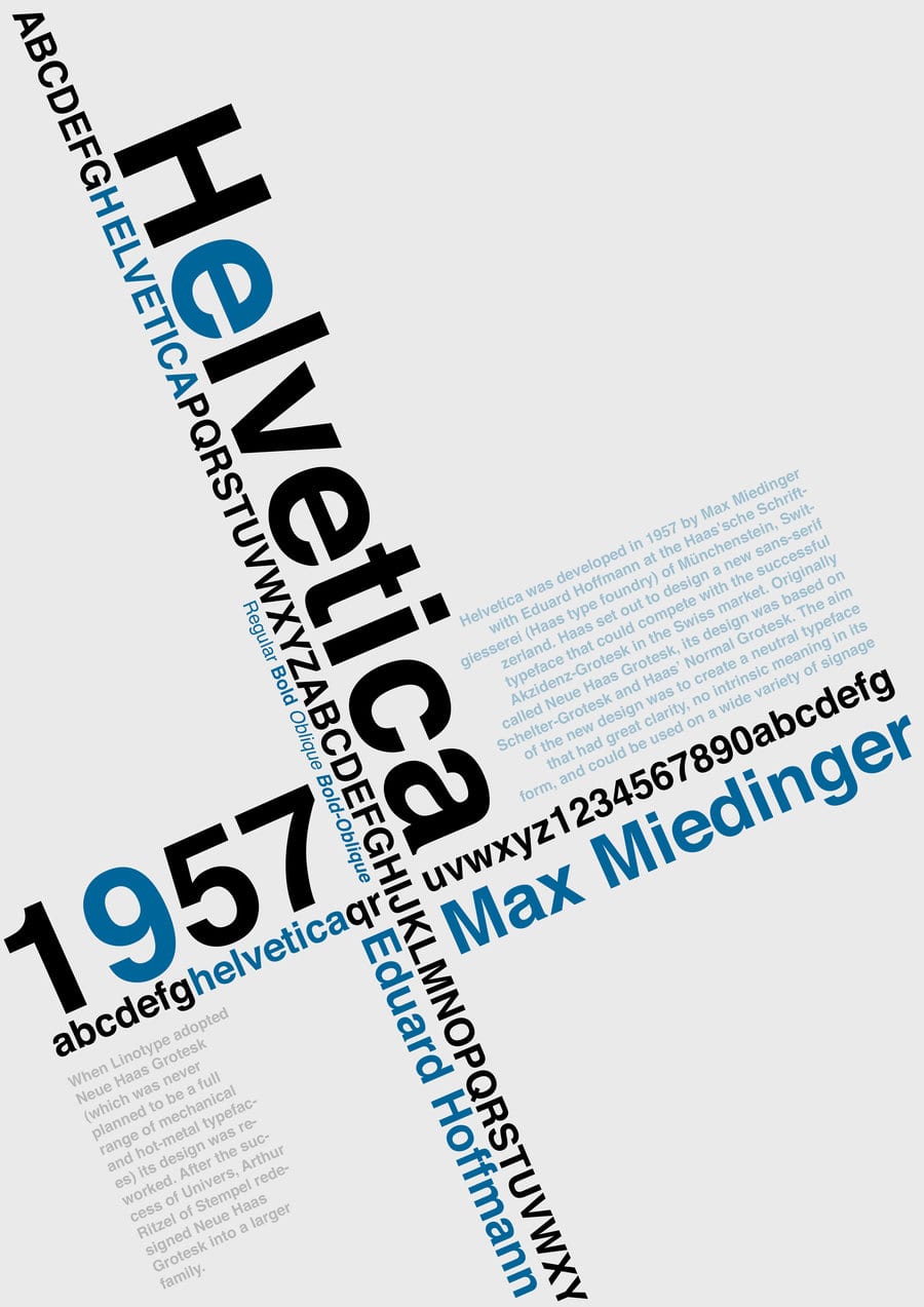
Two sans-serifs were introduced and used globally for their ease of readability
- Univers Family
- Helvetica
Helvetica is representative of how we view font today and use as to point us in directions, in logos etc. Purely because of the simplicity and legibility.