Designing a portfolio of company guidelines will be a unique design element that needs to be tackled for Enganche. The reason why I chose to specifically look at guidelines was because the guidelines didn’t necessarily need to be formulaic but I could freely design something that otherwise would be ignored.
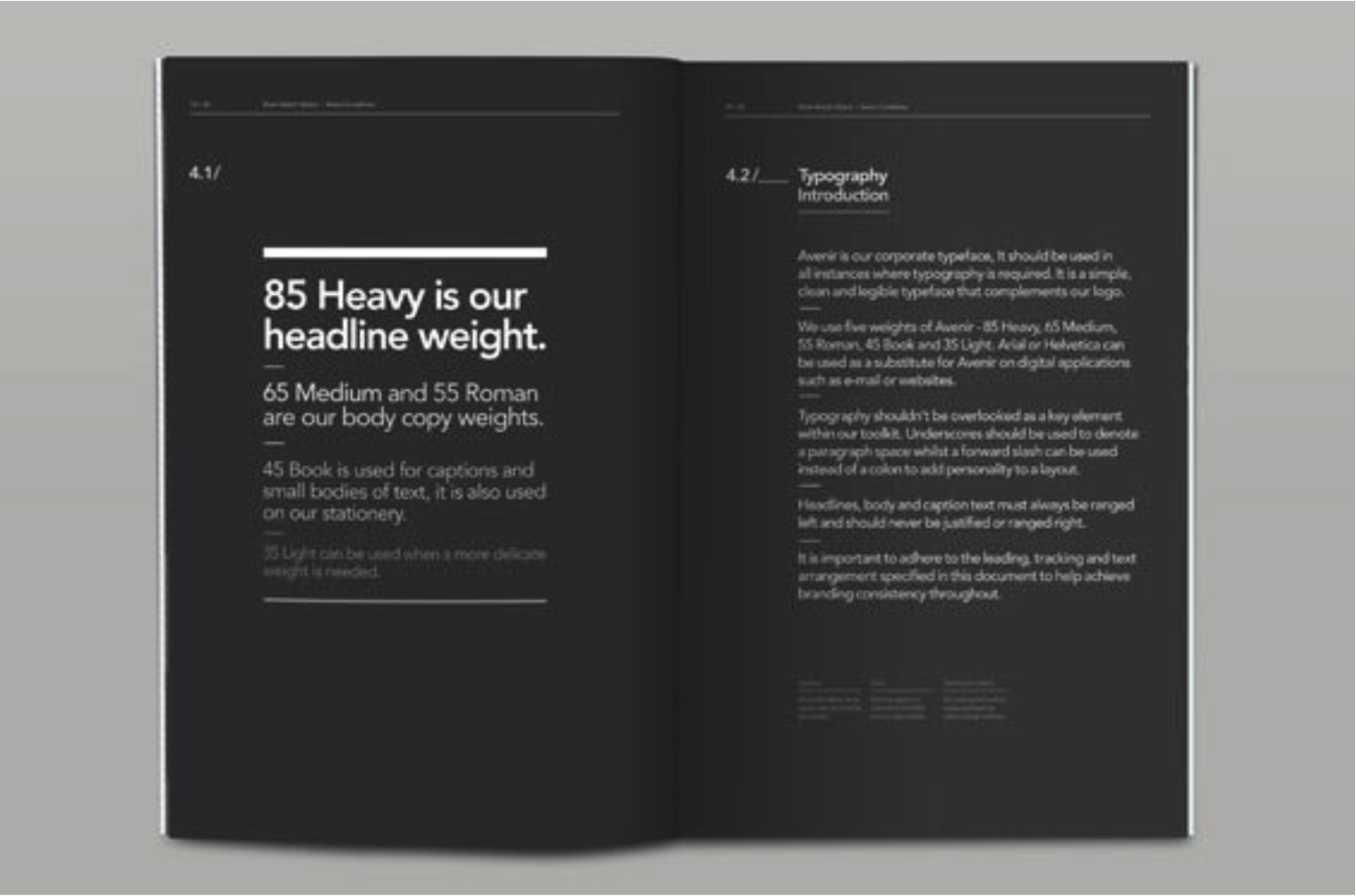
The first guidelines I looked at explored the typography that must be employed in the company for design of documents, etc. The typefaces on the page are contrasted against the dark background and vary depending on the weight of the type.
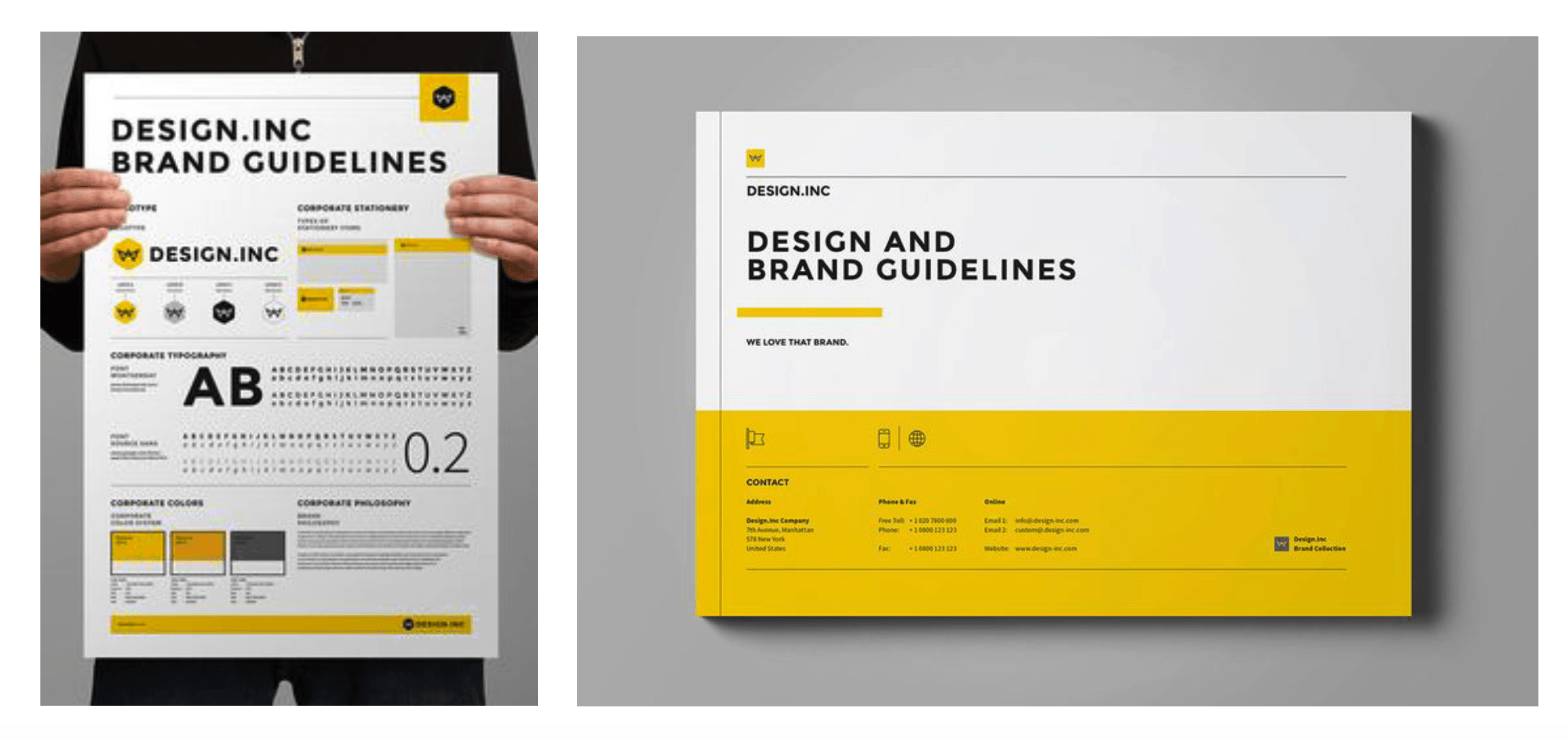
design.inc Brand Guidelines
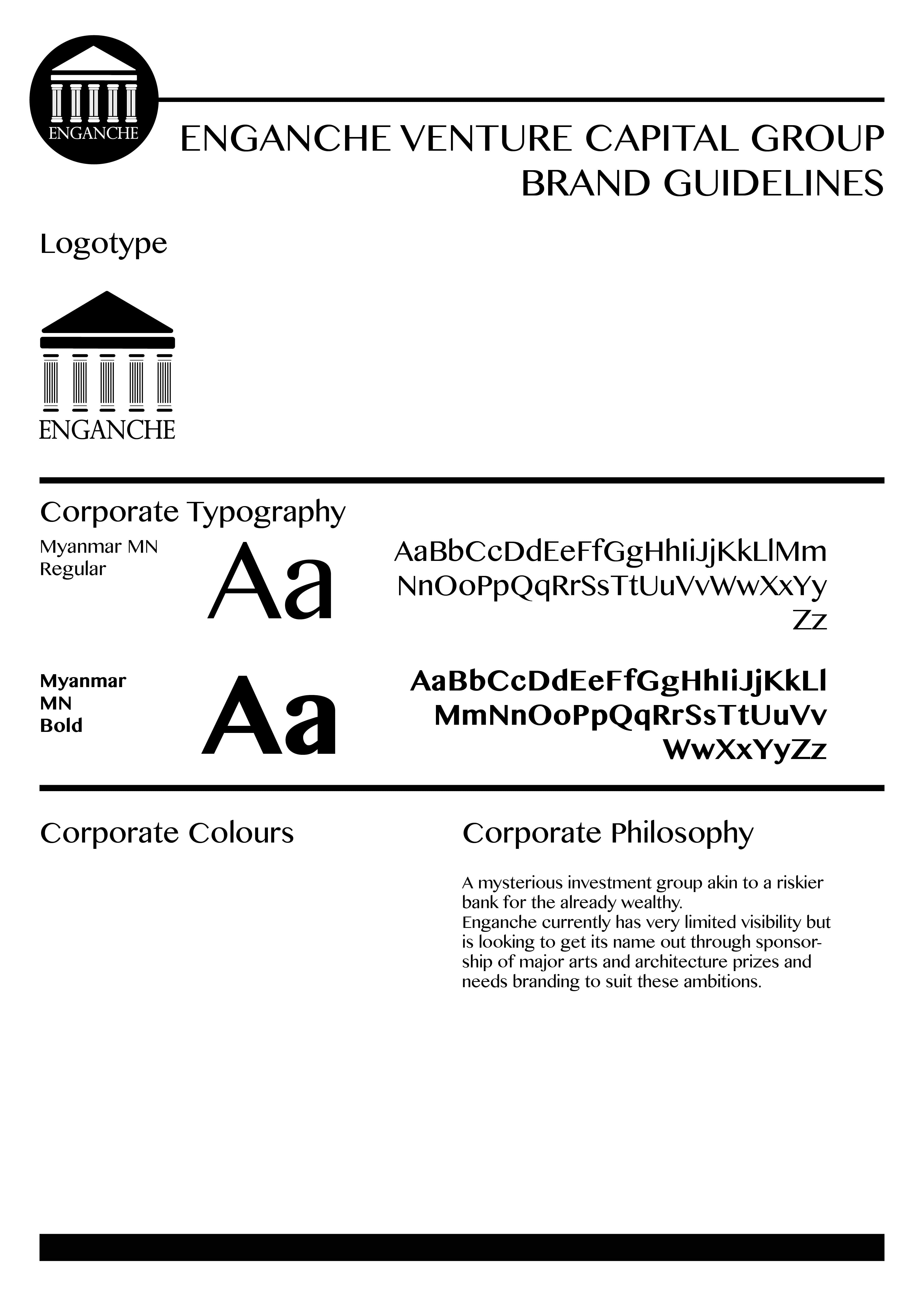
InitialTestDesign
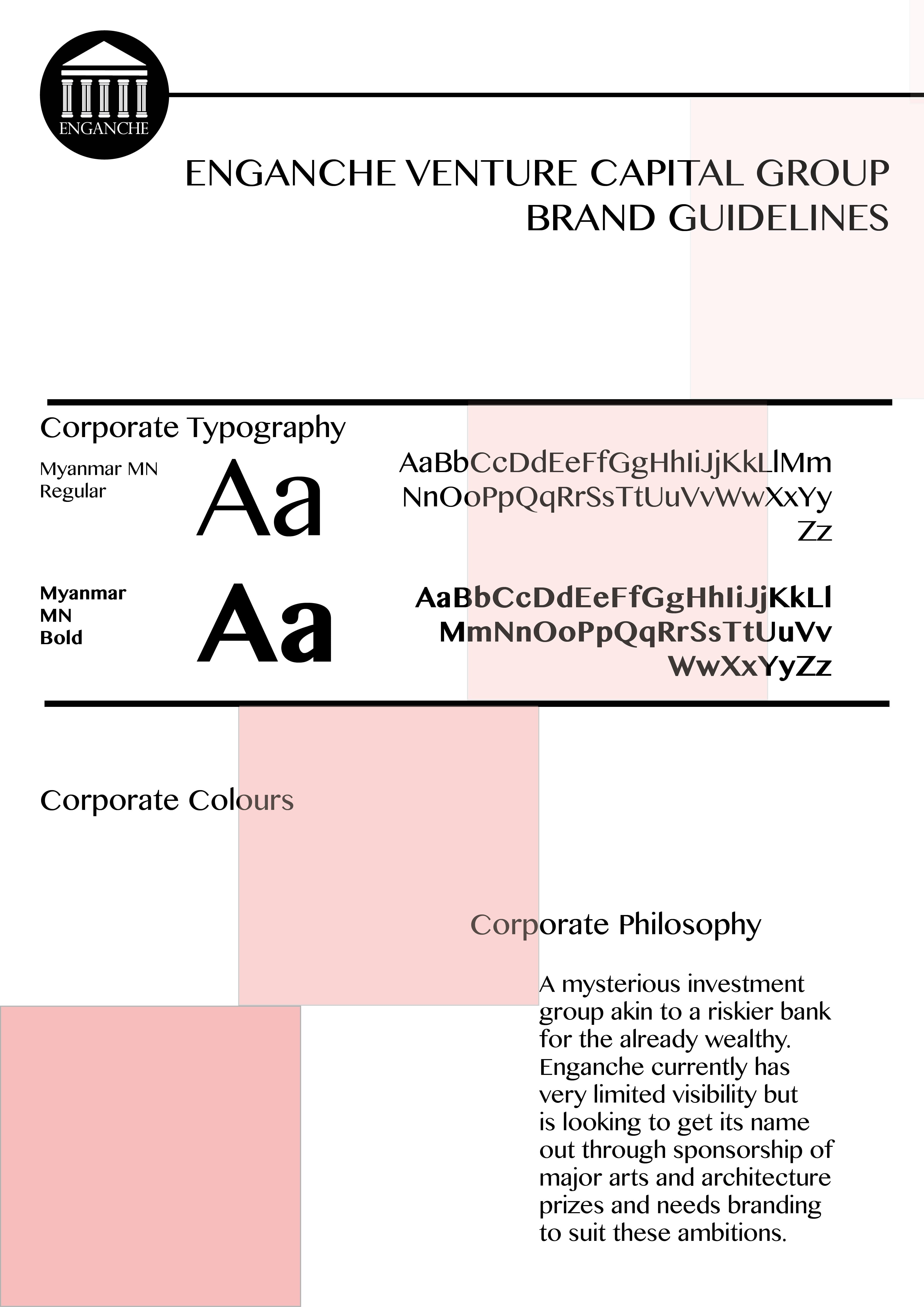
For inspiration of my first design I produced a similar set of guidelines to design.inc. What I have yet to introduce is colour to the design. However, this is entirely dependent on the progress of my logo design and whether my colour palette extends past black/white. I have tested both the reverse logotypes on a black/white background and it looks successful in design. The layout of the page needs some development to become more unique. At the moment there is little emphasis on corporate ideology and the brand package makes little to no comparison.
At this point the corporate typography is dominating the page and could be made smaller in order to fit more onto the page, or to emphasise white space in this design. From here, I will continue to work on both layout and colour implication.
[Update]
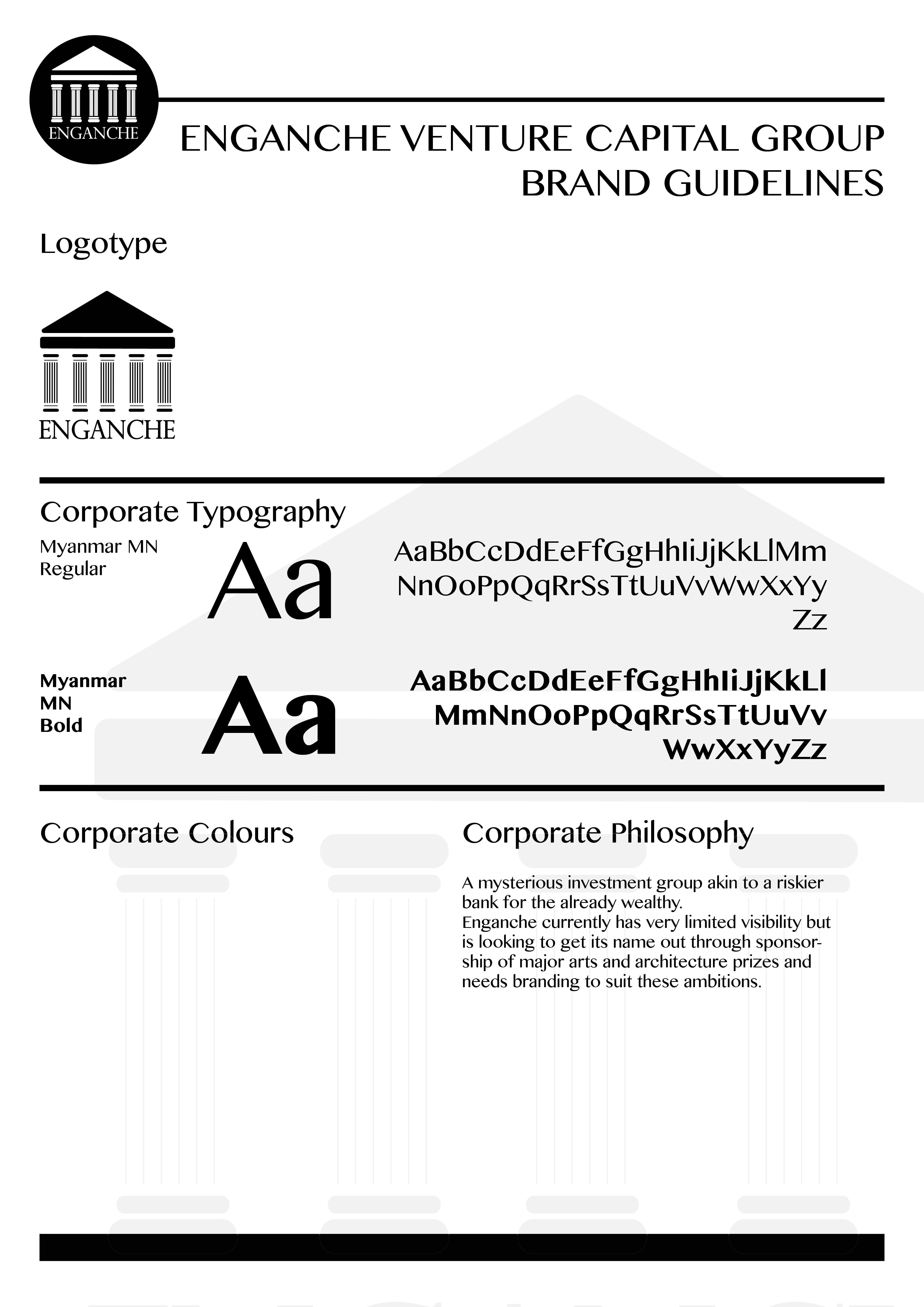
These set of designs are a step up from my initial test design but i would like to rebrand Enganche in the near future.