In the workshop we had the opportunity to pin our work to the wall then photograph it before scanning it in with the new texture. This gave me the idea to use a map and mark out various cities and locations to create a typeface.
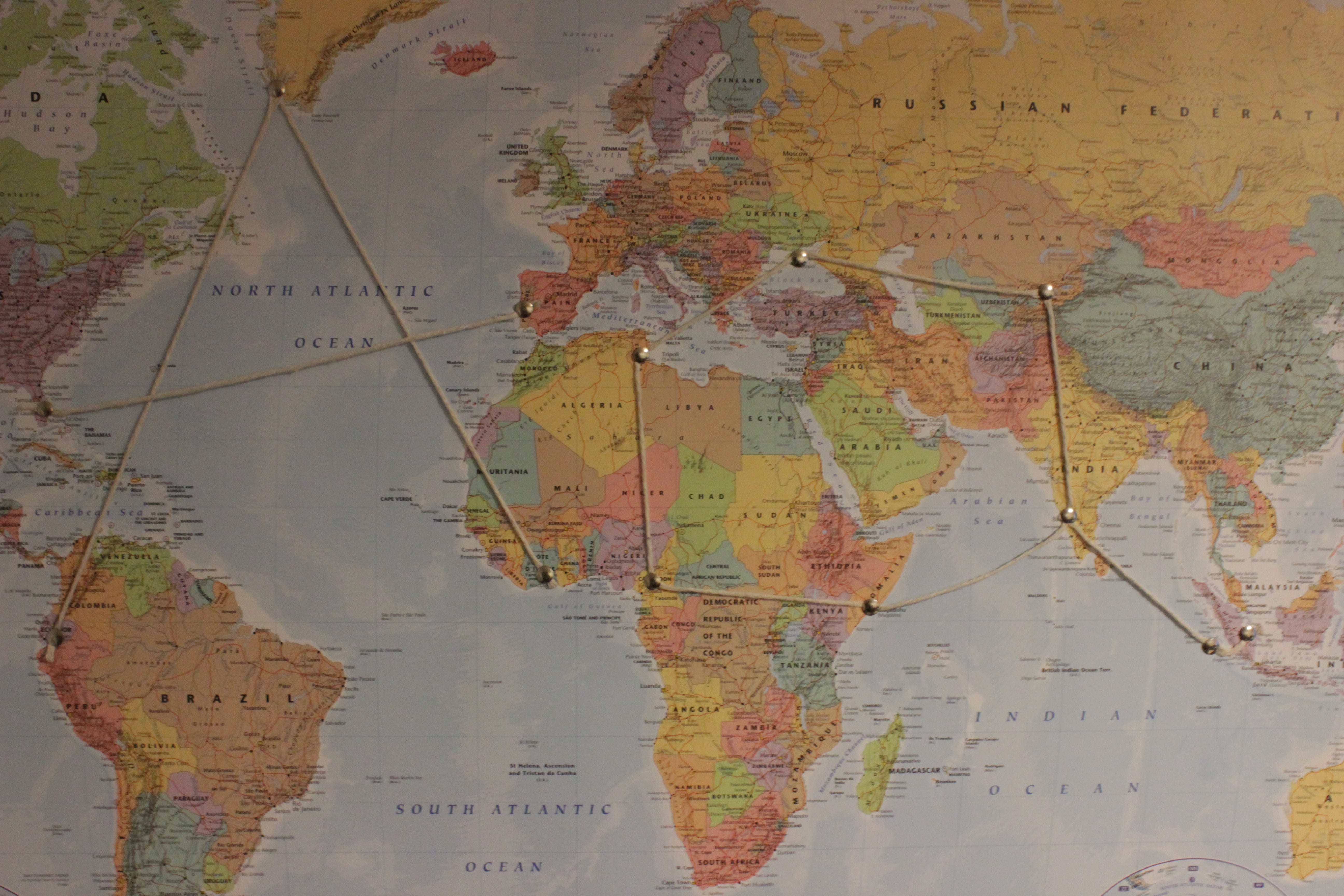
Originally I had planned to go through capital cities only, however this proved difficult with the way the a’s were leaning. I quite like the concept behind this however there was not much contrast between the string and the locations on the map. If I was to continue with this idea I would find a better room to do photograph this in because of the poor lighting.
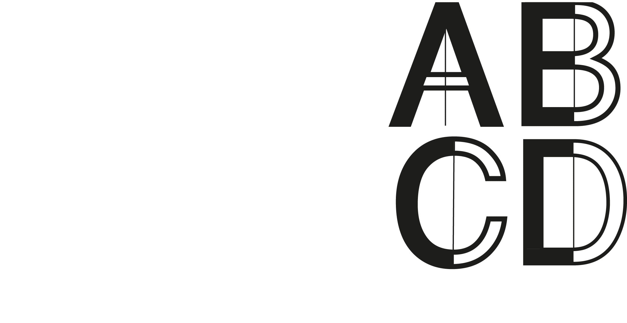
The image on the right was the start of another typeface where I had manipulated Helvetica. I wanted to present a strong black/white contrast whilst adding something to the design to literally divide it.