The development of Enganche’s logo will influence the final package for their business. The first idea I had was simplistic and took inspiration from the indie label ‘HIGHGRND’. The problem with this design was that it did not reflect anything about the company. It was simply the Enganche name.
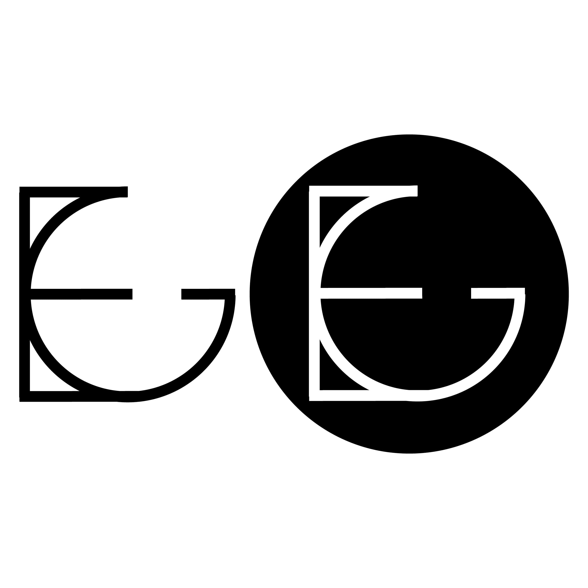
My second design combined the separate letters of En and Ganche to create a blend of letters. The semiotics of this reflect the meaning of Enganche being playmakers, where they work together with the clients to generate results. I chose to do the logo in both a black and white/black circle logo to see which was more effective. The left letter looked ten times better without the circle.
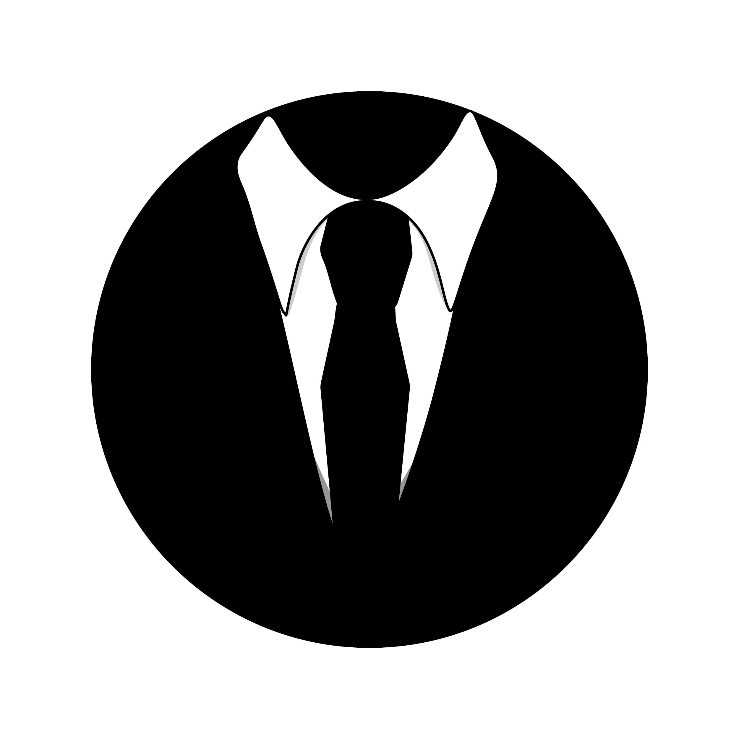
My third design suits the mysterious nature of Enganche as a group. The suit and tie shows sophistication whilst maintaining ambiguity.
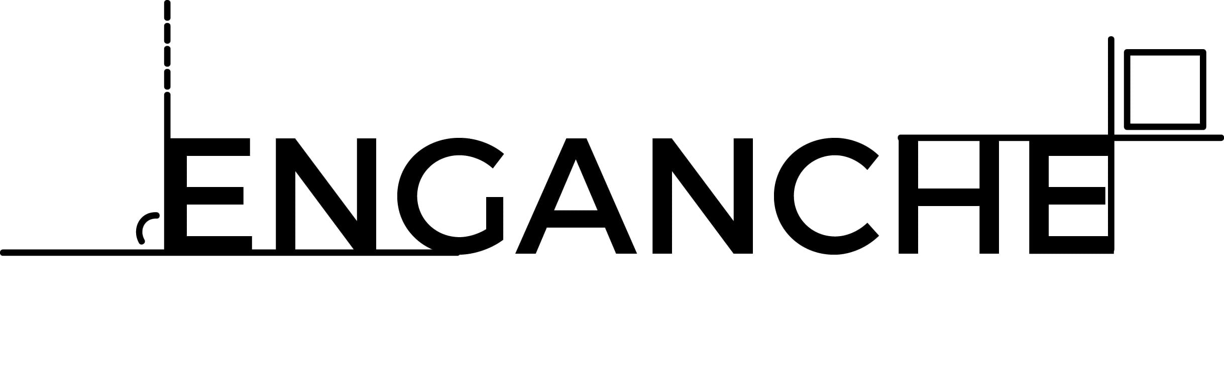
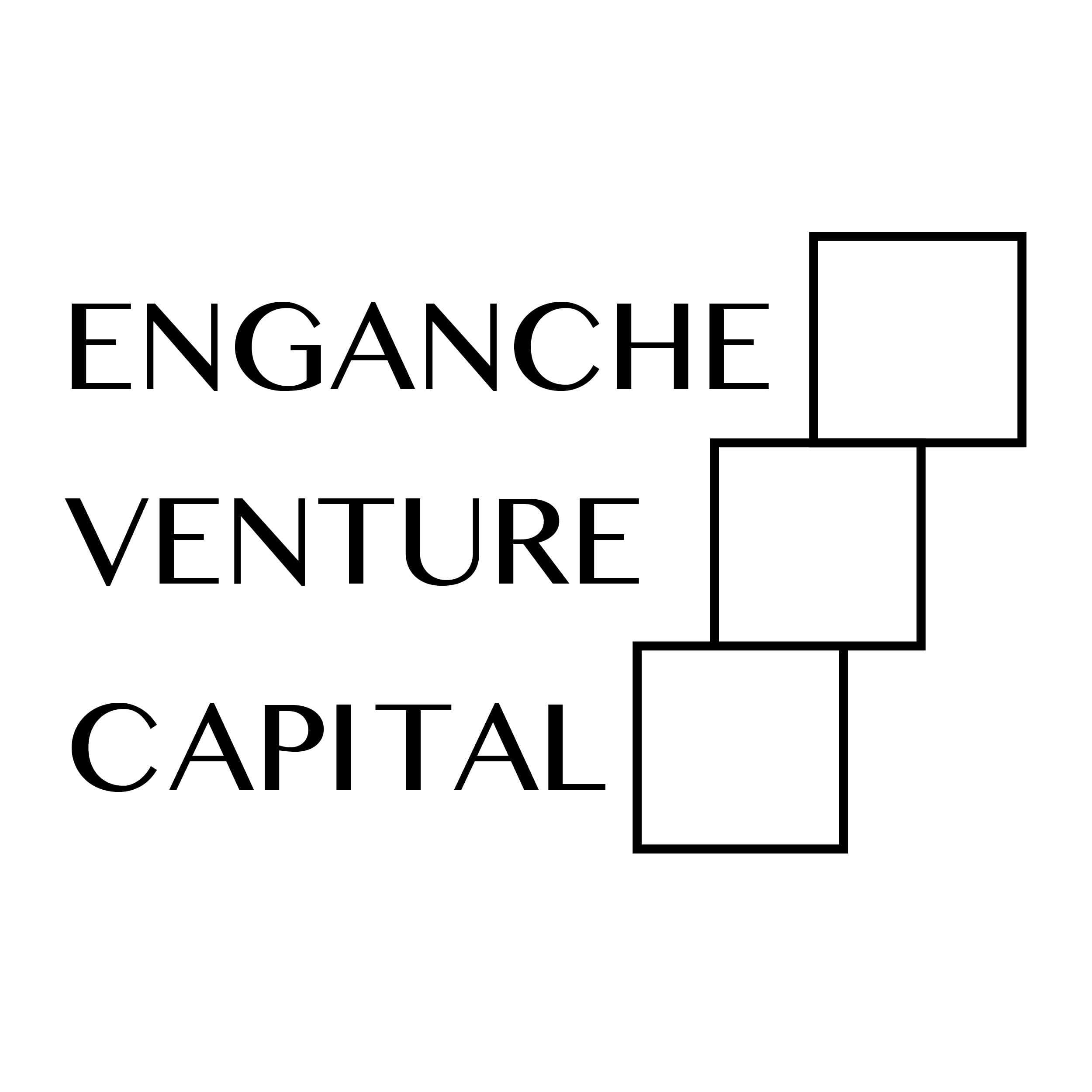
My fourth design was by far my favourite. The blocks next to the type show not only escalation and reaching new heights but also the company’s stability as a Venture Capital Group. I may choose to combine this design with the ambiguous suit and tie design but use the suit and tie design and the companies main logo.
The final design for Enganche would be based around their intention to cover arts and architecture prizes therefore the pillars and serif typeface emphasise the archaic tone I’m trying to present in this logo. The pillars also represent stability much like the building blocks for the company in the previous design.

[Update]
![]()
This logo has been created by combining two wireframe cubes to create a similar logo to the one above. Similarly the blocks show not only escalation and reaching new heights but also the company’s stability as a Venture Capital Group.
![]()