I started off my research by looking into existing web page designs for children around the age of my target audience:
From my research I discovered that these types of web pages use bright, vibrant colours and large text to grab the attention of the user. It also creates a fun atmosphere with minimalism and ease of navigation. So I will consider these factors when I design the online desktop application.
I wanted to make sure the design of my online desktop application was consistent with that of my poster design. This meant using the same colour palette and typefaces most prominently. My first initial design was based upon the existing format of my poster.
The design was minimalistic to suit my target audience of 9-13 year olds and remained consistent with my poster, but it didn’t look like it had the potential to be interactive. There is little instruction for the target audience to decipher how to operate the interactivity.
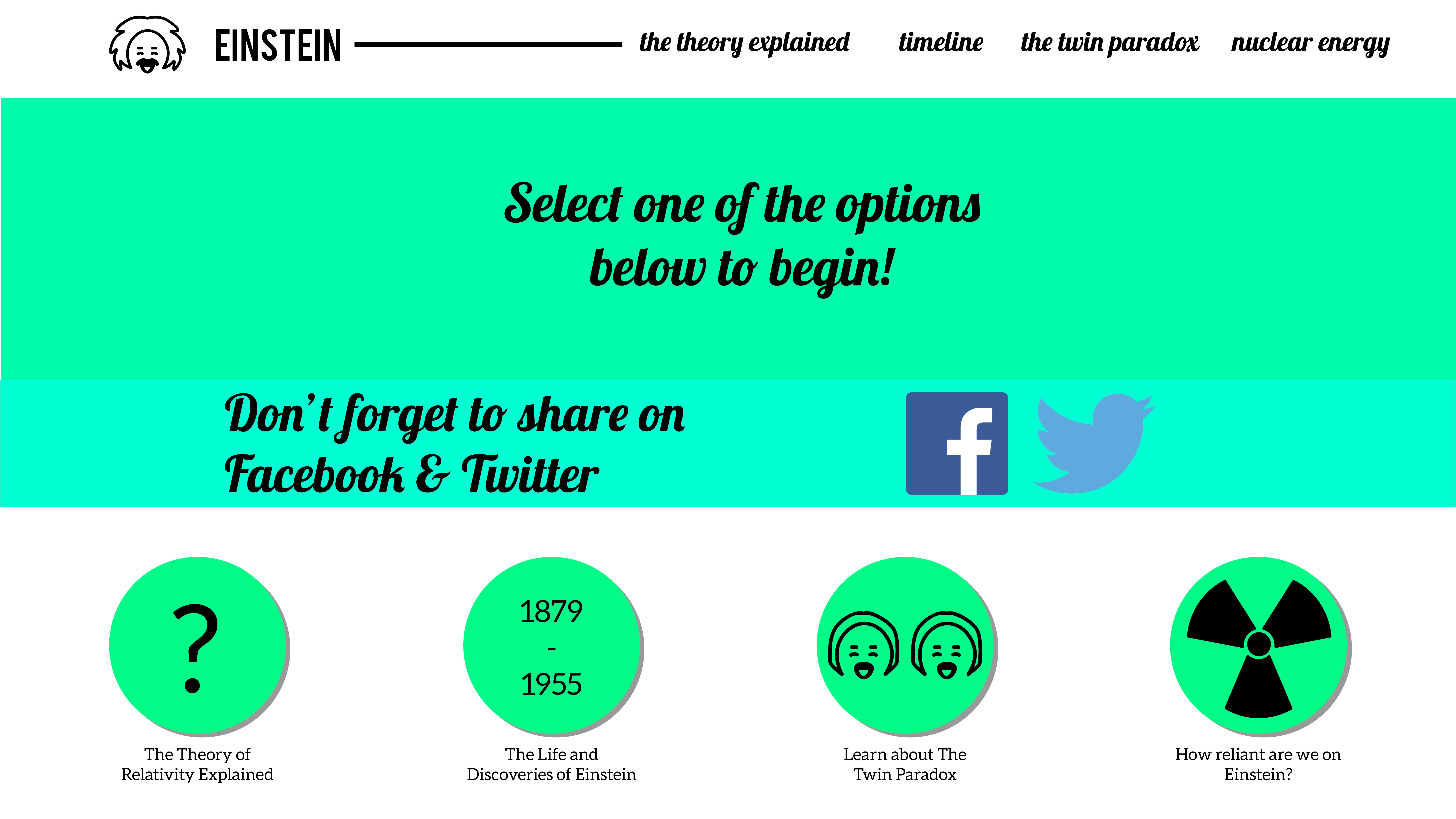
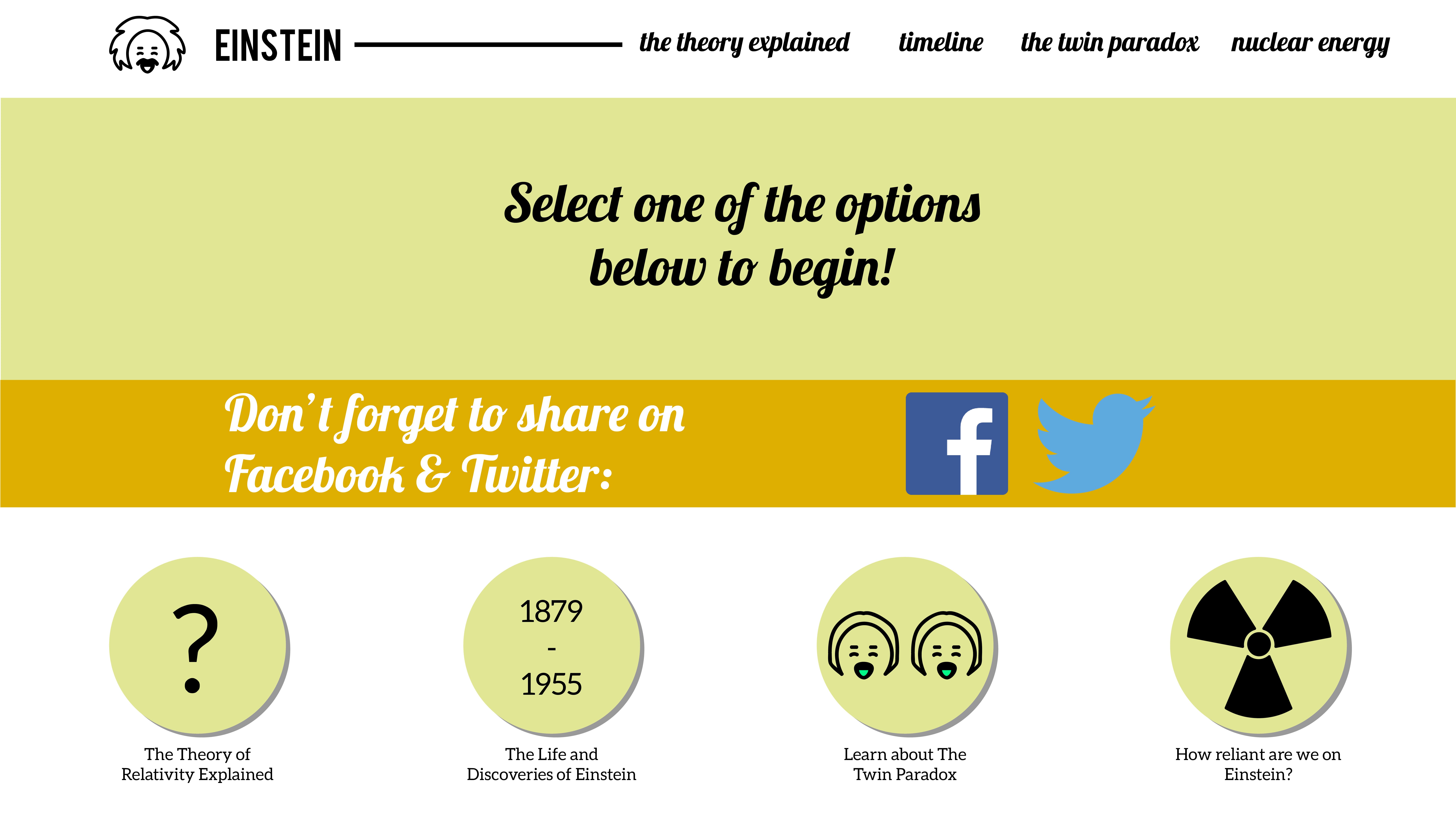
My second design looked at a more interactive design that focused on ease of navigation. The user simply has to select one of the circles from along the bottom and the information will be displayed along the middle of the design. The colours do not run consistently with the design of the poster and app design.
[UPDATE]
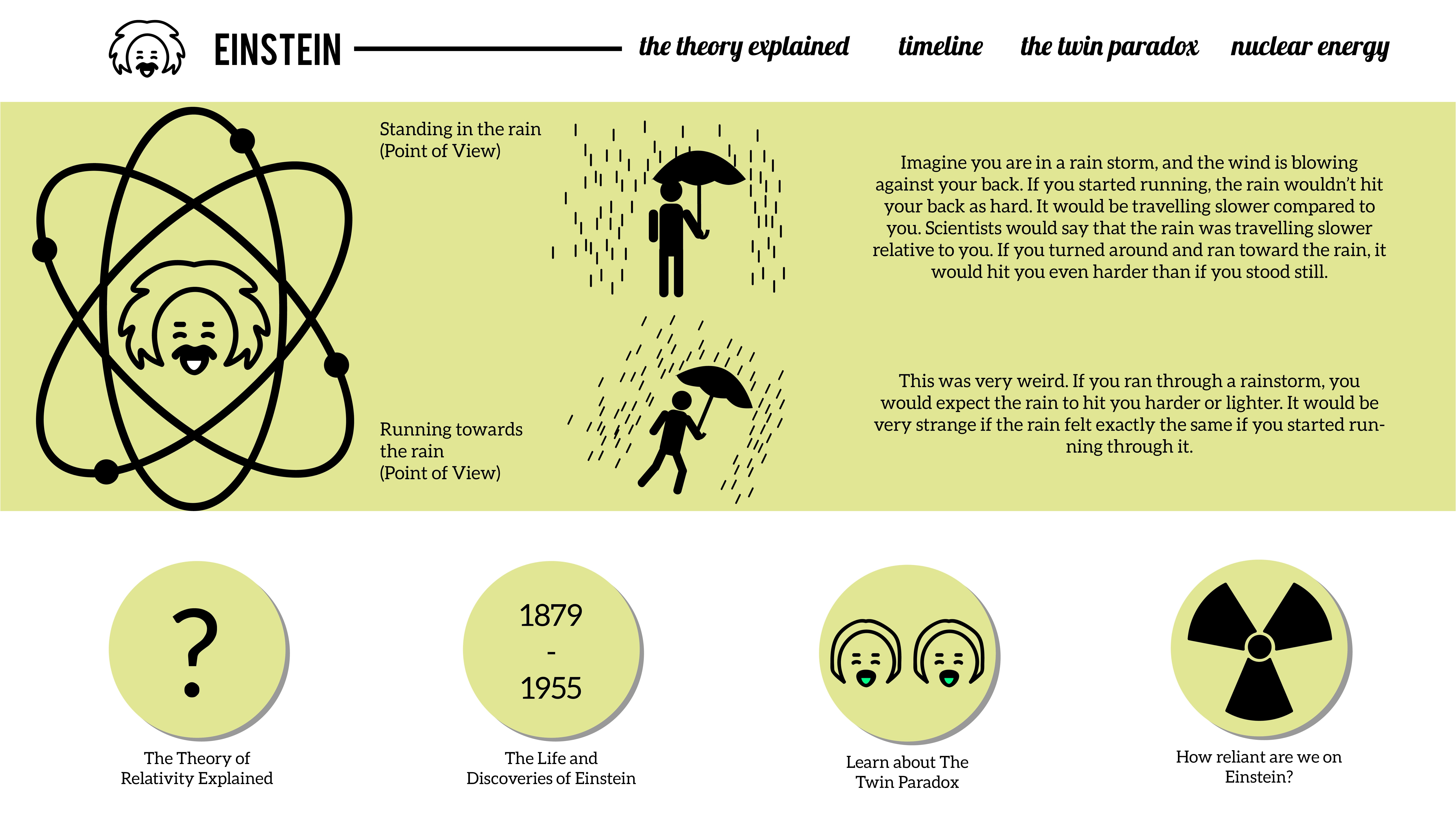
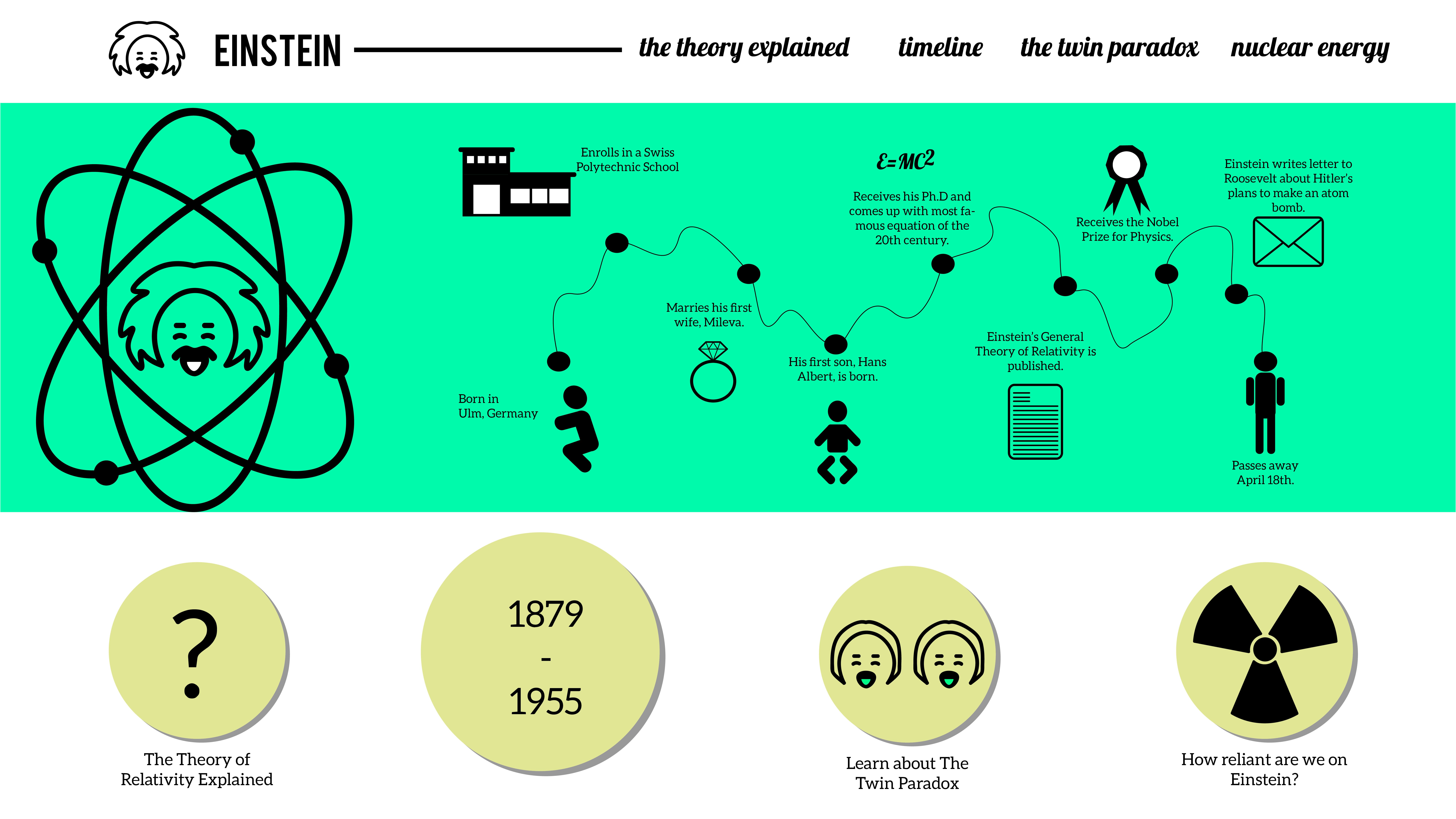
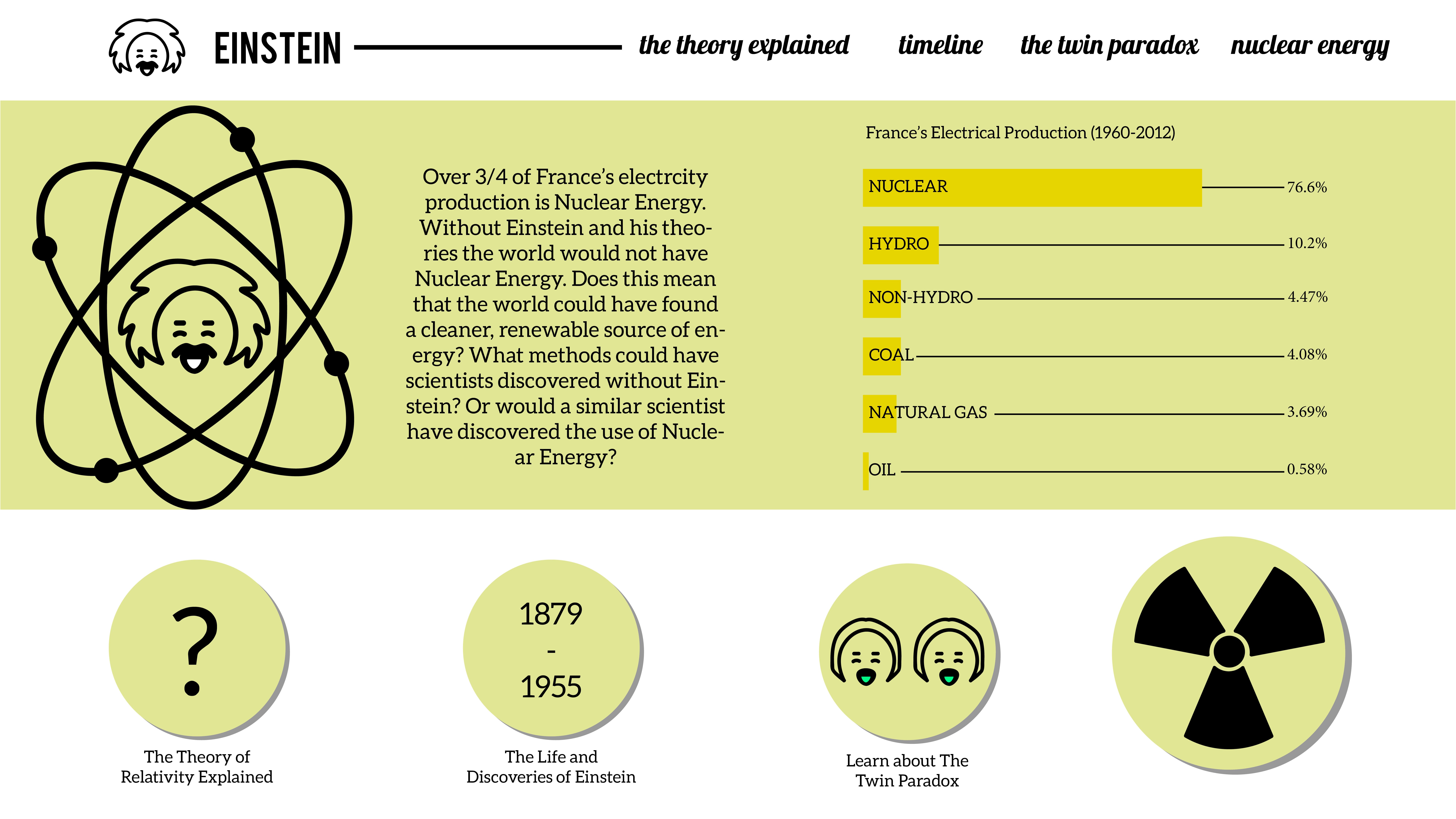
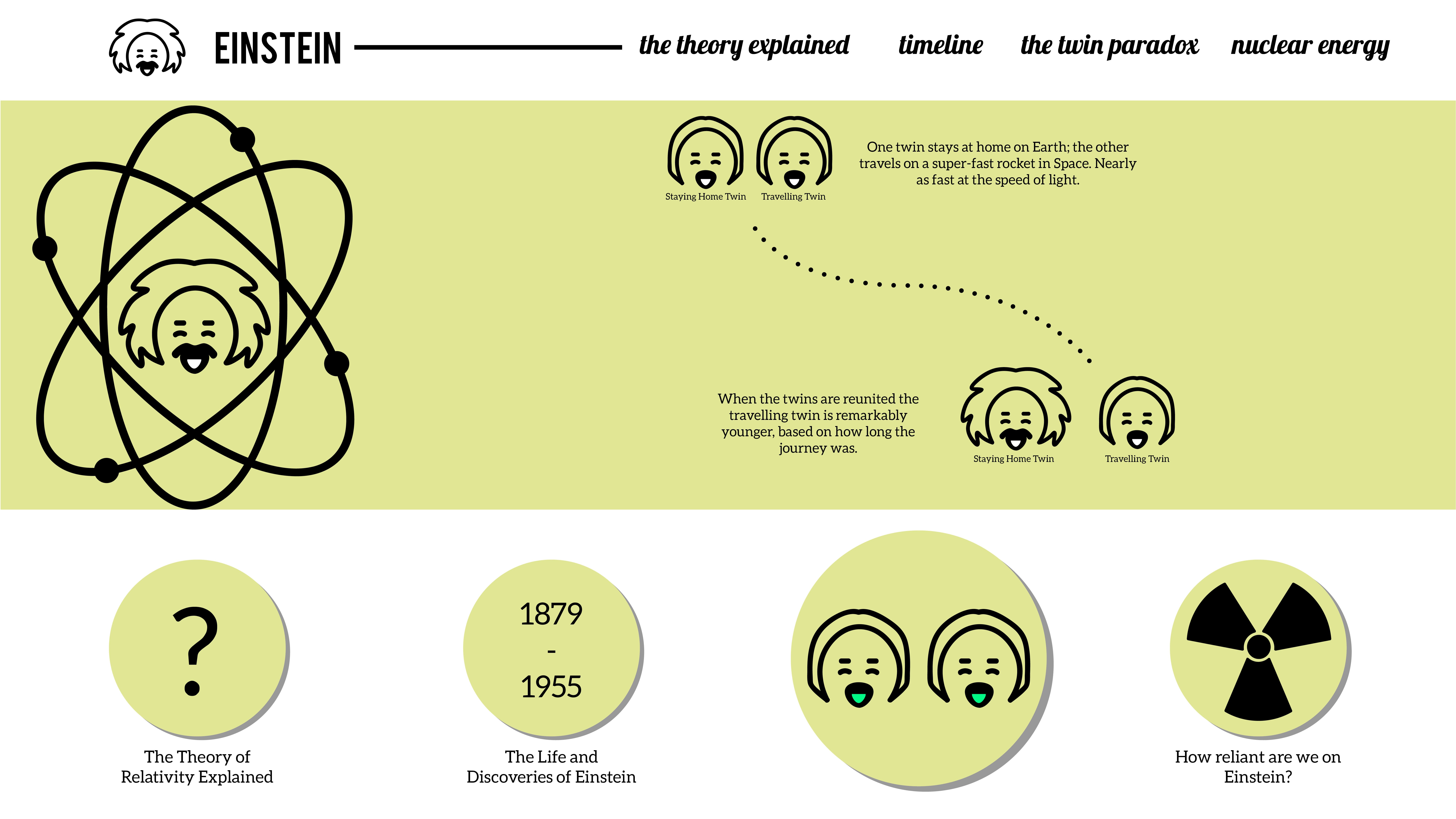
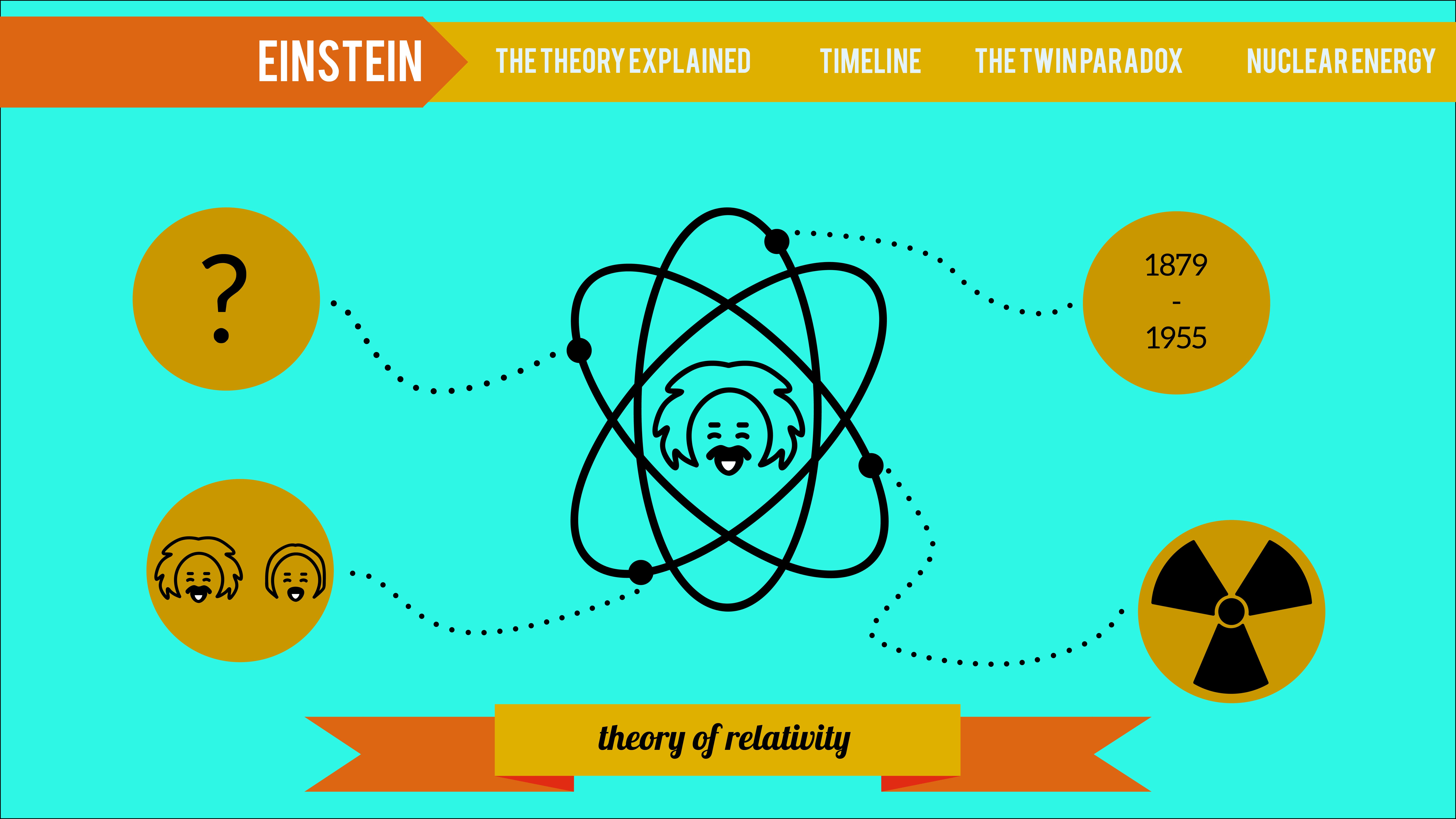
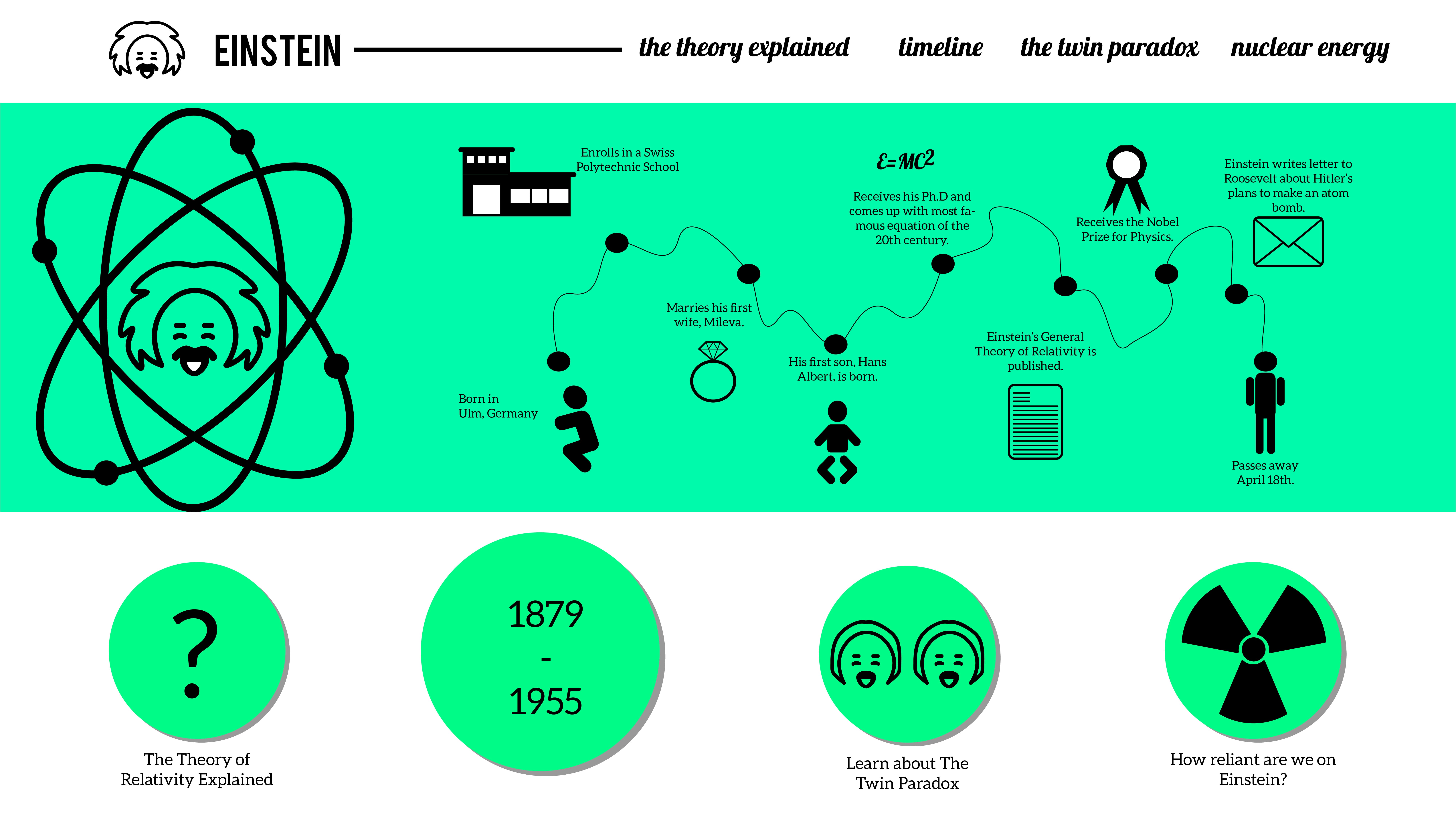
In the most recent update for my online desktop I changed the colours to match that of the App and Poster. Similarly, I would like to develop the amount of space left via the grid system on some of the pages. At the moment I feel like this has better ease of navigation compared to the application because of its size and understanding. The vectors will be further developed alongside the App and Poster Designs.
[UPDATE]
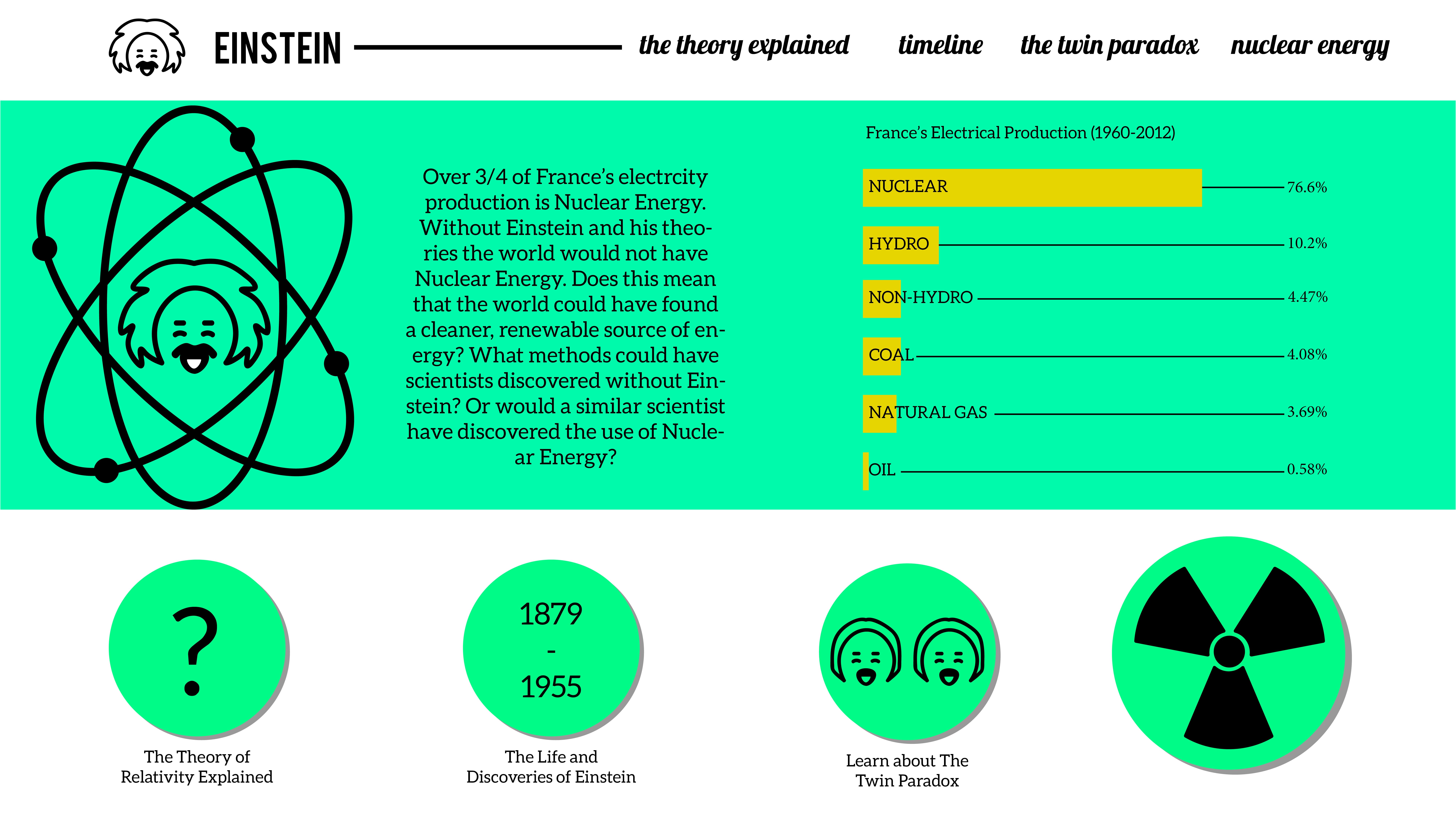
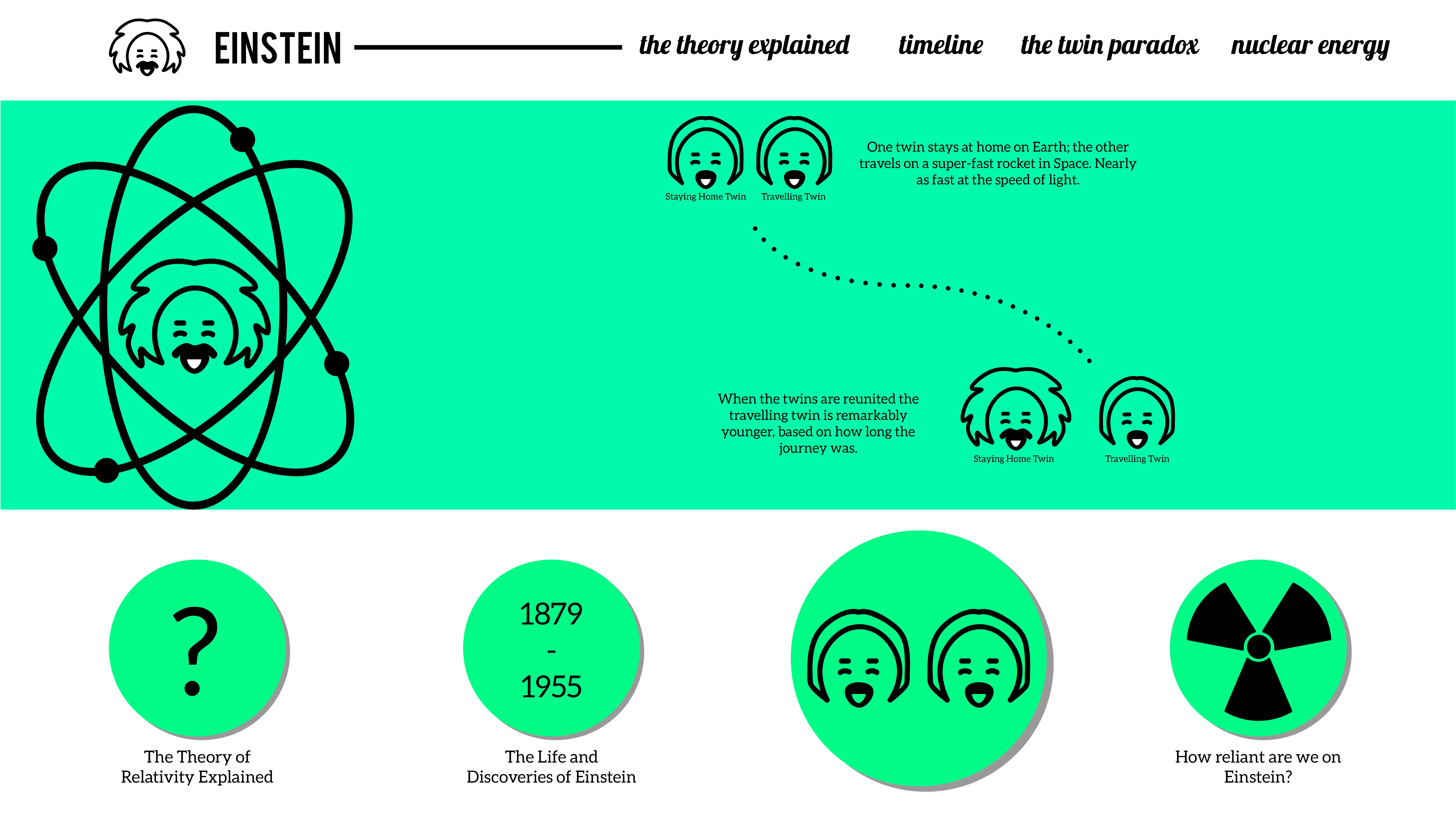
Finalising the designs I redesigned the twin Einstein to look neater as well as adding a spaceship to the Twin Paradox Theory. I went about cleaning up little parts to make the overall design look neater and finalised.