With a few minor adjustments to the typeface I have developed the finished result is follows:
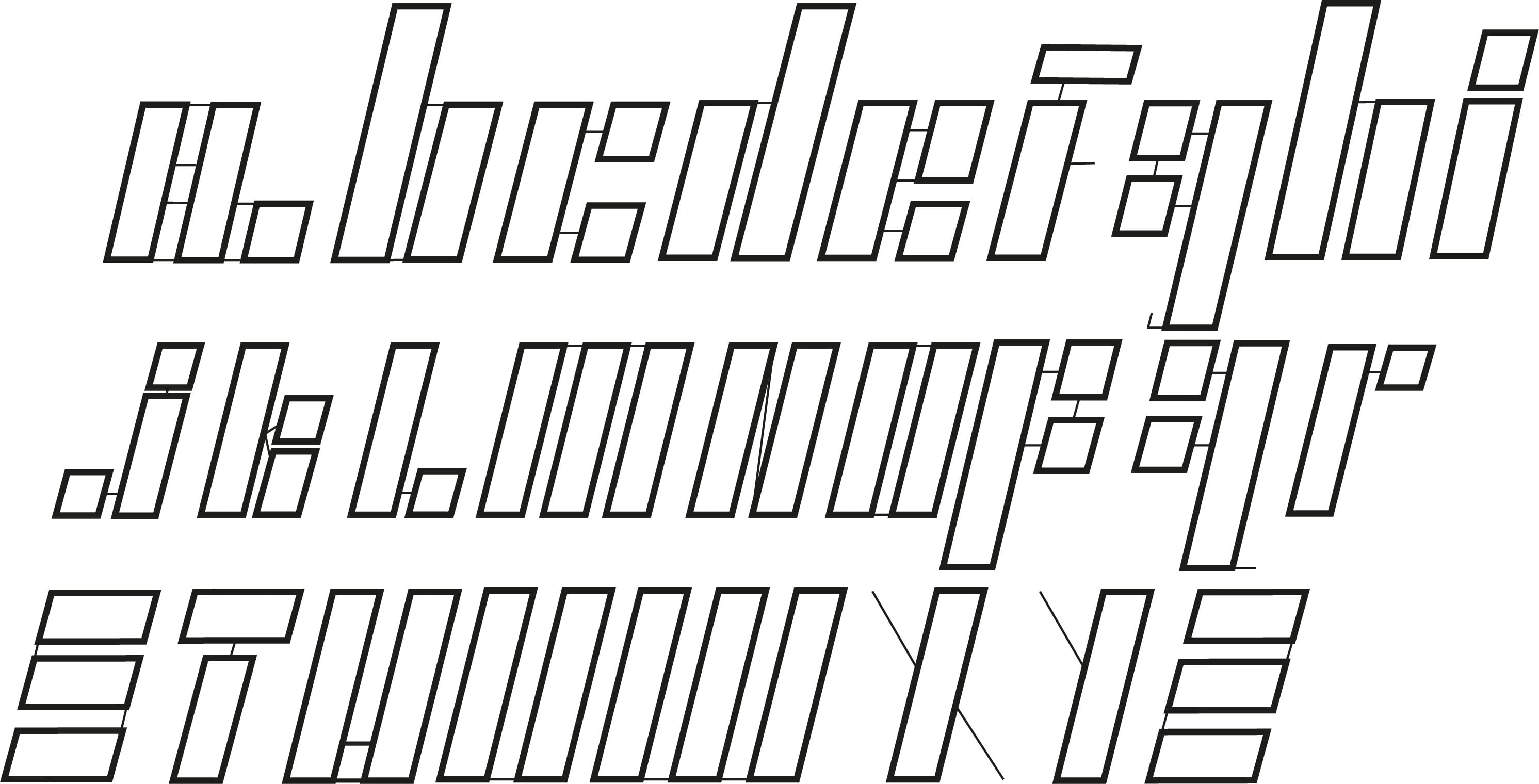
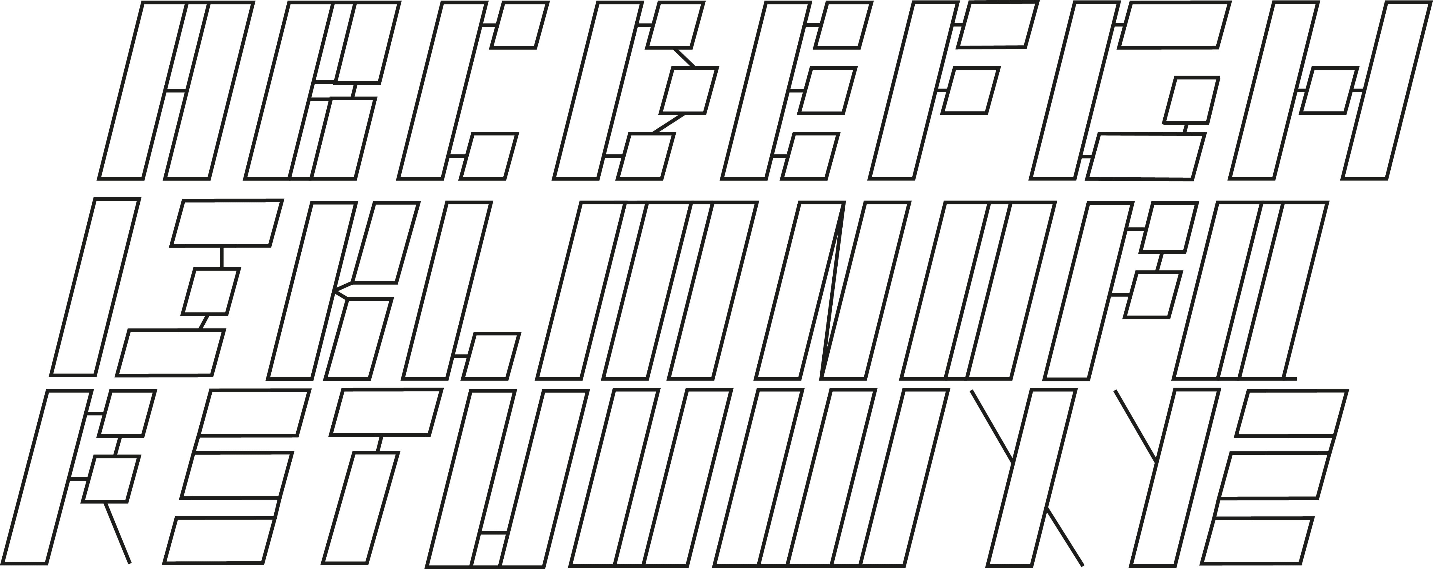
I refined the size of the letters and the positioning to make them all look equally spread out and of the same size. When applying this to a mockup I chose to title the typeface Cyber because of its cybernetic-like feel.
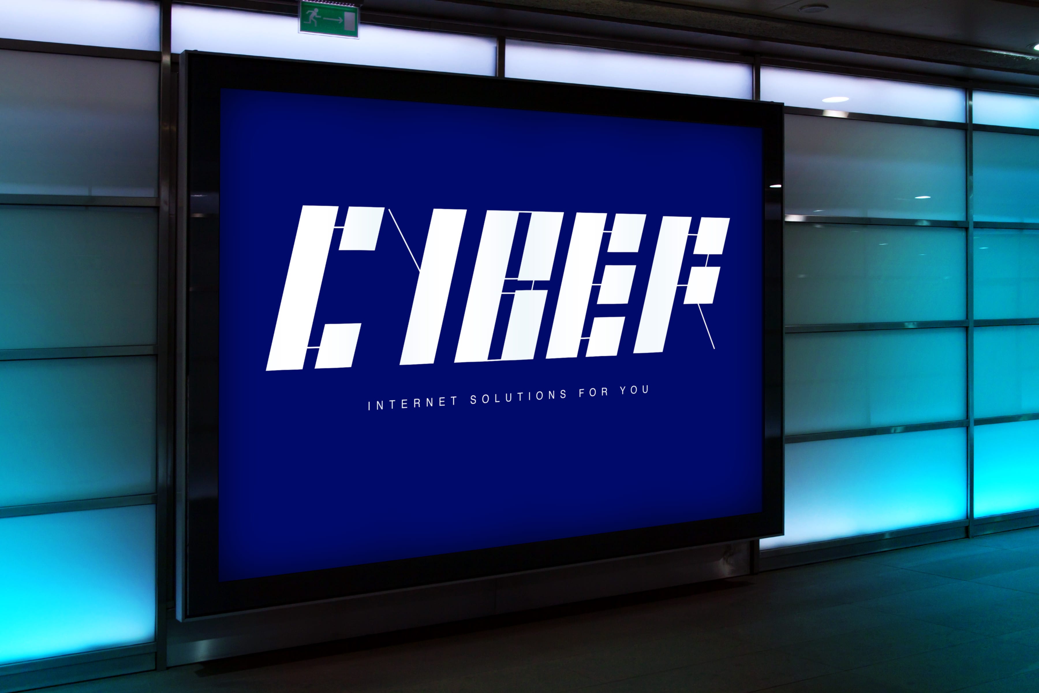
I feel like my typeface would be aimed at corporations who specifically target technological development. The typeface is very futuristic and should be used in this way. This typeface would not be used in standard text based writing but rather for logo and poster design.