Initially, I wanted to continue using space colours to detail Einstein and the Theory of Relativity. Following the release of the video game Fallout 4, I wanted to explore ‘The World without Einstein’. Therefore I did some research into existing Fallout posters to see whether I could draw some inspiration.
http://mattthekid.deviantart.com
http://mattthekid.deviantart.com
A common pattern in these posters was the use of archaic type and black-vectored caricatures. The use of colour and design is very consistent with the 1960s. Using these posters as reference points I began to develop some ideas. I used the research obtained from my app design to form a starting point for what to include in my posters.
Early Poster Design
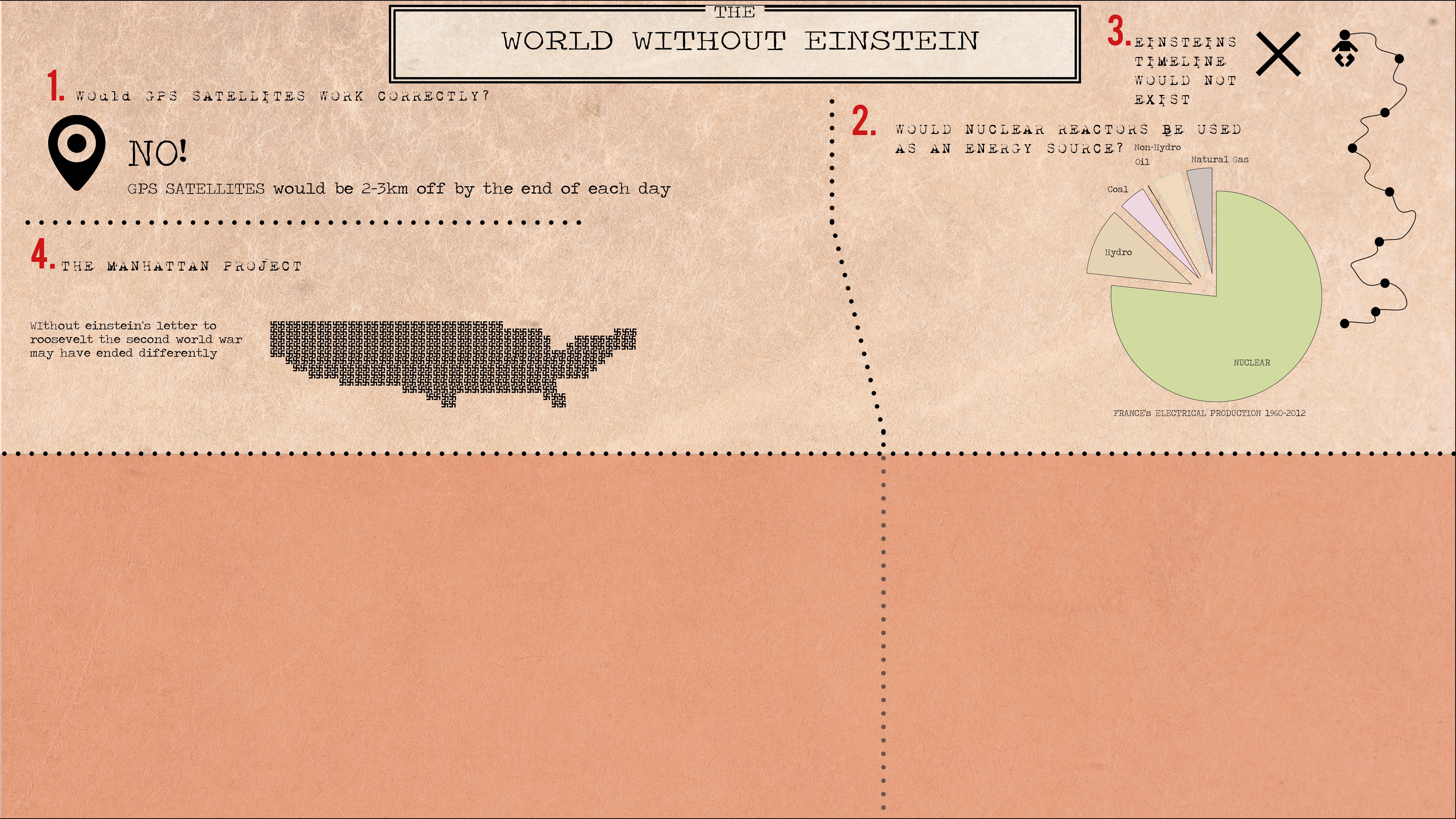
I started to number and gather facts that would support the claim that the world without Einstein would not have developed as it had done. Using the Noun Project I looked at what kinds of vectors I could use. As templates for early designs I used GPS coordinates, swastikas, and a baby. To continue the exploration of this Fallout theme I used a paper texture to make the background look worn and dilapidated. The design didn’t look like it could progress because of what I was trying to say about Einstein.
As a result, I decided to produce a combination of Einstein’s Theory of Relativity and how relevant he was as a person, which would include the world without him. This steered away from my existing research into the Fallout theme:
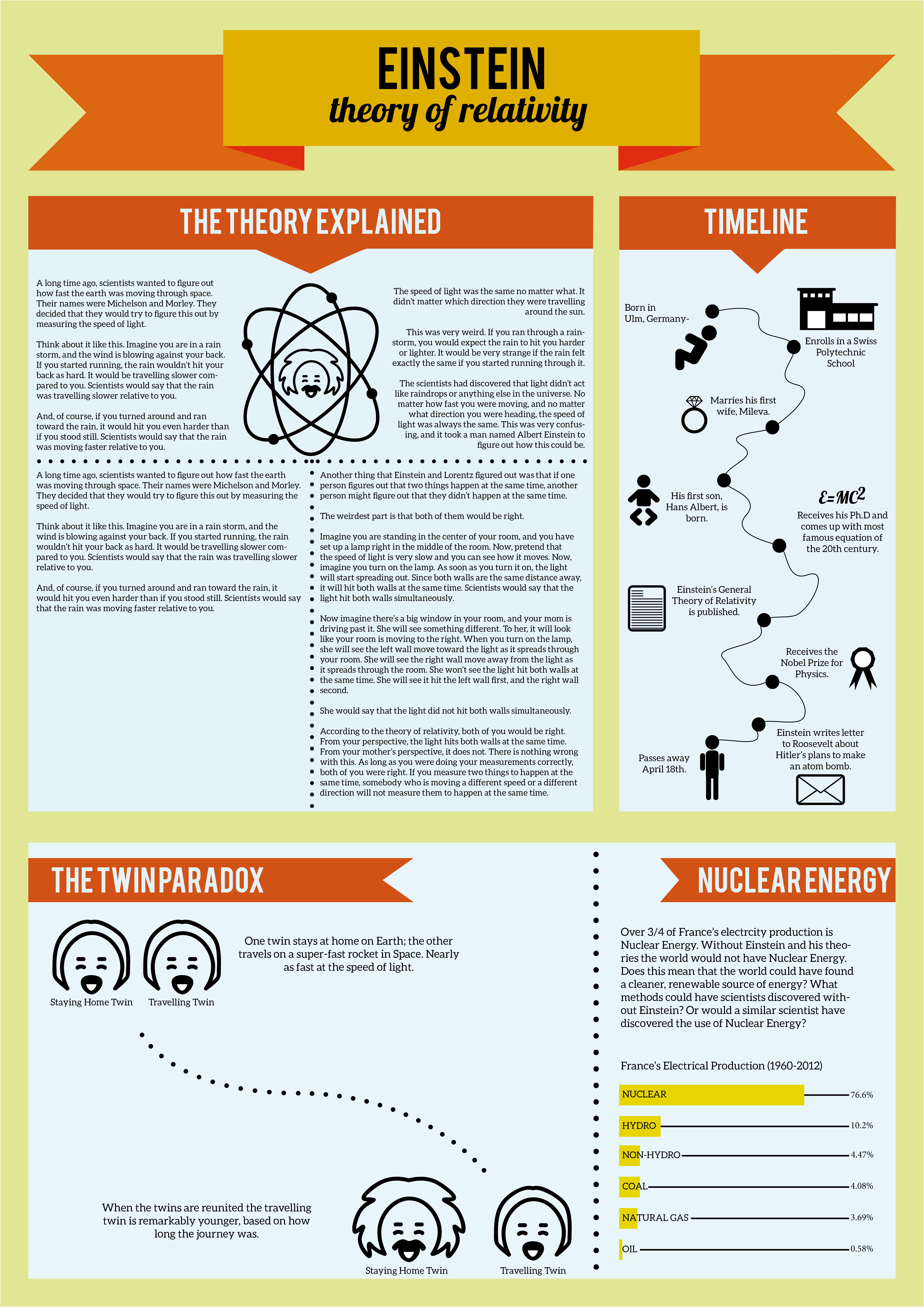
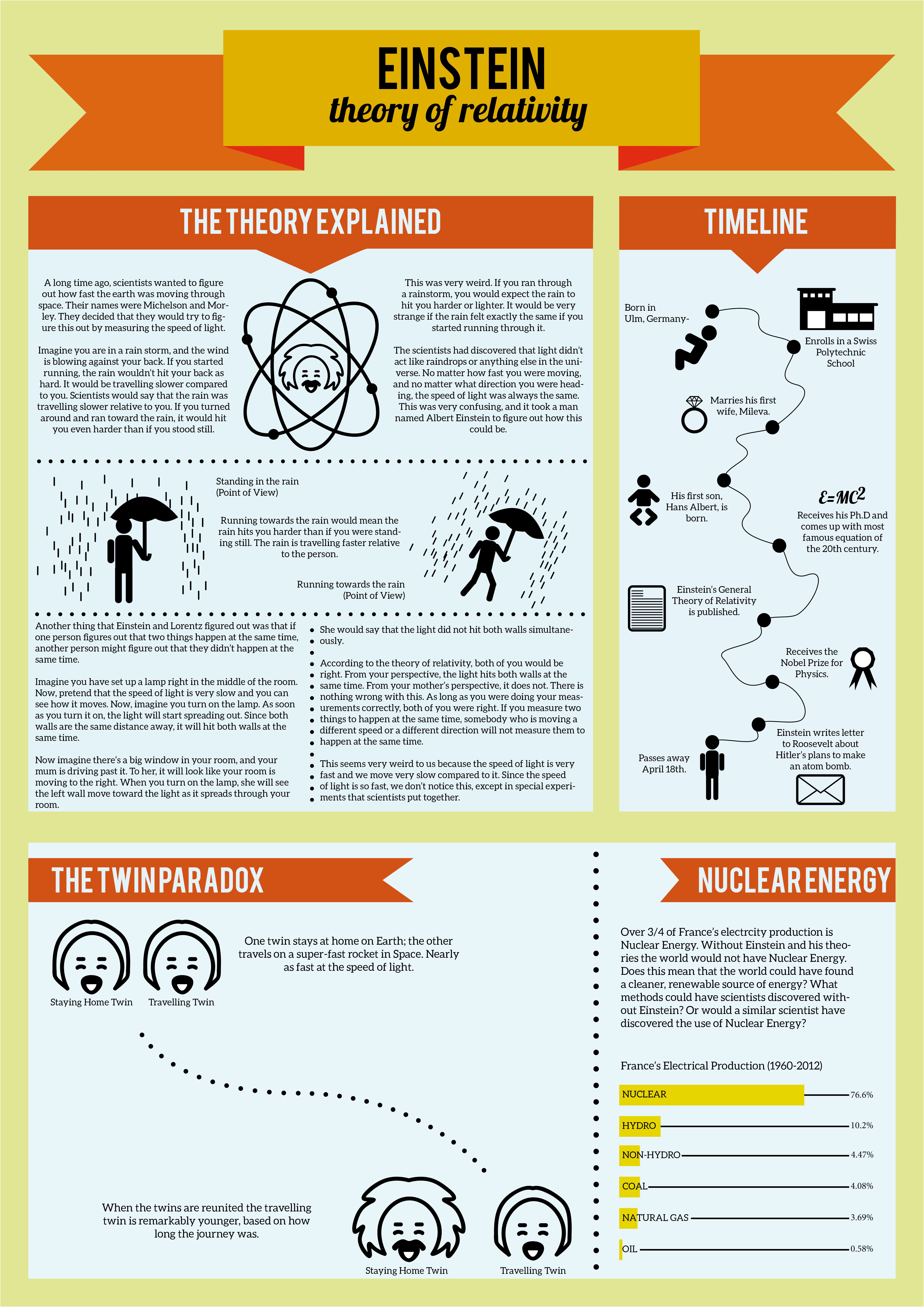
This design built upon the basis of previous infographics. Originally I had designed France’s Electrical Production as a pie chart however the information I was trying to portray wasn’t legible and did not conform to the overall design. Therefore I chose to produce a sideways bar chart that listed the percentages of power, which was not identifiable in the previous design. I had outlined the basis for a timeline but did not look into what I wanted to put on there. I designed all the vectors that appear on the page. The final typographic was based on the Twin Paradox. At the moment there is too much white space so I want to include a spaceship travelling across the dotted line and possibly more information. I am pleased with the variation of the vector. I may choose to have less information in the theory explained section as it is a lot of information in a small space.
[UPDATE]
In this version of the poster design I reduced the amount of text in ‘The Theory Explained’ box and added new vectors to explain the example of relativity provided by Carter from Trending Sideways (http://trendingsideways.com/index.php/the-theory-of-relativity-for-kids/). I still think more text could be reduced but it aids in the understanding of the complex theory. I would still like to reduce the amount of white space amongst ‘The Twin Paradox’ section and further develop the caricatures. I also enlarged the type on the timeline so that my target audience could read it better.
[UPDATE]
Finalising the designs I redesigned the twin Einstein to look neater as well as adding a spaceship to the Twin Paradox Theory. I went about cleaning up little parts to make the overall design look neater and finalised.