Initially, before focusing on any kind of audience I launched myself into designing a format for an application. This was just to develop ideas and see what I could come up with. The result was:
Early Designs
Early Design
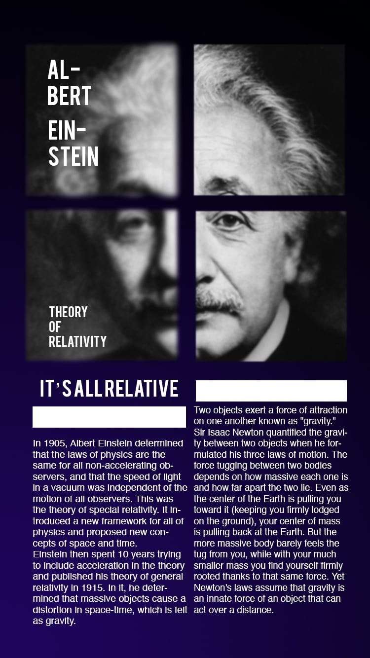
I chose white type against a dark blue backing to relate to the Theory of Relativity’s space applications. Despite having the dimensions of an app, the design was significantly lacking. The design did not look like it was an app. I aimed to have the bottom left square slide down to reveal more information but nowhere was there an indication this was possible. This was something to consider to future design.The way I chose to portray Einstein’s name was similar to the periodic table of elements and I chose to typeface ‘Bebas’ to create a powerful impact for his name and theory. To further develop my designs I will incorporate ease of navigation for young children so that they are able to use the app.
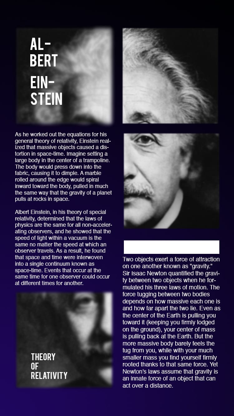
Developing a working app design
Developing a working app design
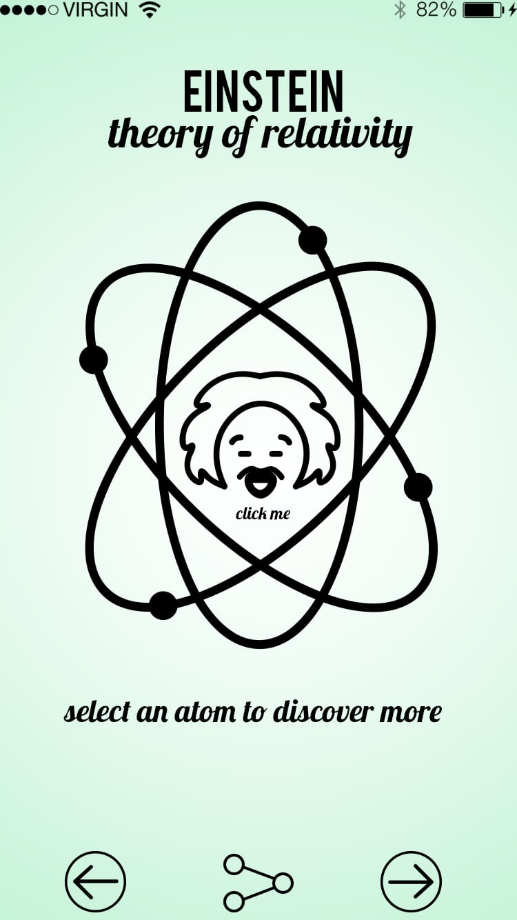
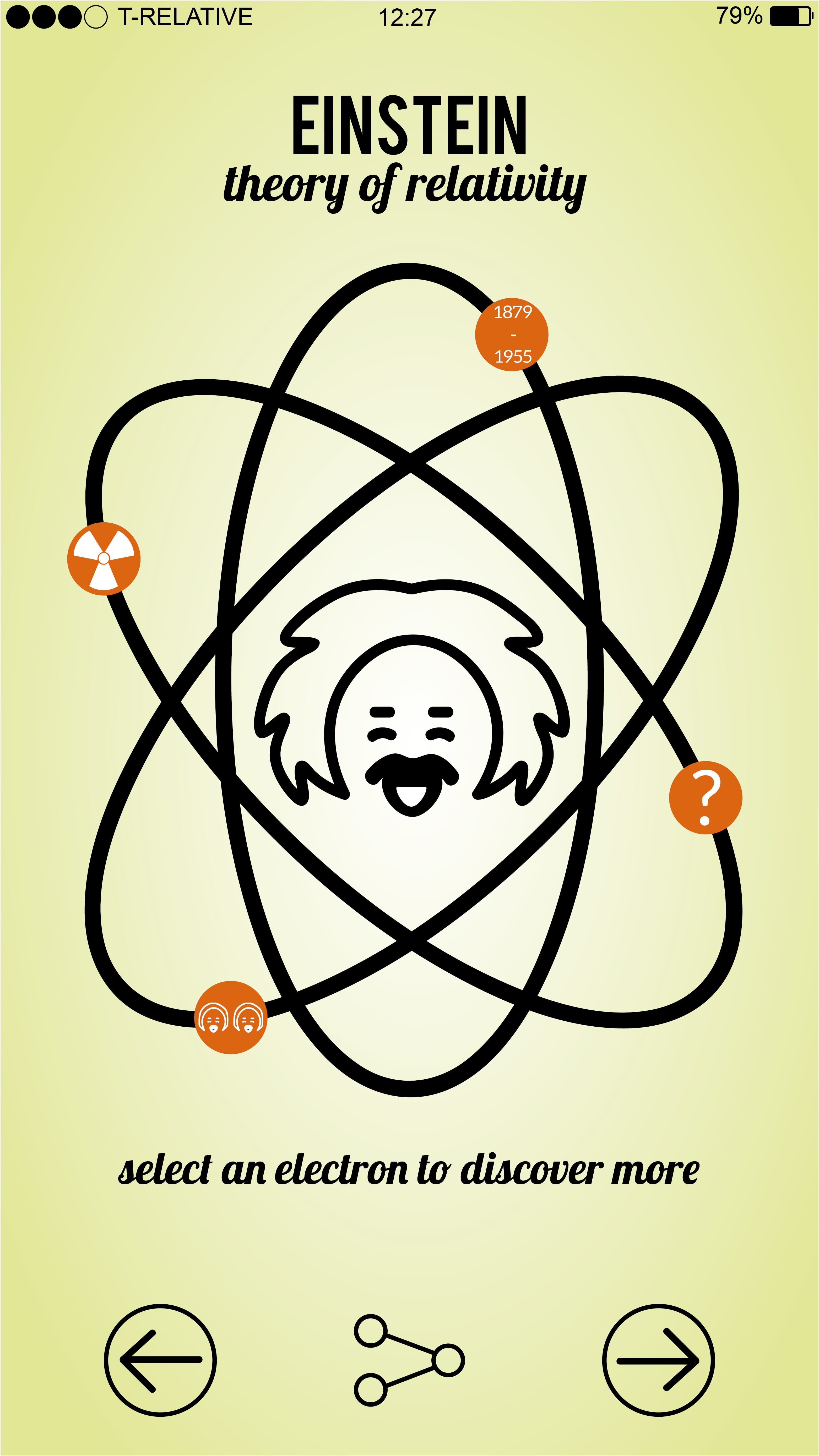
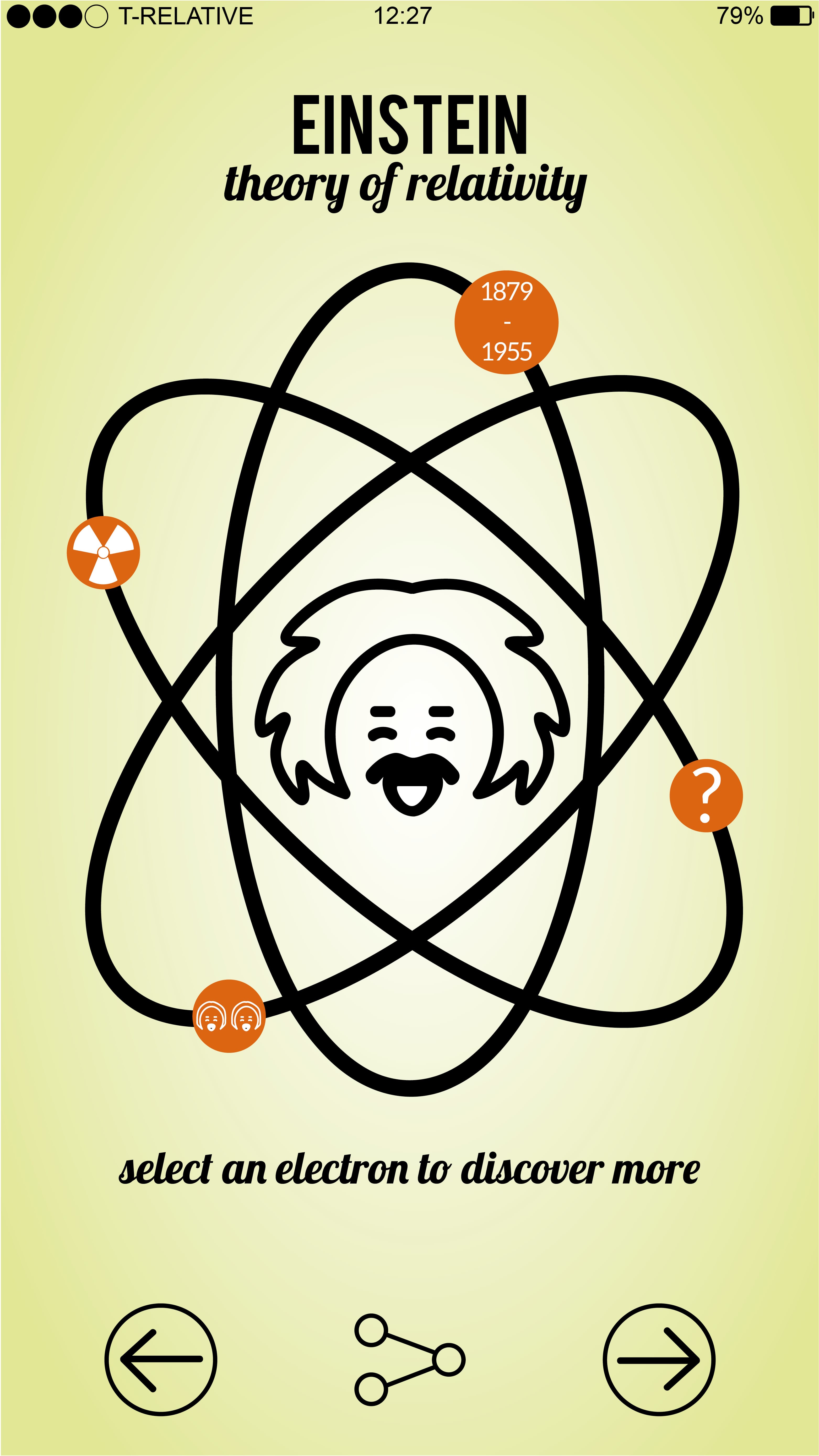
Acting upon influences from existing Einstein infographic I chose to use a pale pastel colour for the backdrop to make the vectors I had developed stand out. Using the website Noun Project I found a vector of Einstein. As a template I traced over this and deleting previous elements. This was just a rough idea of what I wanted my Einstein vector to look like and requires development of my own. I particularly liked the atom vector I developed as a navigation system. The user is prompted to select a circle to find out more information about the Theory of Relativity. The typefaces used all work in synergy to relay information to the user. Using a PSD assets file I placed the stock iPhone bar along the top of the page to give a realistic idea of what this app will look like. Much like the Einstein Vector I will develop my own style of these assets so as to fully create my own work
The use of the share button on the bottom encourages the user to spread information more easily which is one of the goals I set myself to educate younger people about Einstein. Young people need to be able to spread this information and adding a share button that can be linked to Facebook or Twitter is invaluable.
[UPDATE]
I began to consider colour more once I had begun to develop my poster. Although my research had shown the use of pastel colours I wanted to consider my target audience and what would grab their attention as young children. Therefore I chose to use more vibrant colours but also stay true to green/orange like colours.
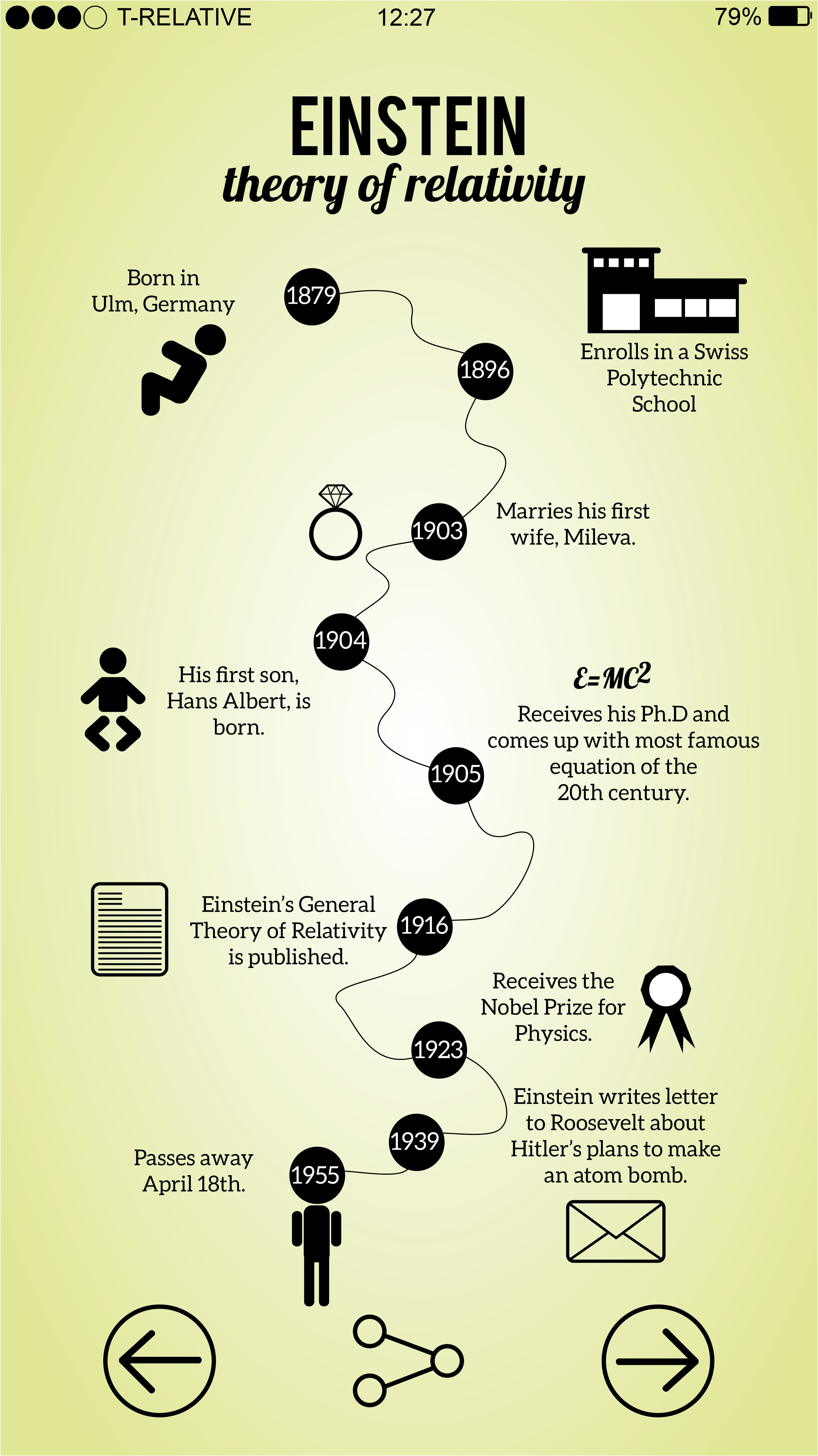
Furthermore, I began to develop a fixed set of vector images, that would become staple in my designs. This is to maintain the simplicity of understanding for children. They should be able to associate these images with words/phrases/things they have learnt through the designs.
[UPDATE]
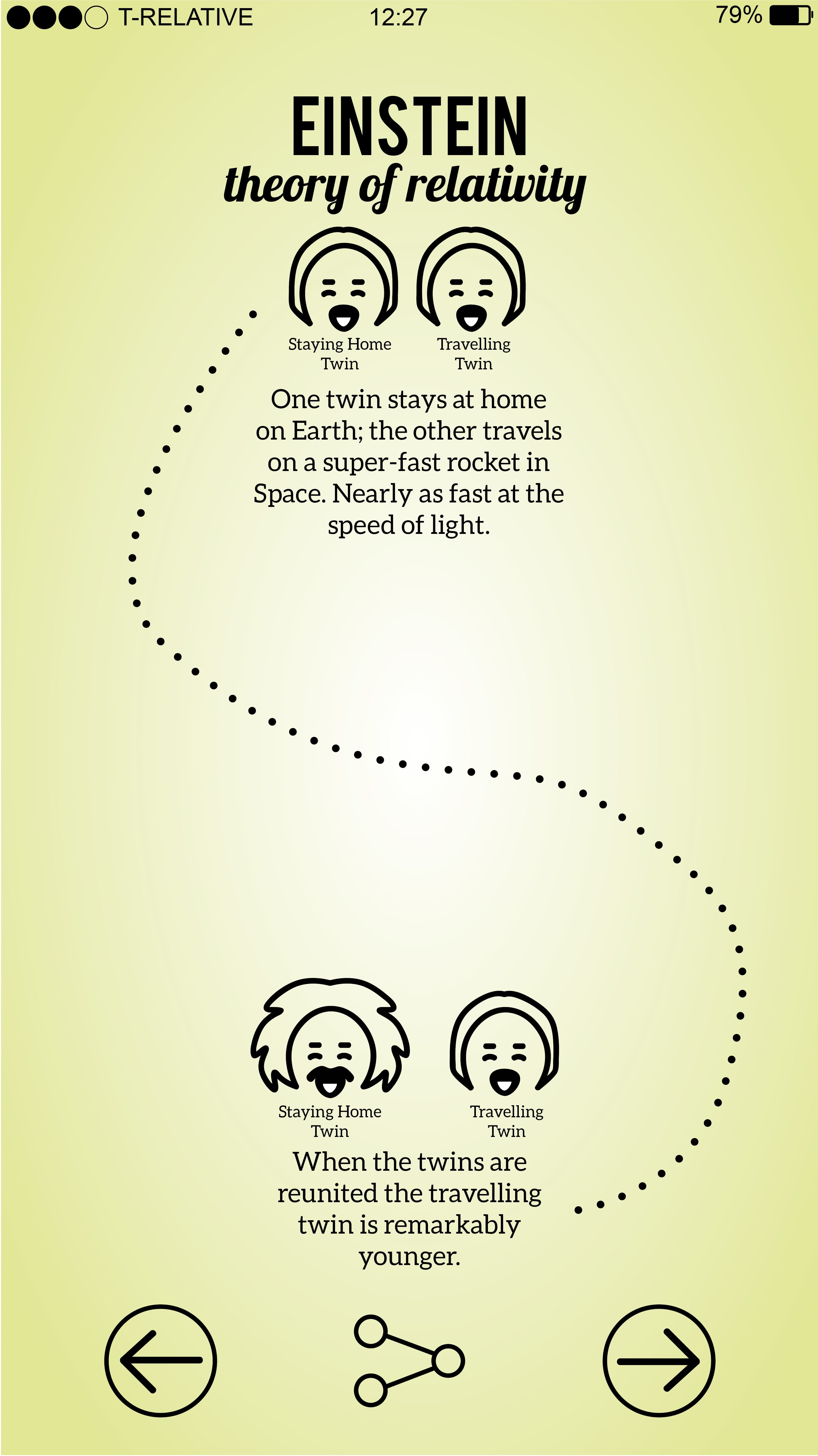
Finalising the designs I redesigned the twin Einstein to look neater as well as adding a spaceship to the Twin Paradox Theory. I went about cleaning up little parts to make the overall design look neater and finalised.