In order to design a brochure or set of stationary documents I needed to produce some research into existing examples of layout to decide what is suitable for the corporate package Enganche needs.
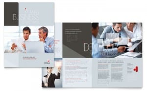
The first example that stood out to me was from stocklayouts.com. The design is business-oriented and what stood out was the images on the page. The images are impactful but not so much that they dominate the page. As a mysterious, investment group, I need to make sure the images are both serious and impactful in a layout.
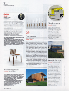
What made this design interesting was the positive upset of balance on the page that actually created balance. No one column is similar in style, but the balance of text and images on the page creates an irregular harmony. As a magazine article the page bares little white space. However, I would like to emphasise white space in my brochure/stationary for the specific reason of targeting specific parts of text.
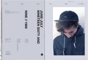
Despite not being business-oriented, the style of this magazine is modern and unique. It is unique because of the dominance of the right hand image and the imposing white space on the left hand side of the page. Larger, bolder typeface drags the attention of the reader to that area. Despite being rotated vertically it is still legible. However, I feel this design cannot be used as a basis for Enganche as there is too much white space and too little information.
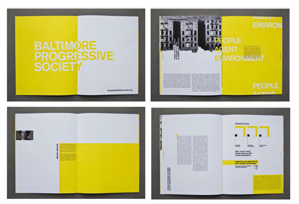
What drew me to this design was the varying amount of space and colour used in this collection of images. The yellow blocks are dominating, but also present a tranquil atmosphere. The use of simply white and yellow are harmonic. The amount of variety in these designs is something I could consider for my design of the Enganche brochure/stationary layout.


