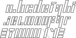
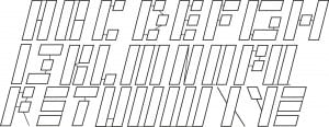
My final typeface design was an expansion of the Korean flag research and development that I looked into. Originally I had developed multiple designs that looked into using blocks and slants to create a typeface.
I really liked how in one of my original designs the smaller stroked lines connected the blocks to form letters. Therefore I chose to develop how these looked with all the uppercase letters. The individuals letters are strong on their own but as a group are much stronger. The typeface looks very cybernetic in appearance and looks somewhat like a flowchart.
The difficulty in the development of this type was the consistency of the letters. The blocks had to be expanded multiple ways to accompany for the different shapes and sizes. Some of the letters were simply inverted like the ‘M’ and ‘W’. Only the letter Y changes different of the slant whereas all the other letters lean to the right. I made this decision to distinguish the X from the Y.
 I then began to develop the lowercase letters. These proved more difficult than uppercase letters because of the curves. Some letters like ‘m, n and w’ were scaled down to size to maintain consistency in pattern and legibility.
These letters began to look more and more corporate through development. Therefore I will try to combine these letters with a company to create a logo and then do a mockup for this.
