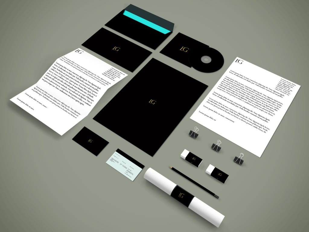
Using a PSD Mockup I found I chose to design a series of stationary that would match the Enganche branding:
Creating a range of stationary allowed me to see the Enganche logo across a variety of mediums and check its effectiveness. I am quite pleased with the outcome of this output. The strongest area being the foil-texture that appears on the branding. It is both mysterious and elitist in its appeal which suits the direction of the target audience.
Perhaps more care could have been paid to the layout of the letterhead and the folded letterhead to include this foil-design. However, I am pleased with the business card and how the two main palette colours compliment each other.
