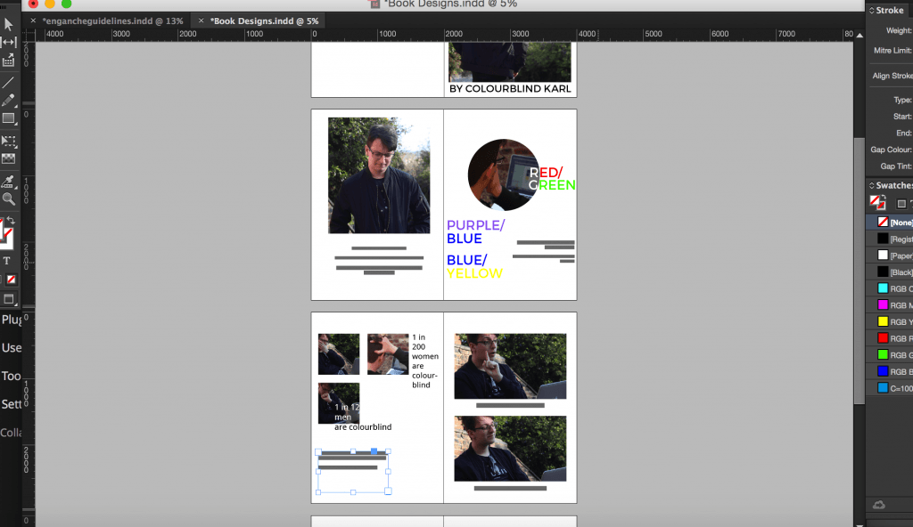
To start realising the concept of this book I took a series of images in a photographic montage that would form the basis of the story. Through this I wanted to convey key emotions and actions that would aid in the development of a storyline.
At this point the storyline is as follows:
1. This is Karl. Karl is colourblind.
Karl found out he was colourblind when he was 7.
Since then he has had trouble with reds, greens,
purple and blues.
2. Karl often does design work that
requires colours.
How does Karl do his work without
colours?
3. Karl gets confused and frustrated with his work because it doesn’t look good.
This leads to Karl being unhappy.
4. But that doesn’t bring Karl down!
He knows how to use his creativity.
Facts
I chose to include facts about colourblindness at random points to create a more unique design. At this point it does not seem to work effectively and needs to be developed so that there is harmony between the text and images. I don’t think this kind of approach has been taken in a children’s book and because this design aspect is so different it is a brave step in trying to meet the target audience.
Forming Colour
On the second main page I included the main types of colourblindness:
- Red/Green
- Purple/Blue
- Blue/Yellow
These have been reflected with their own colours being featured in an artistic way on the page. More development needs to take place to develop the overall layout of the page because it has not come together yet. However, with the right layout the design will look effective.
