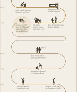
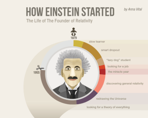
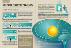
Upon learning the details of the second brief, ‘Einstein and the Theory of Relativity’, I decided to do some research into the topic and look at already existing infographics relating to this theory. The resulting research was intricate and detailed to an extent where it did not look simplistic enough. It made me question how young people would be able to understand this theory if I could not understand it myself. How many other people were in my position? The already existing infographics were plain and did nothing to further my knowledge of relativity. That’s when I started looking into Einstein as a person. Infographics about his life were frequent and look generally better and more interesting to read, but what made them different from one another?
I had to make a list of the things I could do to design a set of infographics that would engage audiences.
- Target Audience would be young people (9-13 year olds) without an understanding of Einstein and the Theory of Relativity.
- How could I make my infographics stand out from the rest?
- What aspects of Einstein as a person had not been explored?
All of the existing Einstein’s infographics shared a common feature. The use of green, pastel colours were prominent in all designs.This allows diagrams and writings to be more impactful to the reader. These colours are also more calm and inviting rather than be in your face. These infographics look more targeted to a mature individual as children would rather have these explosive colours to attract their attention. As I am designing for young teenagers I would like to mix and match ideas between the two to create something captivating as well as informative at the same time.
[UPDATE]
After doing research into sensible typefaces to use I came across a presentation that showed the trendiest font combinations of 2015 (http://www.slideshare.net/adamnoar/presentation-panda-2015-font-trends/).
There were:
- Handwritten fonts that mimicked the look of handwriting.
- Flat fonts that complimented flat design.
- Mixed fonts that go well together.
- Hipster fonts with a contemporary feel.
- Bold fonts that demand attention.
I chose to use Bebas Neue because it was in fact a bold font that demanded attention and would be powerful for headings. I then chose to use Lobster for subheadings because of its fluidity and the way it mimicked handwriting would create a complimentary contrast. For the body of texts I chose the typeface Aleo because it had a neutral impact that felt like it could portray information legibly to children. I feel like this combination is well aimed at my target audience of 9-13 year olds.
[UPDATE]
After the discovery of The Noun Project I decided to opt for vector-type graphics because the simplicity of these designs would appeal to children and would be easily identifiable. The Noun Project provided the perfect template for me to develop my ideas and create my own types of vectors to be used in my designs.
Creation of the Einstein Caricature
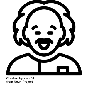
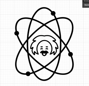
Using this existing icon vector sourced from Noun Project. I developed at a similar yet different idea for my Einstein. In order to do so I made him look cuter with squinted ideas and crazier hair to appeal to my target audience.
As a centrepiece for my designs and logos I included the symbol for atoms and electrons with Einstein in the middle. These would provide a basis for my designs to take shape.
