Final Design Analysis

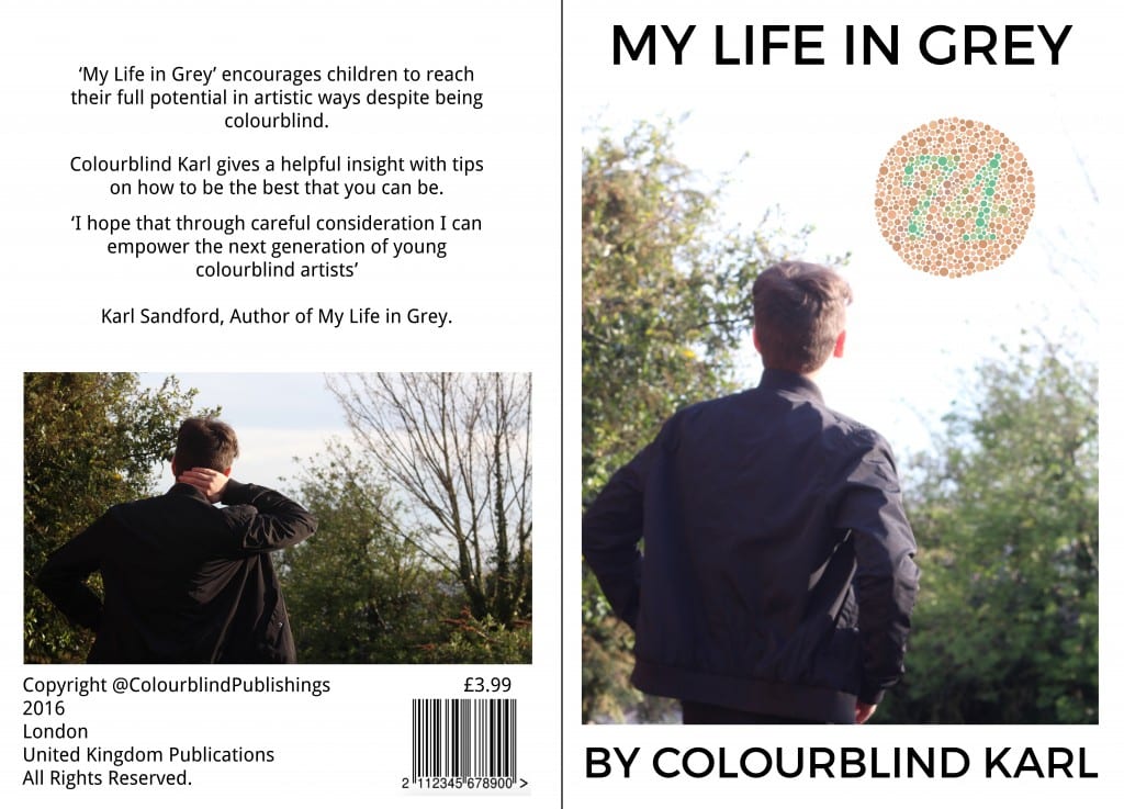
Final Designs for Children’s Book:

Book Designs Book Designs2 Book Designs3 Book Designs4

Design Process

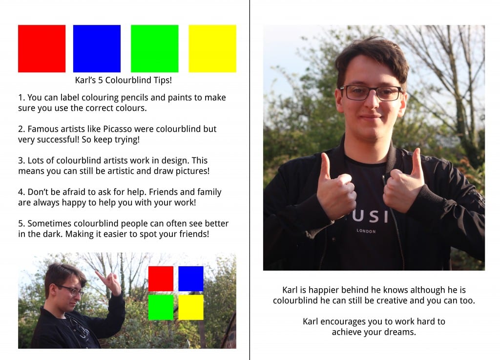
The design process of this book derived from my own experiences on being colourblind. When given the brief of dealing with a troubling matter I immediately leapt towards colourblindness. Children can be turned away from the arts because of this hinderance. However, they shouldn’t. The book covers the story of ‘Colourblind Karl’ and his own frustrations. The narrative is weak in the aspect that the character of ‘Colourblind Karl’ is not explored in depth. However, this was soon the intention behind the book. The main focal point is ‘Karl’s 5 Colourblind Tips’. These tips are meant to encourage children to reach their full potential and harness their creativity.

The book itself lacks any kind of technical skill. However, I leaned more towards a photographic montage book. This was because I wanted to move away from illustrated drawings and focus on having a character that children could be familiar with. The first 4 pages of the main book are very disjointed and remain not formulaic through the work. This is to represent the frustrations that ‘Colourblind Karl’ faces when he is trying to do his work. It is a disorder created through disorder. The final 2 pages are then arranged in a formulaic layout. This is to show the reorganisation of ‘Karl’s’ mind and his own self-belief. So despite the lack of any real technical abilities shown in the production of the book. I focused on a layout that would represent the mending of disorder to create harmony.

My design was heavily influenced by DVARTWORKS. Therefore I chose to create contrast through using RED/GREEN, PURPLE/BLUE, BLUE/YELLOW and PINK/GREY. This further supports the creation of disorder on the page through the random placement.

Conclusive Comments

Given the chance to make this piece stronger I would increase the amount of technical skill applied to this brief. I have kept the overall design very simplistic to suit my target audience, however I would like to take this even further to develop a different style to be applied to the same audience.

Before uploading to the gallery I will change the grammatical errors and clean up the whole design.
Photographic Montage + Narrative Development

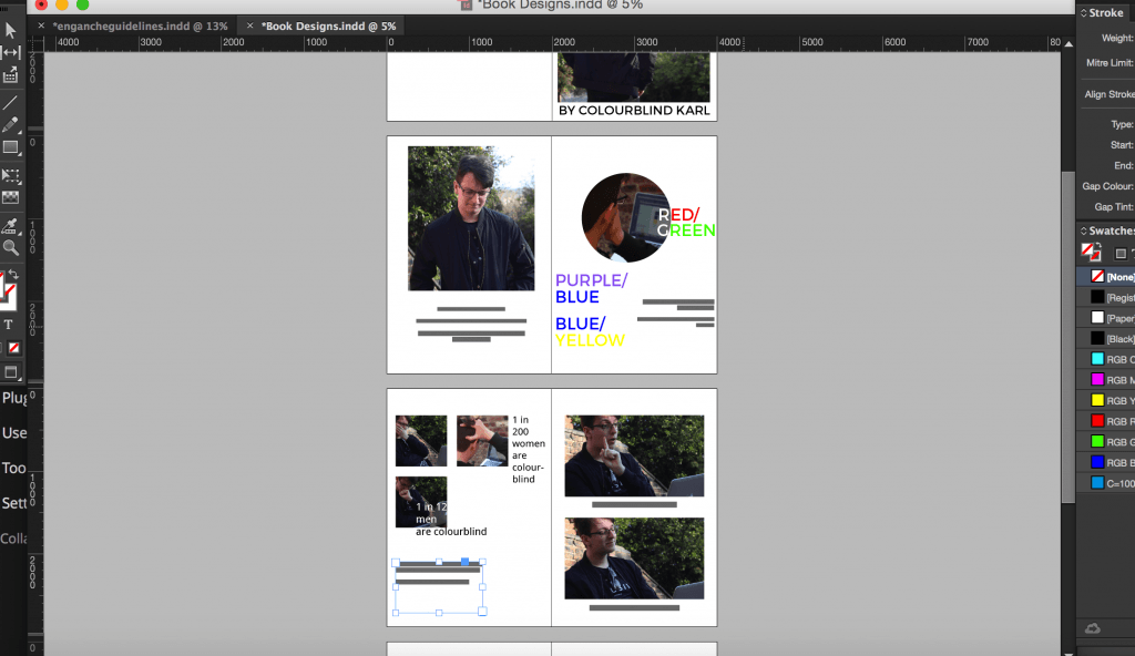
Development of Work inDesign

Development of Work inDesign

To start realising the concept of this book I took a series of images in a photographic montage that would form the basis of the story. Through this I wanted to convey key emotions and actions that would aid in the development of a storyline.

At this point the storyline is as follows:

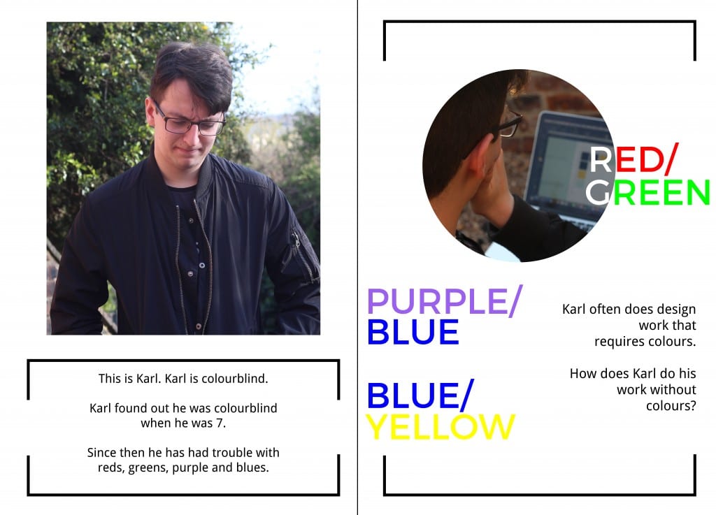
1. This is Karl. Karl is colourblind.

Karl found out he was colourblind when he was 7.

Since then he has had trouble with reds, greens,

purple and blues.

2. Karl often does design work that

requires colours.

How does Karl do his work without

colours?

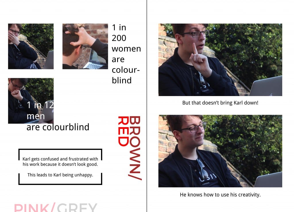
3. Karl gets confused and frustrated with  his work because it doesn’t look good.

This leads to Karl being unhappy.

4. But that doesn’t bring Karl down!

He knows how to use his creativity.

Facts

I chose to include facts about colourblindness at random points to create a more unique design. At this point it does not seem to work effectively and needs to be developed so that there is harmony between the text and images. I don’t think this kind of approach has been taken in a children’s book and because this design aspect is so different it is a brave step in trying to meet the target audience.

Forming Colour

On the second main page I included the main types of colourblindness:

  • Red/Green
  • Purple/Blue
  • Blue/Yellow

These have been reflected with their own colours being featured in an artistic way on the page. More development needs to take place to develop the overall layout of the page because it has not come together yet. However, with the right layout the design will look effective.

Brochure Mockup

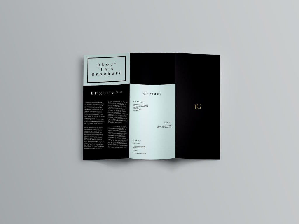
As my secondary output for Enganche branding I chose to create a trifold brochure:

outside

Outside of Brochure

I wanted to maintain the same style of branding that was in the brand guidelines for the Enganche company itself. So I kept the same style of a gold-foil logo cover. The smallness emphasises the company’s mysterious investment nature. The back cover looks very similar to the business card but more spread out. The amount of white space works effectively here. The ‘About This Brochure’ is surrounded by a box that is a more recent style of design that has caught on. The pattern works effectively here in cohesion with the typeface.

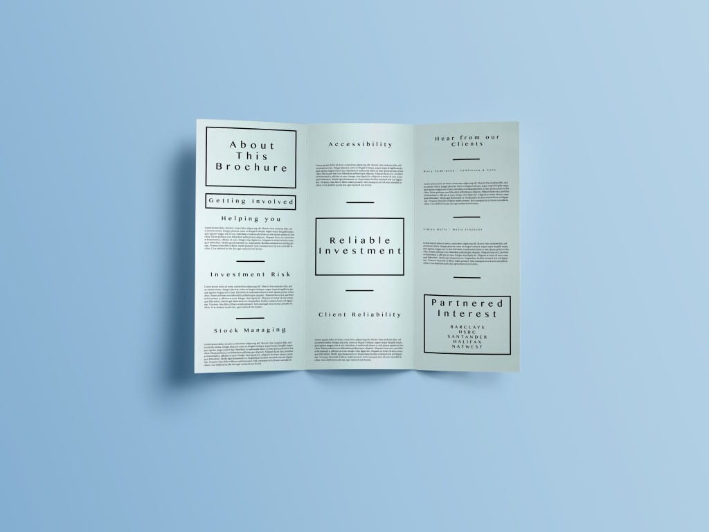
inside

Inside of Brochure

I then chose to continue this box design on the inside of the brochure by highlighting key areas of the Enganche company. The layout is quite modernised suiting the style of branding I was aiming for. I then choose to use a variety of headers combined with lorem ipsum to form the contents of the brochure. E.g.

  • Investment Risk
  • Stock Managing

Overall, I think the brochure is most effective in conveying the information that it needs to. Although it could be seen as a bland design it suits the brand identity of the company and should be seen in such a way. It looks exclusive and secretive which is implied through the Enganche logo and colour palette which has been maintained throughout all of the projects for this design brief.

Stationary Design

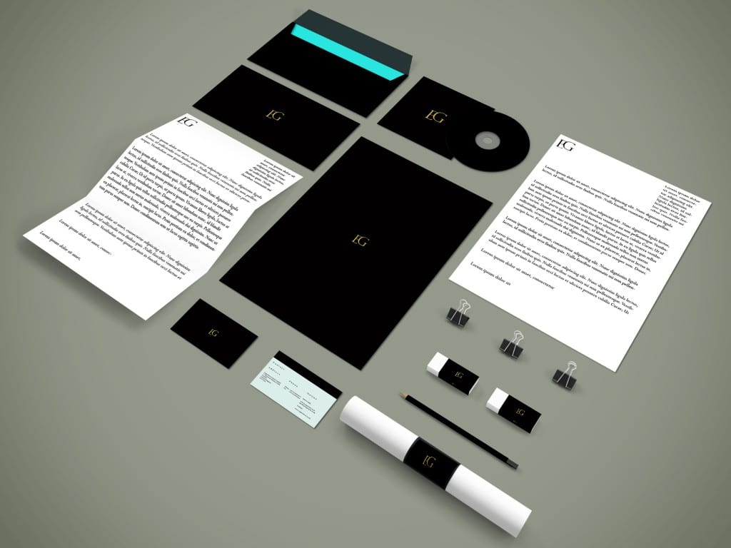
Using a PSD Mockup I found I chose to design a series of stationary that would match the Enganche branding:

Branding Mockup

Branding Mockup

Creating a range of stationary allowed me to see the Enganche logo across a variety of mediums and check its effectiveness. I am quite pleased with the outcome of this output. The strongest area being the foil-texture that appears on the branding. It is both mysterious and elitist in its appeal which suits the direction of the target audience.

Perhaps more care could have been paid to the layout of the letterhead and the folded letterhead to include this foil-design. However, I am pleased with the business card and how the two main palette colours compliment each other.

Branding Overhaul

Following feedback from in-class discussions I decided to head in a different direction with the branding of Enganche and what I felt was suitable to the brief. Enganche are a mysterious investment group and this needed to be presented in the brand guidelines.

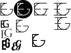
Feedback from my logo pointed towards a redesign of my preferred design. People preferred the top-left design as a basis for elaboration and it looked mysterious and had a keyhole design. Almost as if you were unlocking something.

Variations of Logo Design

Variations of Logo Design

As a result I chose a traditional design with serifs that connected the two letters together. The front of the brand guidelines was redesigned to be completely black and have a foil-like logo. To show this effect on Photoshop/inDesign I chose to layer a gold foil over the letters. Although it is not easy to see it is effective in suiting the specifications of the brief.

Brand guidelines redesign

Brand guidelines redesign

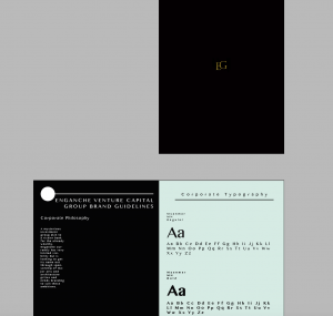
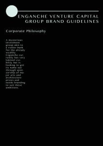
The main idea behind this design is to apply minimalistic features to the page. The corporate philosophy does not dominate the page and it also remains the sole focus with white space to support the minimalistic approach.

Proposed Brand Guidelines

engancheguidelines2engancheguidelines22engancheguidelines23engancheguidelines24

engancheguidelines25engancheguidelines26

At this point I would like to change the colour palette to be more suitable however the light-paper like texture is effective.  

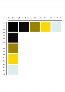
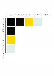
Final Colour Palette

Final Colour Palette

I decided my final colour palette would be made of four colours, for a minimalistic effect. The strong use of mysterious and financial colours compliment each other to create the brand identity for Enganche.